Storybook Font
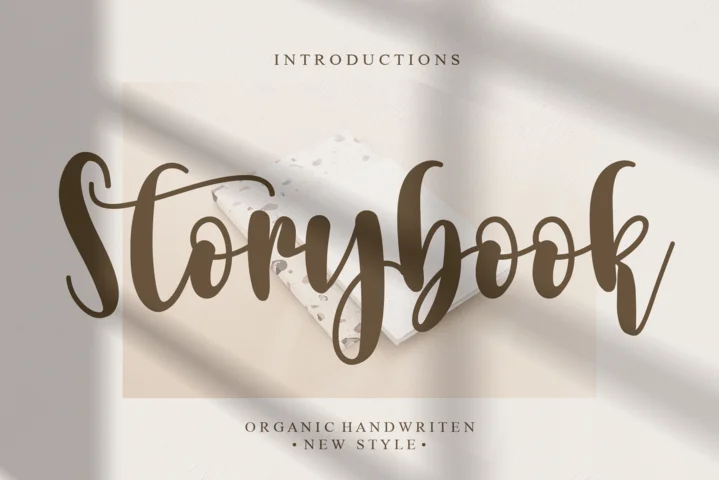
Storybook font means a range of typefaces that people might associate with children’s books or, in brief, narratives. It generally encompasses fun and eccentric qualities, enhanced to help make the text more interesting for young readers. It often has characters with curves on the corners, top and bottom strokes of different thicknesses, and other add-on features to make the font look more artistic.
The true intention of storybook fonts is to help teach children how to read and engross the child’s attention towards reading more and more and to contribute towards the looks and feels of the storybooks, making children fall in love with reading books.
You can find more free Handwritten fonts here.
Uppercase, Lowercase & Symbols Font

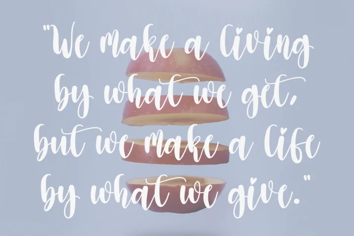
Characteristics of Storybook Font
- Playfulness: The Storybook Fonts are designed with some curves and objects because they bring children happiness and fun while reading.
- Rounded Edges: Letters, about their contour, are predominantly designed with soft corners and curves, making them more approachable to young learners.
- Varied Heights: Several Storybook fonts include letters of varying height, which makes the text exciting and not plain or simply horizontal.
- Decorative Elements: Most of these fonts come with a flair that may be in the form of swirls, stars, or any other figure that could depict a certain theme of the project in question and support creativity and imagination greatly.
- High Readability: Even though Storybook Fonts visually resemble a fairy tale, they are designed to be easily legible for the audience, thus making the content easily understandable for early learners.
- Colorful Versatility: They also use bright colors and playful layouts more than anything else, which helps make the concept of the story more appealing to the people.
- Thematic Consistency: Some Storybook Fonts are meant to share the ideas of the given book’s plot and might involve characters reflected in the literature.
History of Storybook Font
Indeed, exploring the history of Storybook Font and its function in children’s literature is useful as it stemmed from the need to make reading exciting for the young. When children’s books started to appear on a large scale in the second half of the XIX and the first half of the XX century, illustrators and authors aimed not only at children’s vision but also at the aesthetic potential of typography.
Some of the first silly fonts appeared in the late phase of ornamented typography but were drawn based on romantic lettering with slight twists, for kids’ sake. These fonts gained significant popularity before the 1960s, after asserting themselves with the help of new print technological advancements and the emergence of the idea of graphic design.
Over time, as educational psychology slowly began to acknowledge the role of sight words in early learners, Storybook Fonts was further tuned up to add friendliness while making it as easy to read as possible. Today, these fonts remain an essential element of children’s literature that contributes to developing a visual context and children’s imagination, promoting reading as a joy for a lifetime.
How to Use the Storybook Font
When implementing Storybook Fonts in children’s books or learning, several crucial points should be considered to make their use valuable and efficient. Here are some guidelines:
1. Choose the Right Font
- Choose a Storybook Font that is more suitable to the story being narrated or the class of the audience that one intends to address. Think of the age group and the feelings you want to elicit from your target audience through the typography.
- Ensure the font type chosen does not compromise readability, especially for early learners who find it hard to decipher complex font patterns and designs.
2. Combine with Illustrations
- It is also recommended that the Storybook font be used jointly with illustrations to create a proper context and avoid the cluster of the texts. They must not overshadow it but should be quaint enough to balance the artwork they are required to contain.
- Position text appropriately relative to the images; make the place where text appears interesting in the context of the bigger picture.
3. Utilize Appropriate Colors
- Choose bright colors easily visible on the prior background and use the Storybook Font. Avoiding monotonous shades makes it more eye-catching and adds a playful aspect to the otherwise dull text.
- If choosing a single color is not possible, utilizing gradients or colors with a childlike charm is in line with the themes or feelings of the tale.
4. Incorporate Decorative Elements Wisely
- When using Storybook Font, as mentioned earlier, the aesthetics of the fonts are more elaborate, but one should avoid overusing the decorations. The problem with too many fine points is that they complement their deficiencies by obscuring the text and reducing its legibility.
- The primary focus is selecting thematic accessories that do not overshadow the main narrative or interfere with its delivery.
5. Maintain Consistency
- Maintain proper font sizes, styles, and colors in a book or any readable material all the time. This seems to maintain the continuity and stability of the articles read, which, in turn, assists in establishing a rapport with the juniors.
- When designing, consider how the font cooperates with other text items (such as headings and body copy), judiciously employing type variations to differentiate these elements.
6. Test Readability
- It is therefore recommended to read the material containing selected pictures aloud with children of the targeted age to assess if they are interested and how well they can comprehend information. Their input can also improve how fonts are utilized for the best content appreciation.
- Based on how inviting the paragraph looks, make adjustments as and when necessary to font sizes or spacing as advised by observations on the part of the readers.
So, if followed, it will help to maximize the utilization of Storybook Fonts in developing interesting and attractive pieces of literature for young folks.

