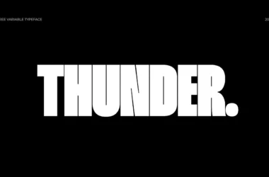
Alternate Gothic Font Family
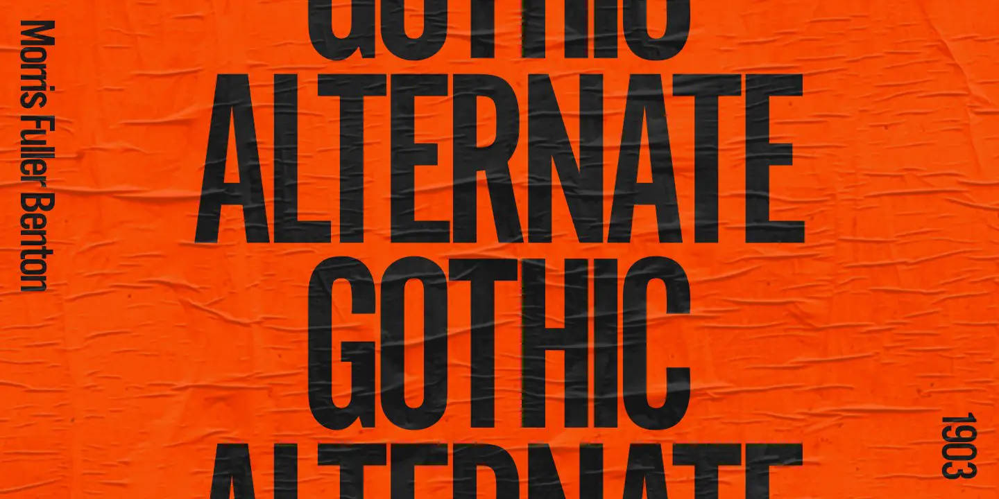
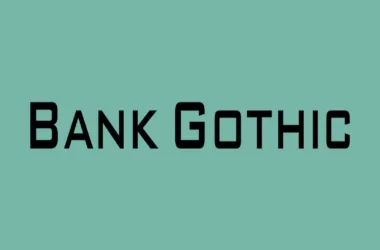
Alternate Gothic font family, developed in the early 20th century, is a sans-serif typeface known for its compact and condensed design. It was created by Morris Fuller Benton for the American Type Founders (ATF) as a variation of the original Gothic design, tailored to meet the growing demand for space-saving typefaces in advertising and newspaper industries.
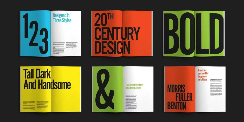
Characterized by its close-fitting letters, tall x-height, and uniform thickness of strokes, Alternate Gothic offers a no-nonsense, direct aesthetic often used in headlines and graphic prints to convey clear and impactful messaging.
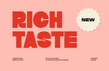
You can find more free Display fonts here.
Uppercase, Lowercase & Symbols Font
History of Alternate Gothic Font Family
Alternate Gothic Font Family, designed by Morris Fuller Benton for the American Type Founders (ATF) in 1903, stands out as a significant contribution to the typographic landscape of the early 20th century. Created during rapid growth in advertising and print media, Alternate Gothic was developed to respond to the need for more attention-grabbing and space-efficient typefaces.
Its design is characterized by a compact, sans-serif style that maximizes space usage while offering clear legibility, making it an ideal choice for headlines and other display uses. Over the years, Alternate Gothic has maintained its popularity, adapting to the digital age and becoming a go-to font for designers seeking a classic, impactful typeface.
Usage of Alternate Gothic Font Family
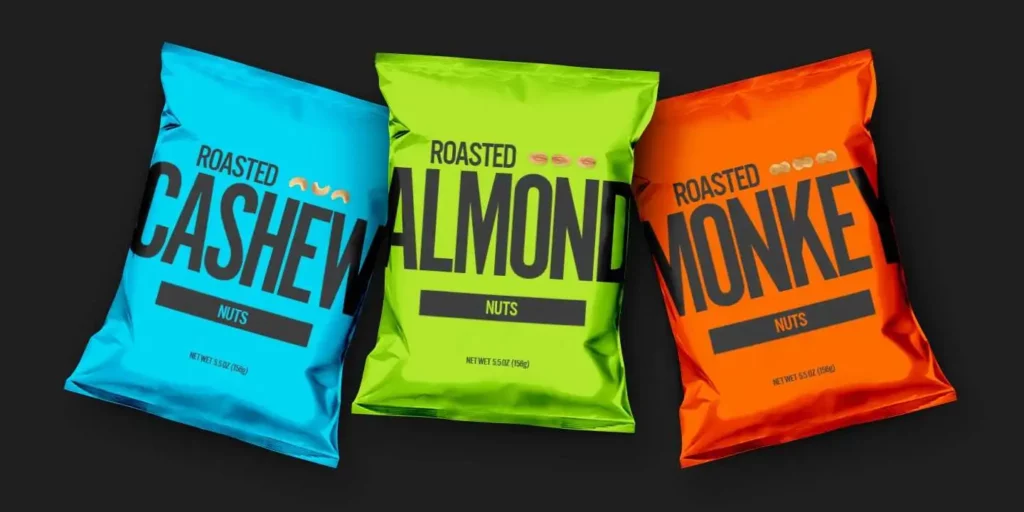
The versatility of the Alternate Gothic Font Family has allowed it to be used across various mediums and projects, ranging from print to digital. Its distinctive, compact sans-serif design saves space and adds a strong visual impact to the content it accompanies.
Here are some key areas where Alternate Gothic has been effectively utilized:
1. Advertising
Alternate Gothic’s eye-catching style makes it an excellent choice for advertising materials. It’s often used in posters, billboards, and online ads where making a bold statement is crucial. Its ability to stand out even from a distance has made it a favourite among advertisers looking to grab potential customers’ attention.
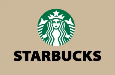
2. Branding and Logo Design
Many brands have chosen Alternate Gothic for their logos and branding materials due to its clean, impactful style. Its straightforward and professional appearance helps companies establish a robust and memorable identity.
3. Editorial and Publishing
Alternate Gothic is a popular choice for headlines and subheadings in magazines and newspapers. It provides excellent readability and space efficiency, vital in printed publications’ densely packed format.
4. Digital Media and Web Design
With the rise of digital media, Alternate Gothic has transitioned smoothly into web design and online content. Its clear legibility and strong presence make it suitable for website headers, digital banners, and online articles, enhancing user experience with its straightforward appeal.
Tips for Using Alternate Gothic Font Family
When incorporating Alternate Gothic Font Family into your design projects, using this classic font effectively to maximize its impact is essential. Here are several tips to keep in mind:
- Pairing with Other Fonts: Alternate Gothic works well in contrast with serif fonts for body text, creating a balanced visual hierarchy. Choose a serif font that complements its clean, sans-serif nature for an appealing design.
- Kerning and Spacing: Due to its condensed style, pay close attention to kerning and letter-spacing to ensure readability, especially in digital formats. Proper spacing can significantly improve legibility and overall aesthetic.
- Colour Choices: This font stands out when paired with bold colour choices. Use vibrant backgrounds or text colours to make your design pop. However, ensure enough contrast between the text and its background to maintain readability.
- Use for Headlines and Short Texts: Given its bold and attention-grabbing nature, Alternate Gothic is best suited for headlines, titles, and short pieces of text rather than lengthy paragraphs.
- Size Matters: When using Alternate Gothic, especially in print, ensure the font size is manageable for your audience. Larger sizes highlight its aesthetic appeal, while smaller sizes may hinder readability due to its condensed properties.
Implementing these tips will help leverage the iconic strengths of the Alternate Gothic Font Family in your designs, making your projects stand out while maintaining clarity and visual interest.