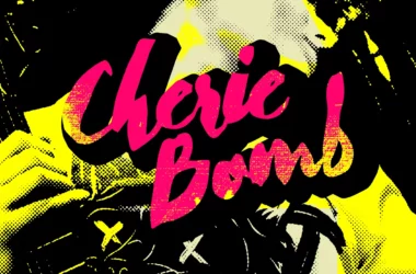
Blackout Font
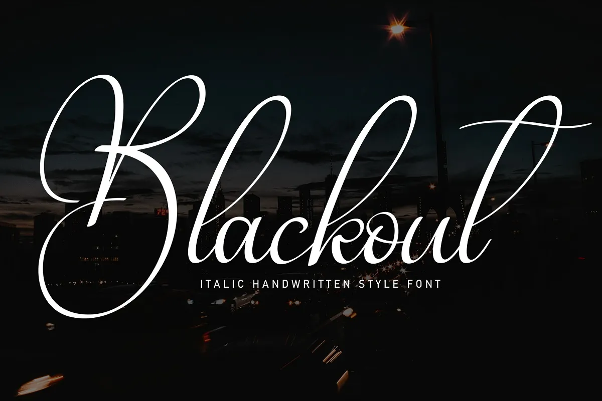
Blackout Font is a bold, impactful typeface with solid, block-like letterforms. Originating from the visual style of mid-20th century factory signage, it eschews traditional curves and fine lines in favor of thick, straight edges and heavyweight strokes.
This font is often used in contexts requiring a strong visual impact, such as headlines, posters, and branding materials, where its assertive, no-nonsense appearance can convey messages with clarity and a sense of robust confidence. Its distinctive look is a nod to historical design sensibilities and a versatile tool for contemporary graphic communication.
You can find more free Handwritten fonts here.
Uppercase, Lowercase & Symbols Font

History of Blackout Font
Blackout font is a distinctive and bold display font that emerged from the experimental design landscape of the early 21st century. Created by Tyler Finck in 2008, it was part of a “League Gothic” project aimed to resurrect and modernize old classics for the digital era. Blackout stands out due to its solid, geometric shapes and absence of interior spaces, which refers to the blocky letterforms used in early 20th-century advertising and signage.
Its inspiration is rooted in the period’s industrial spirit and helpful approach to typography, where visibility and impact were paramount. The font quickly gained popularity among graphic designers and creatives looking for a modern twist on vintage styles, making it a favoured choice for logos, headlines, and any project requiring a robust, attention-grabbing typeface.
Characteristics of Blackout Font
Blackout font boasts a series of unique features that distinguish it from traditional and contemporary typefaces alike.
These include:
- Bold and Blocky Appearance: Its most defining characteristic is its heavy, block-like letters, contributing to its high visual impact.
- Lack of Interior Spaces: Blackout has eliminated interior spaces, unlike many fonts, resulting in solid letterforms that draw the eye.
- Geometric Shapes: Using geometric shapes in its design gives it a modern and industrial feel, suitable for various design contexts.
- Inspired by Vintage Styles: Though modern in application, Blackout’s design pays homage to the bold, straightforward typography of early 20th-century signage and advertising.
- Versatility in Use: Ideal for headlines, logos, and any project where a strong visual presence is needed, Blackout can adapt to both print and digital formats.
- High Legibility at Large Sizes: Its unique characteristics ensure that it remains highly legible when scaled up, making it perfect for impactful headlines and posters.
Using of Blackout Font
Blackout font’s distinct appearance makes it a versatile tool for various design projects. Here are some key considerations and tips for using this font effectively:
1. In Digital Design
With its bold and geometric features, blackout font has become a staple in digital design. Its solid, impactful appearance makes it particularly effective for website headers and banners, which are critical for quickly capturing the viewer’s attention. Designers also favour Blackout for creating digital advertisements, social media posts, and graphics where clarity and visual impact are paramount. Its versatility allows it to stand out on desktop displays and mobile screens, ensuring legibility and style across all platforms.
2. In Print Media
In print, Blackout font injects a modern vibe into traditional media. It is widely used in poster designs, magazine headers, and book covers to convey strength and sophistication. Event flyers and album artwork benefit from its bold, blocky appearance, which resonates well with audiences looking for fresh, edgy visuals. Furthermore, Blackout’s ability to remain legible at large sizes makes it ideal for outdoor advertising, such as billboards and signage, where distance viewing is a consideration.
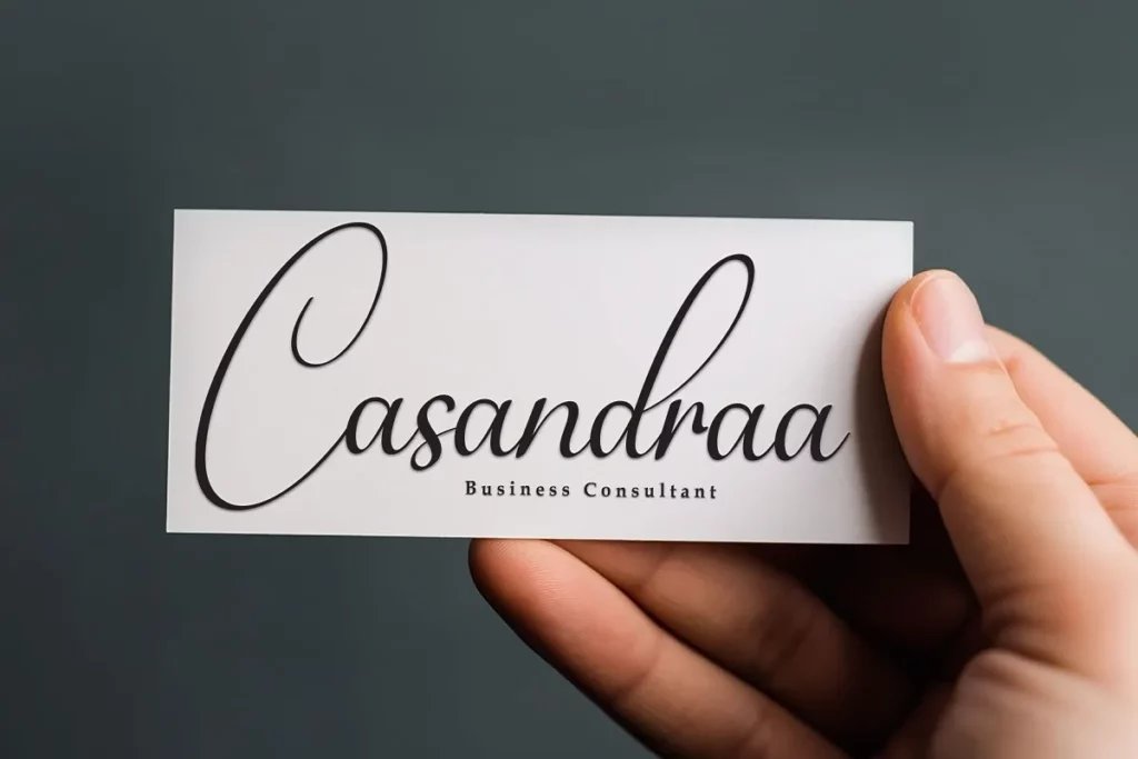
3. Branding and Logo Design
Blackout is particularly cherished in the branding and logo design industry. Its robust and distinct appearance helps in crafting memorable and impactful brand identities. Companies aiming for a modern, strong presence find Blackout an excellent choice for their logos, business cards, and promotional materials. The font’s unique blend of vintage inspiration with a contemporary twist appeals to brands that wish to stand out while paying homage to past design elements.
4. Creative Projects and Art
Artists and creatives often turn to Blackout font for projects that require a blend of industrial charm and modernist simplicity. Its use in infographics, zines, and art installations highlights its adaptability and effectiveness in conveying messages with style and substance. The font’s characteristic lack of interior spaces creates a distinctive visual texture that enhances the artistic appeal of creative works.