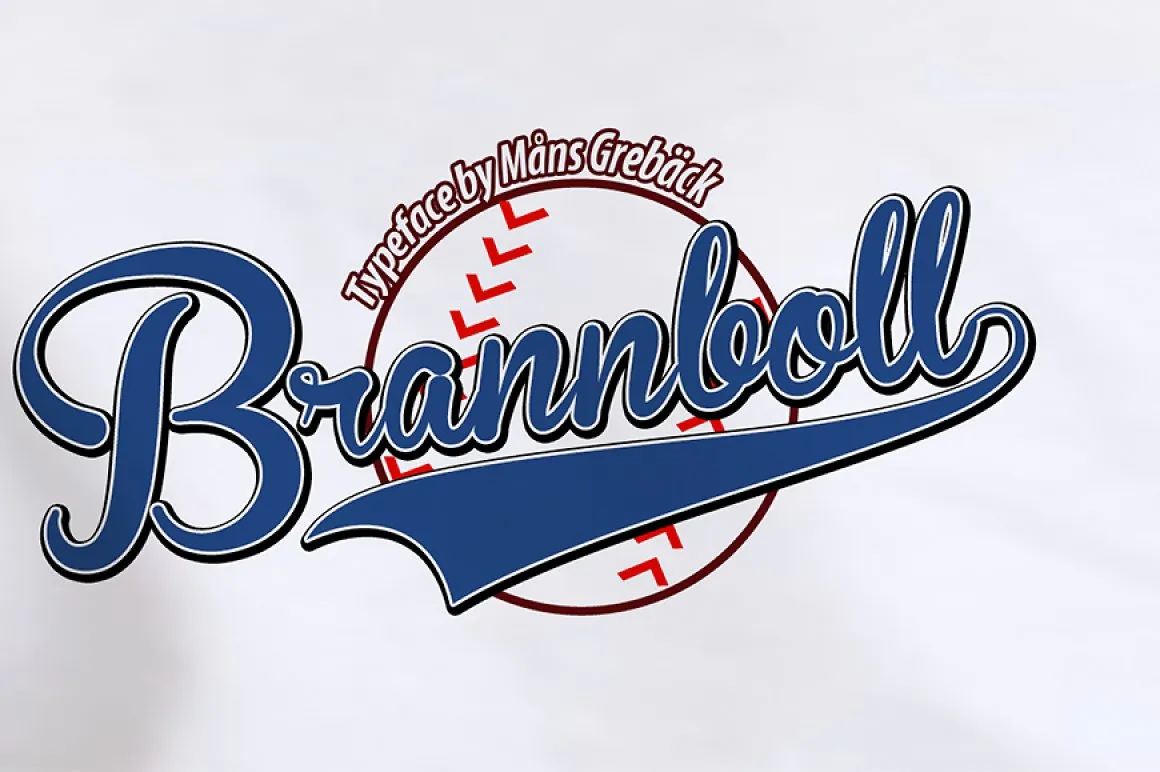
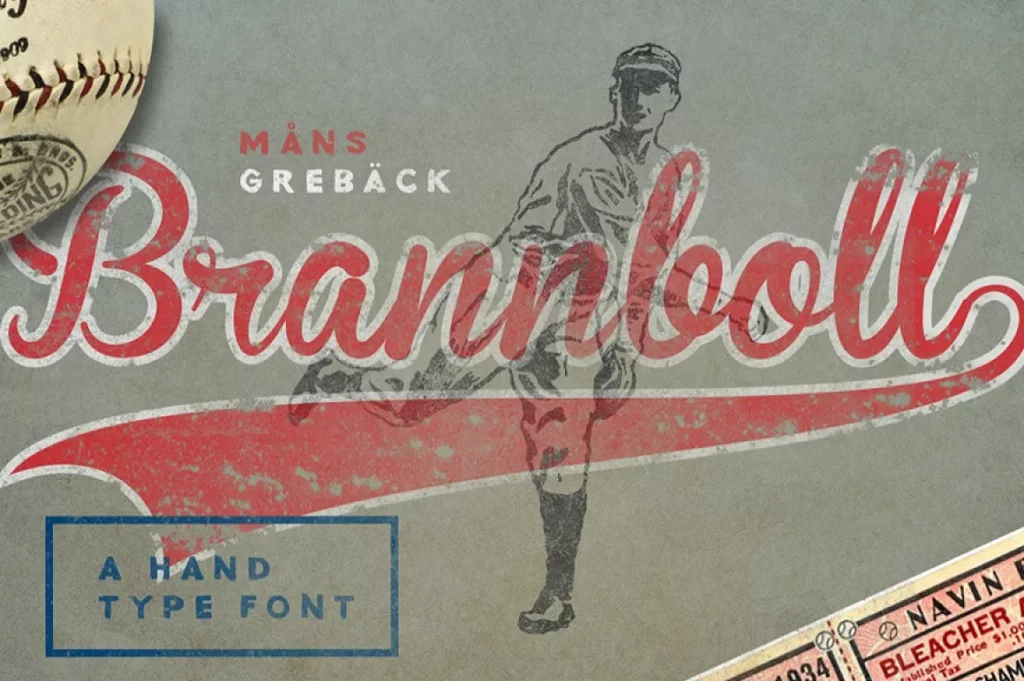
Brannboll Font
Brannboll Font is a unique typeface known for its elegant and flowing script design, reminiscent of calligraphy. Its distinctive character stems from a blend of vintage charm with a modern twist, making it particularly suitable for use in logos, invitations, and other forms of stylish lettering.
This font’s versatility allows it to be used in various design projects, adding a touch of personality and sophistication.
You can find more free Old School fonts here.
Uppercase, Lowercase & Symbols Font
History of Brannboll Font
Brannboll is a font deeply rooted in tradition and sportsmanship. The name ‘Brannboll’ is derived from the Scandinavian ball sport – similar to baseball – called “Brännboll” or “Brannboll.” With a heritage linked to a pastime that embodies community and competition, this font carries a legacy of vitality and energy.
Developed by Måns Grebäck, a Swedish designer renowned for his calligraphy-inspired typefaces, Brannboll is a fusion of vintage script and modern design elements. Its thick strokes and pronounced serifs contrast traditional calligraphy, while the clean, smooth lines convey contemporary sensibilities. Released into the public domain, the Brannboll font has become a beloved staple for many design projects, from event posters to branding materials.
Usage of Brannboll Font
Brannboll Font, with its unique blend of traditional and contemporary elements, offers versatile applications in the design world. Here are some key ways in which Brannboll can be utilized effectively:
- Branding and Identity: Its strong, distinctive character makes Brannboll perfect for logos, business cards, and branding materials that aim to stand out and convey a sense of dynamism and originality.
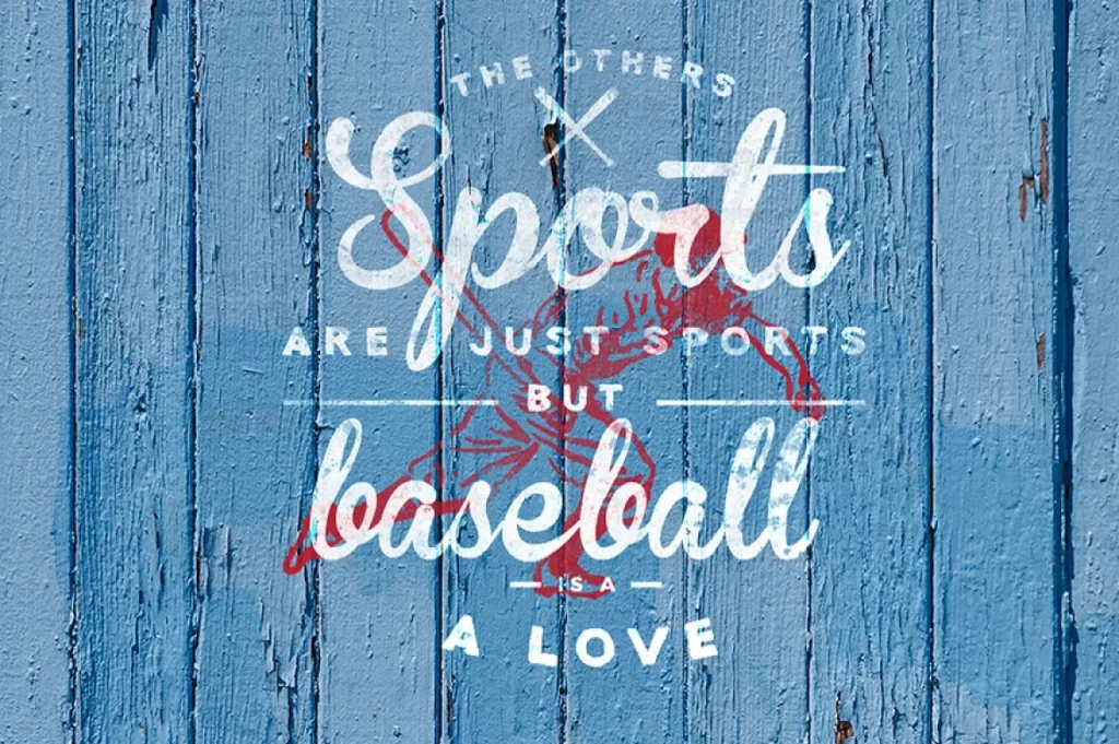
- Event Promotion: Flyers, posters, and invitations for sports events, music festivals, or any community gathering benefit from Brannboll’s energetic vibe, drawing attention and building anticipation.
- Digital Media: For websites and social media content that require a touch of personality, Brannboll’s unique style enhances visual interest, making headlines and call-to-action buttons more engaging.
- Editorial Design: Magazines, ebooks, and online publications can use Brannboll to add a decorative element to headlines and pull quotes, increasing readability and aesthetic appeal.
- Product Packaging: Particularly suitable for lifestyle and sports-related products, the font can add an element of excitement and appeal to packaging design.
Leveraging Brannboll Font’s characteristics in these applications can significantly enhance the visual communication of a project, making it more memorable and impactful.
Tips for Using Brannboll Font
While the Brannboll font is versatile, successful integration requires a nuanced approach. Here are some tips to consider when using Brannboll in your designs:
1. Pair it Thoughtfully
To balance Brannboll’s boldness, pair it with a more straightforward, neutral typeface for body text. This contrast will enhance readability and direct focus to the content.
2. Size Matters
Due to its bold and decorative nature, Brannboll is best used in larger sizes. Smaller sizes can lead to readability issues, so use it in headlines, logos, and other prominent areas where space isn’t a constraint.
3. Colors and Context
Choose colors that suit the mood and context of your design. Solid, high-contrast choices are practical for high-energy designs, while muted or monochromatic palettes can evoke a more subdued feel.
4. Align with Purpose
Ensure that the use of Brannboll aligns with the message you want to convey. It’s a font with a dynamic presence, so it’s best suited for designs that call for a bold statement.
5. Practice Restraint
While it’s tempting to showcase Brannboll Font’s strength in every design element, resist overuse. Too much can overwhelm the eye and dilute the impact. Selective application is critical to emphasizing its unique charm.
6. Respect the Kerning
Kerning is the spacing between individual letter pairs. Pay close attention to Brannboll’s kerning to maintain readability and a balanced text flow.