Frontage Font
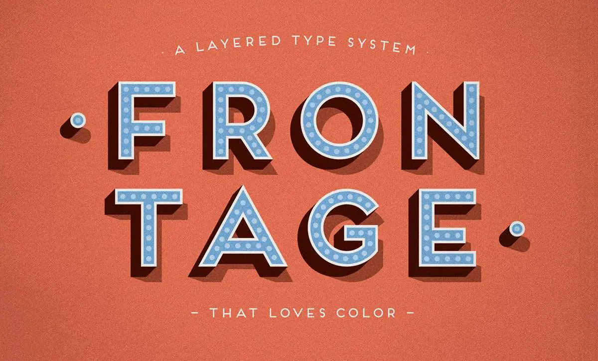
Frontage Font is a charming layered type system with endless design possibilities. The font’s playful and bold character suits a wide range of creative projects, from eye-catching headlines to distinctive logos.
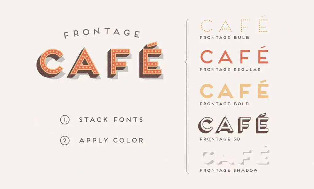
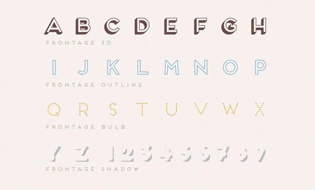
Its defining feature is the ability to layer different styles within the font family to create textured, three-dimensional lettering effects. This versatility allows designers to experiment with depth and colour, making Frontage Font a popular choice for branding, advertising, and editorial designs.
You can find more free Display fonts here.
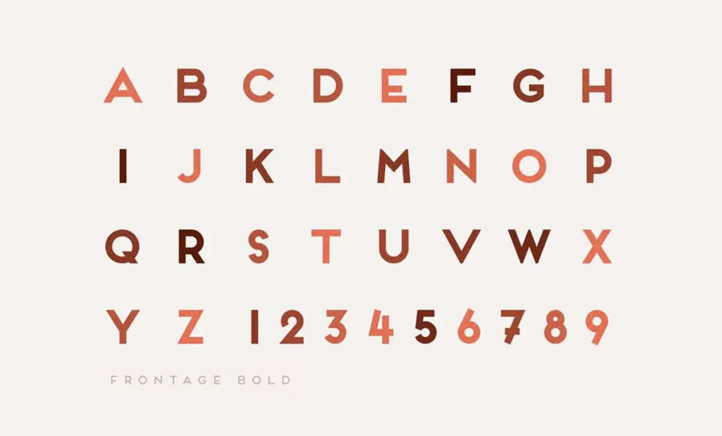
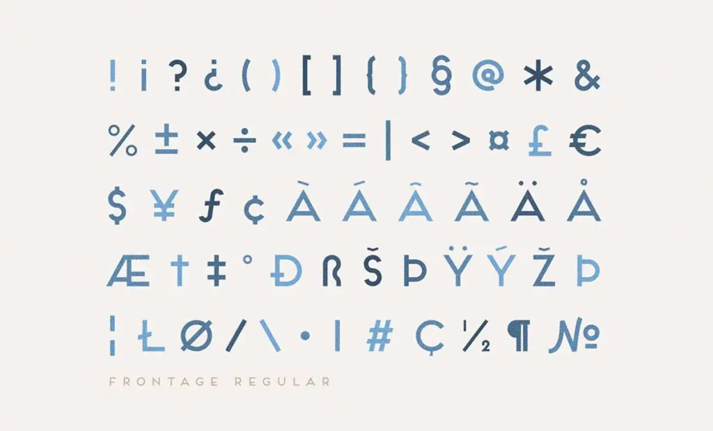
Uppercase, Lowercase & Symbols Font
What is Frontage Font?
Frontage Font is a bold and contemporary typeface with a versatile throwback to the ornate aesthetics of the Art Deco era. Created by Juri Zaech, this typeface harkens back to a time of geometric precision and grandiose lettering, bringing the lush style of vintage sign painting into the digital age.
Each letter is a work of art on its own, with sharp edges and a clean, contextual kerning that gives it the potential to be a design superstar in its own right.
Applications of Frontage Font
In design, fonts are tools crafted to meet specific needs and evoke certain emotions. Frontage Font’s applications are as varied as the designer’s visions. Here, we explore several contexts in which this typeface can shine.
1. Branding
The bold and sophisticated lines of this font make it an exceptional choice for branding. Whether in the ‘fin’ of a company name or as the main body of a classic logo, the font’s ability to command attention and its contextual association with luxury can elevate brand identities in the eyes of the beholder.
2. Marketing and Advertising
Frontage Font offers a unique opportunity to stand out in the competitive and often loud marketing sphere. Its vintage appeal strikes a chord with nostalgia, making it ideal for campaigns touching history, while its modern leanings ensure it doesn’t feel dated.
3. Editorial Design
Juxtaposed against the minimalism often found in editorial design, this font’s decorative strength becomes even more pronounced. When used sparingly and judiciously — placed against the reined-in backdrop of articles and images — it becomes a powerful visual anchor, guiding readers’ eyes through the page’s content.
Tips for Using Frontage Font
When incorporating Frontage Font into your creative projects, consider the following guidelines to maximize its impact:
- Balance with Negative Space: This font’s boldness can easily dominate a design. Ensure ample negative space around text elements to prevent visual clutter and enhance readability.
- Use for Headlines and Logos: Given its distinctive style and decorative elements, this font excels in short, impactful applications like headlines, logos, or call-to-action buttons rather than long text blocks.
- Pair with Simple Fonts: Pair this font with simple, clean fonts for body text to maintain design harmony. This contrast allows Frontage to shine as a focal element while ensuring content remains accessible.
- Experiment with All Caps: Leveraging Frontage Font in all caps can amplify its Art Deco characteristics, making it a striking choice for titles or branded material that aims to evoke a sense of sophistication.
- Mind the Color Palette: This font pairs well with both bold and muted colour palettes, but consider the overall theme of your project. A vintage-inspired palette can complement its retro feel, while a modern palette can underline its boldness.
- Adjust Kerning and Leading: To ensure optimal legibility and aesthetics, tweak the kerning (space between characters) and leading (space between lines) according to the design’s needs, especially when using this font in larger sizes.
By adhering to these tips, designers can effectively incorporate Frontage Font into various projects, striking the perfect balance between artistic flair and functional design.