Gilroy Font Family
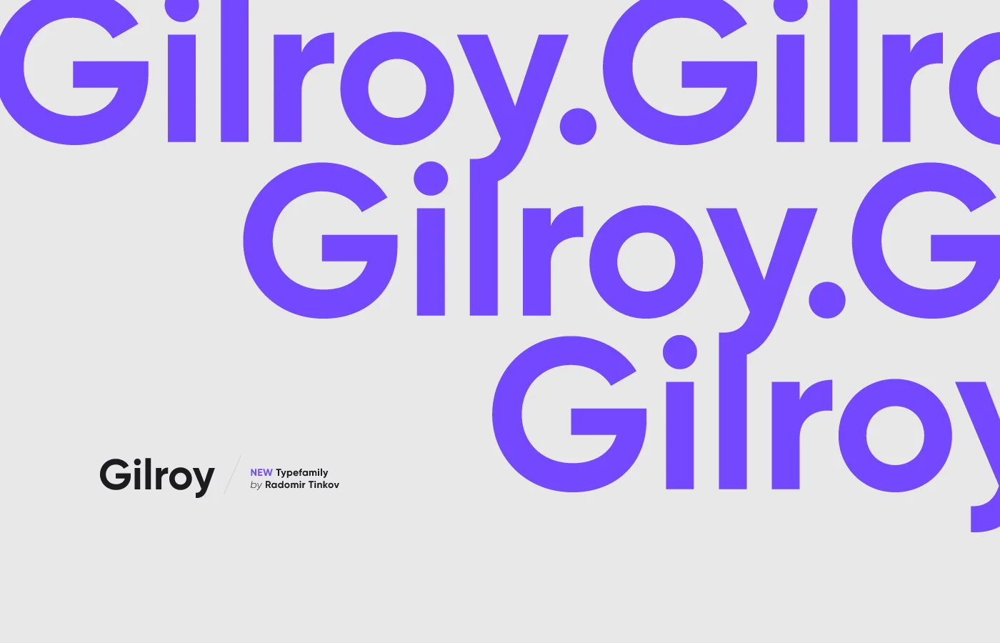
Gilroy Font Family is a modern sans-serif typeface characterized by its clean lines, geometric shapes, and friendly appearance. Designed by Radomir Tinkov in 2016, Gilroy has gained popularity for its versatility and wide range of weights.
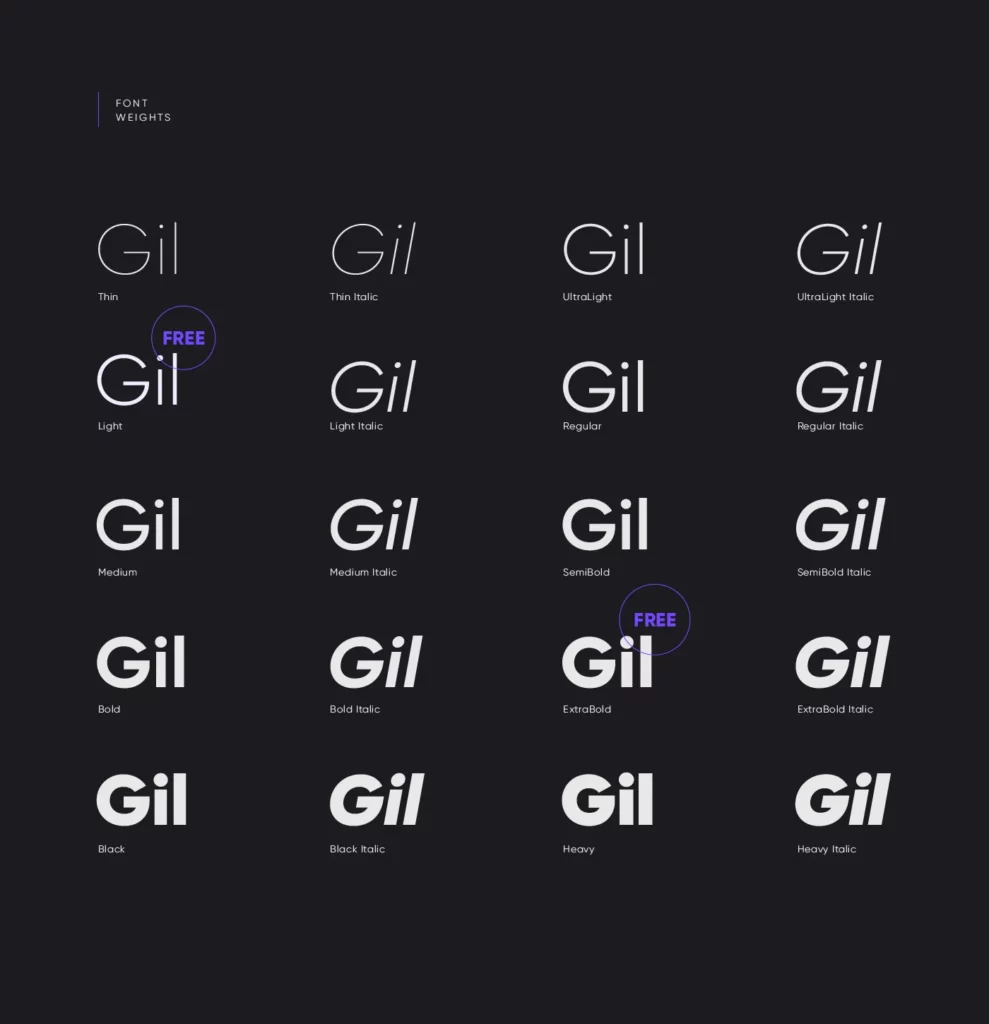
The family includes 20 weights, ranging from Thin to Black, with matching italics, making it a flexible choice for digital and print design projects. Its distinctive yet understated style allows it to be used in various contexts, from corporate branding and advertising to web design and editorial content. Gilroy’s combination of functionality and contemporary aesthetics makes it a go-to font for designers seeking a balance between readability and character.
You can find more free sans-serif fonts here.
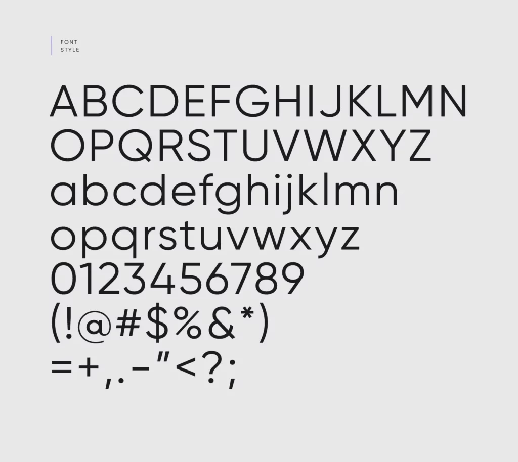
Uppercase, Lowercase & Symbols Font
Background of Gilroy Font Family
Named after the city of Gilroy in Northern California, the Gilroy font family presents a unique fusion of industrial simplicity and subtle elegance. It was crafted by Radomir Tinkov, a prolific type designer noted for his groundbreaking works that redefined the boundaries of modern typography.
Steeped in its creator’s individuality and forward-thinking ethos, Gilroy is a typeface that refuses to be confined to a singular style or purpose. It has made its mark across various design projects, from sleek corporate branding to edgy retail packaging. Its appeal lies in its adaptability and ability to harmoniously coexist with a myriad of design elements.
Key Features of Gilroy Font Family
Gilroy’s design is celebrated for its perfect blend of form and function, making it a favourite among modern designers. Its key features include:
- Geometric Structure: Gilroy boasts a highly geometric structure, leveraging the principles of the Modernist movement to achieve a clean, minimalist aesthetic.
- Wide Range of Weights: The font family includes a broad spectrum of weights, from Thin to Black, enabling designers to create dynamic and varied typographic hierarchies.
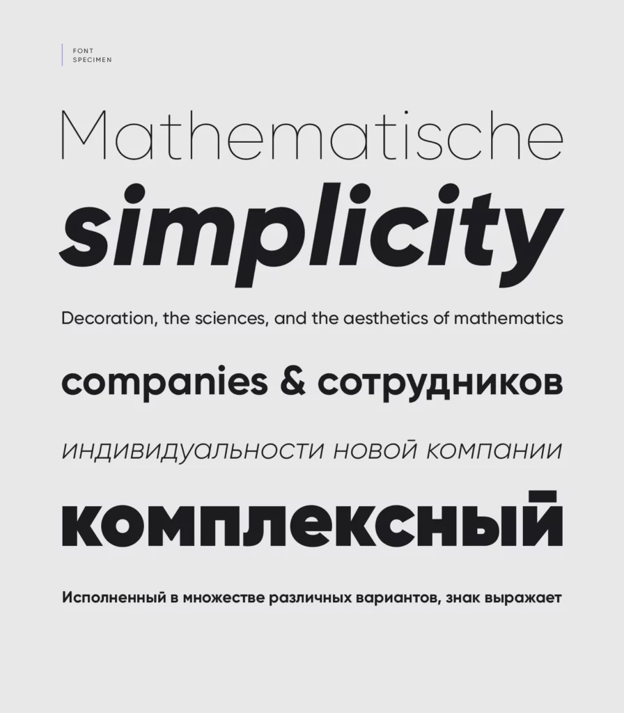
- Distinctive Characters: Certain characters in Gilroy, such as the lowercase ‘a’ and ‘g’, as well as the uppercase ‘G’ and ‘R’, feature unique designs that enhance their personality and recognition.
- Excellent Legibility: Despite its stylistic nuances, Gilroy maintains high legibility at large and small scales, making it suitable for digital displays and print materials.
- Versatility: Gilroy’s ability to adapt to different contexts and applications, from branding to editorial design, speaks to its versatility and broad appeal.
- Modernist Influence: While it is firmly a product of the 21st century, Gilroy pays homage to the Modernist tradition’s reliance on geometric forms and functional beauty.
These features combined make Gilroy Font Family a font and a powerful tool for designers seeking to convey clarity, modernity, and aesthetic appeal in their projects.
Tips for Using the Gilroy Font Family
When incorporating the Gilroy font into your design projects, consider these useful tips to maximize its impact and ensure your work stands out.
1. Choose the Right Weight
Utilize the wide range of weights available within the Gilroy font family to create contrast and interest in your designs. Lighter weights work well for body text and create an elegant, sophisticated look, while bolder weights are perfect for headlines and callouts, providing immediate attention and focus.
2. Pairing with Other Fonts
Gilroy’s geometric and modernist qualities make it a versatile partner for various other typefaces. Consider using a serif font for body text to complement Gilroy’s clean lines in headings and subheadings when pairing. This contrast can enhance readability and add depth to your designs.
3. Color and Background Considerations
The clarity and simplicity of Gilroy mean it can adapt well to different color schemes and backgrounds. However, high-contrast colours can greatly enhance legibility and visual impact, especially in web and mobile interfaces.
4. Minimalist Design
In keeping with the Modernist principles that inspire Gilroy, consider adopting a minimalist design approach. Allow plenty of white space around your text and elements to give the typeface room to breathe and shine. This promotes readability and aligns with aesthetic trends favoring simplicity and clarity.
5. Experiment with Letter Spacing
Adjusting the letter-spacing (tracking) can dramatically change the appearance and readability of the Gilroy font, especially in headlines. Tighter letter spacing can be used for a more compact and assertive look while increasing spacing can add a sense of airiness and sophistication.