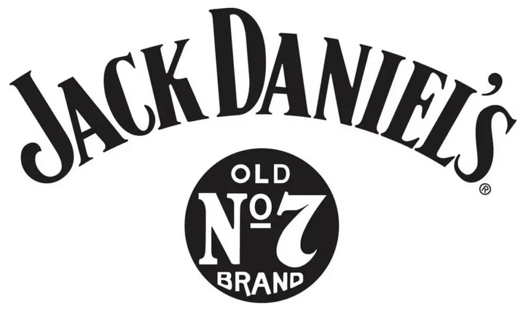
Jack Daniels Font
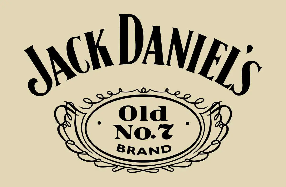
Jack Daniels font, recognized for its usage in the branding of the iconic Tennessee whiskey, is a distinctive typeface that combines script and block styles, mirroring the label’s timeless and classic appeal.
This font is characterized by its bold yet elegant lettering, which captures the heritage and craftsmanship associated with Jack Daniel’s brand. While not officially available for public use due to trademark restrictions, several similar fonts attempt to replicate its unique style for personal projects.
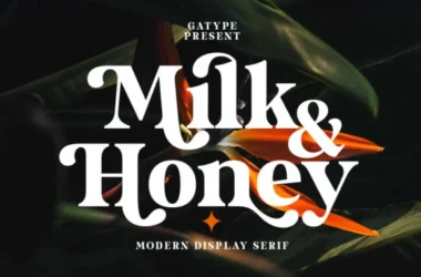
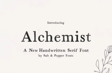
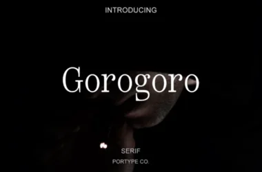
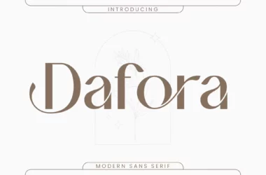
You can find more free Serif fonts here.
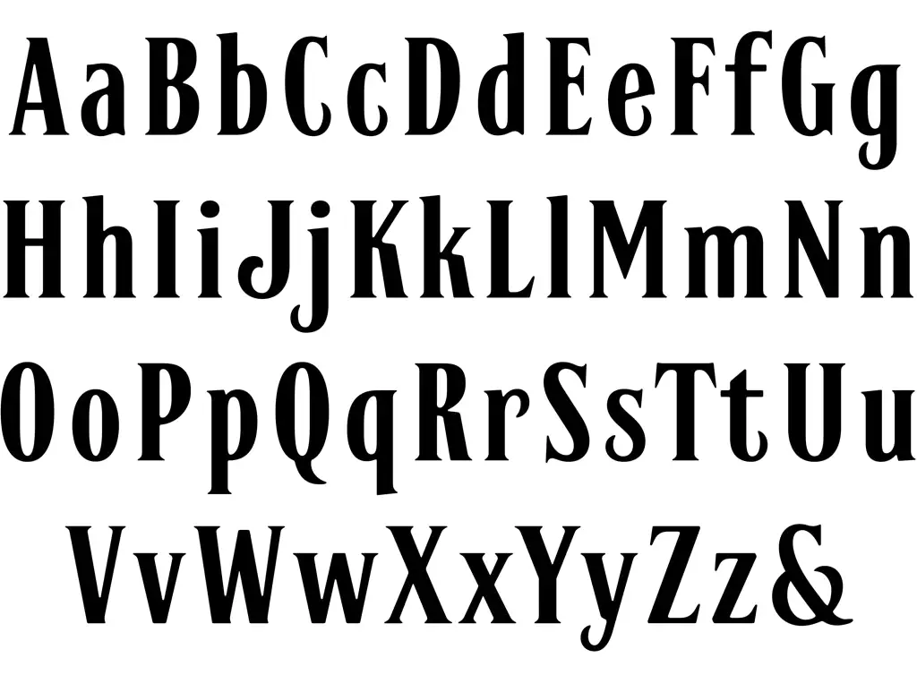
Uppercase, Lowercase & Symbols Font
Origin of the Jack Daniels Font
The distinctive font that spells out “Jack Daniels Font” on bottles of the famed Tennessee whiskey is believed not to have originated from a specific type of foundry, but rather to have been crafted and evolved, mirroring the brand’s development over time. Its roots are deeply embedded in the brand’s storied past, dating back to the late 19th century when Jack Daniel began distilling his soon-to-be-famous whiskey.
The lettering style reflects the era’s preference for bold, ornate fonts, capturing the spirit and tenacity of the American frontier. Although proprietary changes and refinements have likely been made to the logo font over the years, the essence of its original design remains, making it a timeless piece of graphic heritage remarkably tethered to the identity of Jack Daniel’s whiskey.
Key Features of Jack Daniels Font
Jack Daniels font is characterized by distinctive features that have contributed to its iconic status. These include:
- Boldness: The font exudes a bold and strong presence, mirroring the robust character of the whiskey it represents. This boldness ensures outstanding readability and instant recognition.
- Serif Details: The font incorporates unique details, with slight variations that give it an antique and crafted feel. These serifs add a touch of elegance and gravitas to the overall design.
- Slight Slant: There’s a subtle slant to the letters in Jack Daniels font, suggesting movement and dynamism. This slant adds an element of casual sophistication, capturing the spirit of the brand.
- Irregularities and Uniqueness: Unlike typographic designs born out of digital perfection, this font encompasses slight irregularities that hint at its handcrafted origins. These unique touches contribute to the font’s authentic and timeless charm.
- Custom Ligatures: The font features custom ligatures, particularly visible in the way certain letters are connected or presented in the logo. These bespoke elements underscore the font’s custom craftsmanship and identity.
These characteristics collectively underline this font’s capability to project a unique blend of tradition, quality, and authenticity, making it an enduring symbol in both the realms of typography and branding.
Tips for Using the Jack Daniels Font
Using Jack Daniels font in design projects can imbue them with a sense of tradition, craftsmanship, and boldness. Here are some tips for effectively incorporating this font into your work:
1. Stay True to Its Spirit
Understand the essence of the Jack Daniels brand — strong, bold, and rooted in tradition. Your design should reflect these traits. This means choosing contexts that resonate with these qualities, such as beverage branding, vintage poster designs, or projects that require a touch of old-world charm.
2. Balance With Simplicity
Given its bold and detailed nature, this font works best with simpler fonts and design elements. This contrast ensures that the font remains the focal point without overwhelming the design. Consider using clean sans-serif fonts for body text to complement the Jack Daniels font in headings or logos.
3. Use for Distinctive Headings and Logos
This font excels in roles that require immediate impact and recognition, such as headlines, titles, and logos. Its unique characteristics make it less suitable for body text, where readability might be compromised, especially in smaller sizes.
4. Consider the Legality of Usage
Be mindful of copyright and trademark laws when using fonts closely associated with brands. While the Jack Daniels font is iconic, direct usage or close replication in commercial projects might require permission or licensing. Always check the legal requirements before using it in your designs.
5. Pay Attention to Color and Texture
The authenticity of this font can be enhanced through colour and texture that echoes the whiskey’s rich palette and the brand’s rustic aesthetic. Deep browns, golds, and blacks, along with textures that suggest wood, paper, or leather, can amplify the font’s traditional feel.