League Spartan Font
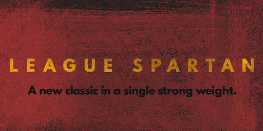
League Spartan Font is a modern, geometric sans-serif typeface that’s versatile and appealing for various applications. Developed by The League of Moveable Type, it draws inspiration from the classic Spartan family, adding a contemporary twist to its character design and spacing.
Distinguished by its clean lines, uniform stroke weight, and balanced proportions, League Spartan is designed to offer excellent readability and a strong visual impact in both print and digital formats.
You can find more free Modern fonts here.
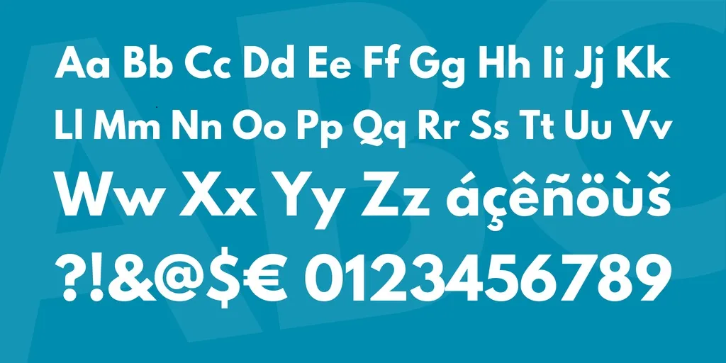
Uppercase, Lowercase & Symbols Font
History of League Spartan Font
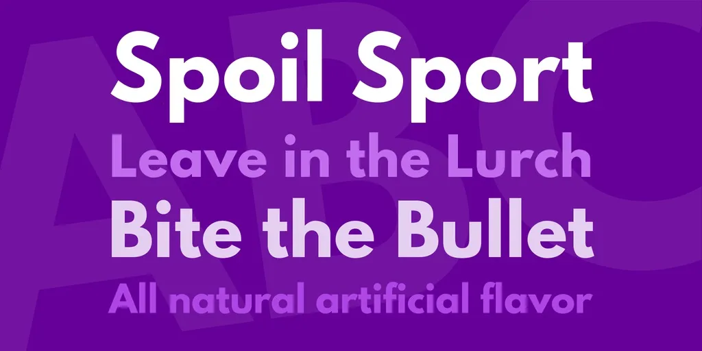
League Spartan Font is a font that screams action, boldness, and modernity. Designed by Tyler Finck, it’s part of The League of Moveable Type, which is a web and print type project that encourages users to share open-source typographic resources.
Initially released in 2014, Finck designed League Spartan as a revival of an old classic, Futura. What makes this typeface unique is its open-source nature, allowing designers from all walks of life to use it without encumbrances. The League of Moveable Type’s intent was to create a typeface that was accessible and usable by anyone, a mission League Spartan fulfills admirably.
Characteristics of League Spartan Font
The distinct characteristics of League Spartan Font make it a versatile and impactful choice for a variety of design projects. Here are some of its key features:
- Bold and Modern: League Spartan strikes with its boldness. The characters are designed with strong, geometric shapes that give the font a modern look and feel, perfectly suitable for headings and eye-catching statements.
- Geometric Sans-Serif: It falls under the geometric sans-serif category, characterized by its clean, simple lines and shapes inspired by geometric forms. This gives it a highly legible and contemporary appearance.
- Versatility: This typeface displays incredible versatility. It can be used across a wide range of design projects, including web design, branding, and print materials like posters and flyers.
- Open-Source: Being an open-source font, League Spartan is available for anyone to use, modify, and distribute. This makes it a popular choice among designers and developers on a budget.
- Wide Language Support: The font boasts an extensive character set that supports many languages, making it a global choice for international projects.
- Optimized for Screen and Print: League Spartan is meticulously designed to look great both on digital screens and in printed form, ensuring clarity and readability in any medium.
How to Use League Spartan Font
To effectively use League Spartan Font in your design and development projects, follow these guidelines for optimal impact and legibility:
1. Selecting the Right Context
- Headings & Titles: With its bold nature, League Spartan excels in headings and titles where you want to make a statement or grab the reader’s attention.
- Logo Design: Its modern and geometric aesthetics make it an excellent choice for logos, especially for brands that want to convey strength and innovation.
- User Interface (UI) Design: For apps and websites, employing League Spartan for menu items and call-to-action buttons can enhance readability and user experience.
2. Pairing with Other Fonts
- Complementary Fonts: When pairing League Spartan Font with other fonts, select a contrasting font for body text. Serif fonts like Merriweather or slab serifs like Roboto Slab are great pairings for readability and aesthetic balance.
- Avoid Similar Fonts: To maintain visual hierarchy and clarity, avoid pairing League Spartan with other bold or geometric sans-serif fonts that may compete for attention.
3. Technical Considerations
- Webfont Integration: For web projects, you can incorporate League Spartan using CSS through font hosting services like Google Fonts. This ensures your text is displayed consistently across different browsers and devices.
- Print Projects: When using League Spartan Font in print, ensure that the font is appropriately licensed and that you’re using a high-resolution font file to avoid any loss in quality.
4. Accessibility
- Color Contrast: Especially important for digital interfaces, ensure that the color contrast between your text (in League Spartan) and its background meets accessibility standards, aiding readability for all users.
- Size and Spacing: Despite its bold nature, proper font size and line spacing are crucial to maintaining legibility. Experiment with settings to ensure that your text is comfortable to read in different mediums.
By integrating League Spartan Font with these guidelines in mind, designers and developers can enhance the aesthetic appeal of their projects while ensuring functionality and accessibility.