Neue Plak Font

Neue Plak Font is a geometric sans-serif typeface initially designed by Paul Renner in 1928 and later expanded and revised, emerging as an adaptable, fresh take on the original Plak typeface. Its extensive range of weights and styles makes it highly versatile for both digital and print design.
Characterized by its clean, straightforward shapes and open apertures, Neue Plak offers exceptional readability and a modern aesthetic, making it suitable for a wide range of applications, from corporate branding to editorial design.
You can find more free Techno fonts here.
Uppercase, Lowercase & Symbols Font
History of the Neue Plak Font
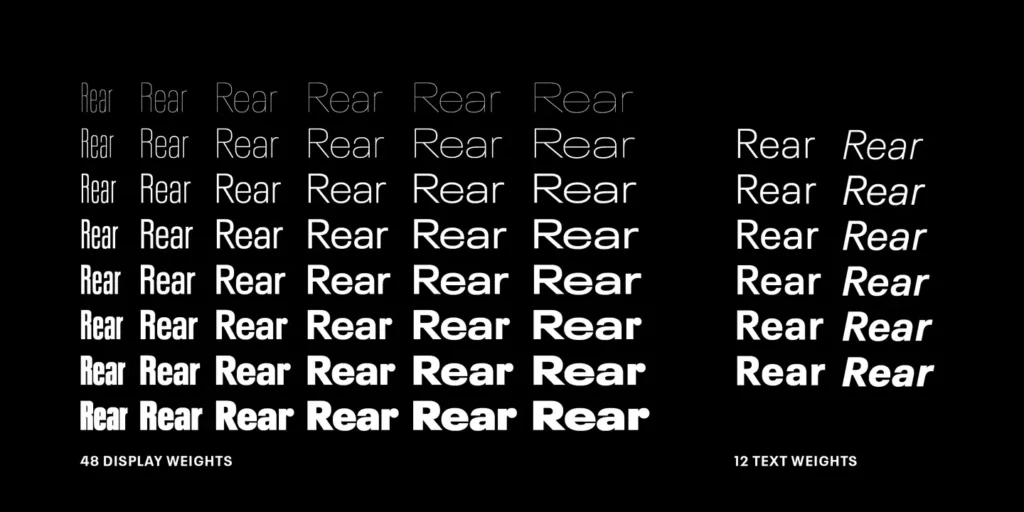
Neue Plak is a revival of a classic typeface that originally hails from the early 20th century. Designed by Paul Renner in 1928, the original Plak was a poster typeface characterized by its bold, attention-grabbing letters, designed for high impact in advertising and signage. Its modern incarnation, Neue Plak Font, introduced by Monotype in 2018, builds on the original’s strong foundation, expanding its range with a wide array of weights and widths.
This expansion not only pays homage to the original design’s versatility but also adapts it for contemporary use, allowing for a more extensive application across digital and print media. The revival was led by a team of designers who sought to maintain the spirit of Renner’s work while making it relevant for today’s diverse typographic requirements, making Neue Plak a robust yet refined bridge between past and present design sensibilities.
Characteristics of the Neue Plak Font
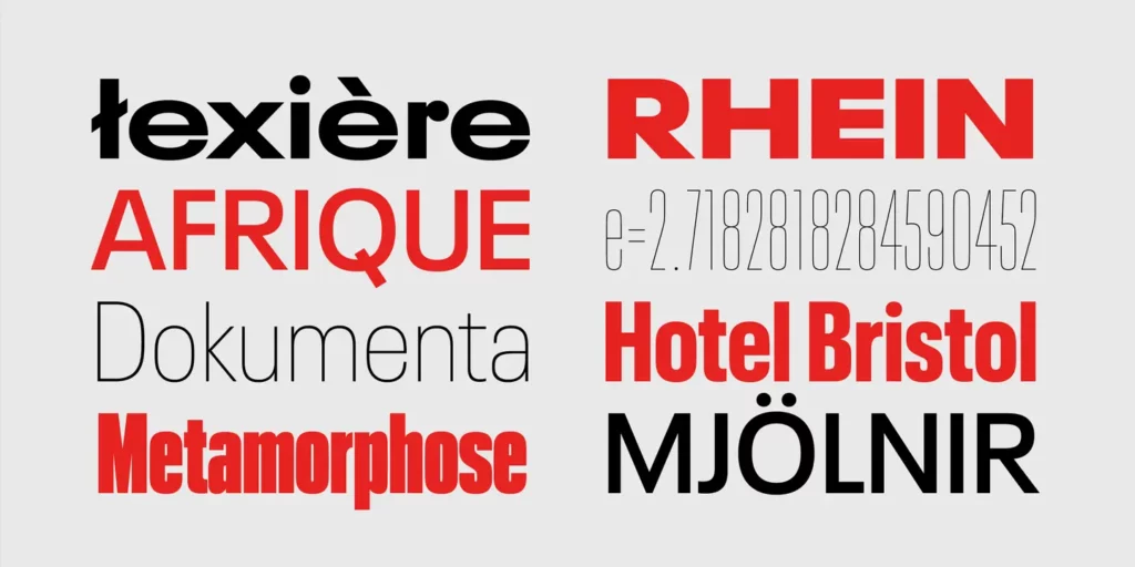
Neue Plak Font stands out due to its distinctive characteristics, which merge historical essence with modern functionality. Below are some key features:
- Versatility in Application: With an expanded range that includes various weights and widths, Neue Plak is suitable for a broad spectrum of design projects, from large-scale advertisements to refined editorial work.
- Geometric Forms: True to its Bauhaus roots, the font features geometrically inspired shapes and proportions, offering a timeless aesthetic that resonates with contemporary design trends.
- Enhanced Legibility: Despite its decorative nature, Neue Plak maintains high legibility at various sizes, making it effective for both digital screens and printed materials.
- Rich Character Set: It includes a comprehensive set of glyphs, supporting multiple languages and typographic features, allowing designers to create more inclusive and globally accessible content.
- Bold and Impactful: Reflecting its origins as a poster font, Neue Plak retains a bold and commanding presence, which is optimal for capturing attention in visual communication.
- Adaptability: The font’s range of expressions, from thin to black and condensed to extended, enables creative flexibility, allowing it to fit seamlessly into varied design contexts.
Applications of the Neue Plak Font
Neue Plak font finds its place in a myriad of design applications, demonstrating its versatility and strength in various contexts. Here are some prominent areas where Neue Plak shines:
1. Branding and Identity
Neue Plak has become a go-to choice for companies looking to establish a strong, memorable brand identity. Its wide range of weights and styles allows brands to express different facets of their personality, from professional and reliable with its lighter weights to bold and innovative with its heavier weights.
2. Advertising and Marketing
Given its roots as a poster typeface, Neue Plak excels in the advertising and marketing sphere. Its ability to command attention makes it ideal for billboards, print ads, and digital marketing campaigns that aim to make an impact and leave a lasting impression on the audience.
3. Editorial and Publishing
In the editorial world, Neue Plak Font’s clarity and legibility, even at small sizes, make it a solid choice for both headlines and body text. Magazines, newspapers, and online publications utilize its range of styles to create visually engaging and readable content.
4. Digital and Web Design
With digital design’s evolving requirements, Neue Plak stands out for its adaptability and web-friendly aesthetics. Websites, mobile apps, and UX/UI designs benefit from their clean lines and geometric shapes, ensuring readability and user engagement across devices.
5. Packaging Design
Neue Plak’s bold and flexible nature makes it perfect for packaging design, where its ability to adapt while maintaining visibility and legibility can make products stand out on shelves. From minimalist designs that use its lighter weights to attention-grabbing uses of its bolder weights, it helps convey brand messages effectively.
6. Signage and Wayfinding
The clarity and impact of Neue Plak Font make it suitable for signage and wayfinding systems. Its excellent legibility from a distance and under different lighting conditions ensures clear navigation and information dissemination in public spaces, airports, and urban environments.