Nordic Font
About Nordic Font
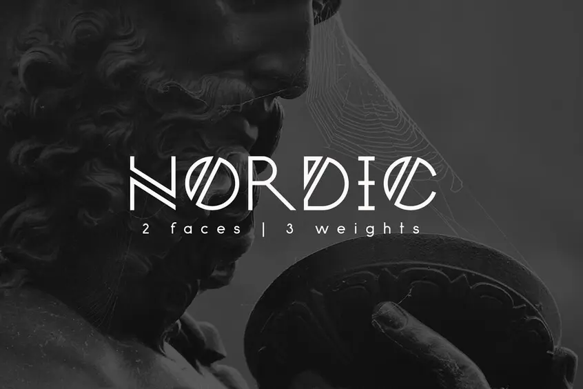
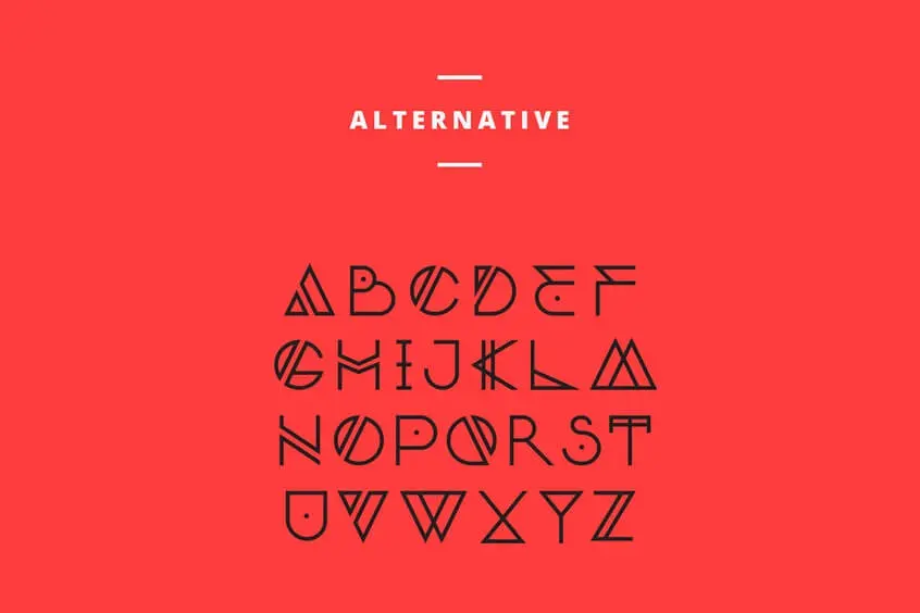
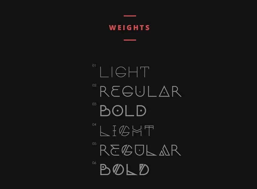
If you’re looking for a unique and sophisticated decorative typeface, Nordic Font is a great option. Fueled by Scandinavian runic alphabets and beautiful geometric shapes, it can meet a variety of everyday design needs. This font comes in two versions and three weights of each: light, regular, and bold. We’ll take a closer look at the features of Nordic Font and provide some tips on how to use it in your design projects.
You can find more free techno fonts here.
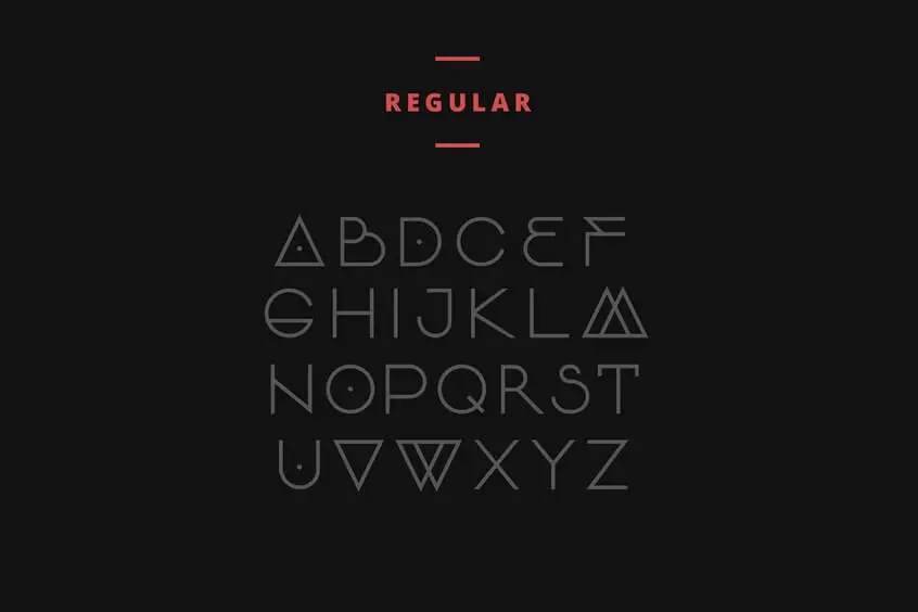
Regular Font
Alternative Font
Weights Font
This font was designed by Yana Bereziner. Nordic Font is an experimental logo typeface that is based on capital letters, numerals, and basic punctuation. It is suitable for those who are looking for unusual logos, monograms, titles, and posters. The main version can also be used as supporting text for longer titles and captions. Additionally, this font looks good in both large and small sizes.
One of the things that makes this font unique is its use of Scandinavian runic alphabets. These alphabets are characterized by their angular shapes and straight lines. As a result, this font has a modern and sleek appearance. Additionally, the typeface is fueled by beautiful geometric shapes. This gives it a sophisticated look that can elevate any design project.
For those who are looking to create striking logos or posters with Nordic Font, experiment with different combinations of letters to create interesting monograms or wordmarks. You can also play around with the different weights to find the perfect balance for your project. And don’t be afraid to use color! Adding a pop of color to your designs can really make them shine.
Tips for Using Nordic Font
If you’re using the main version of Nordic Font for supporting text, consider pairing it with a more traditional serif or sans-serif typeface for contrast. The light and regular weights work well for body copy, while the bold weight can be used for headlines or subheadlines.

