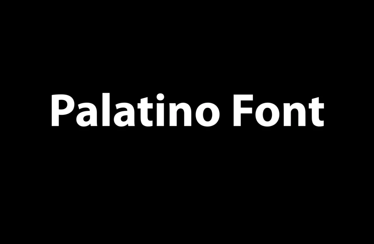
Palatino Font
Palatino Font is a typeface designed by German typographer Hermann Zapf in 1949. Characterized by its large x-height, slightly condensed letters, and generous use of white space, Palatino was initially intended for titles and headings but has become famous for body text.
It belongs to the old-style serif typefaces, drawing inspiration from the Renaissance letterforms, particularly those cut by the Italian master punch-cutter Giambattista Palatino, from whom the font takes its name. Over the years, Palatino has been adapted for various printing technologies and digital platforms, making it a versatile and enduring choice for publishers, designers, and writers.
You can find more free Serif fonts here.
Uppercase, Lowercase & Symbols Font

Characteristics of Palatino Font
Palatino font, created by Hermann Zapf in 1949, is cherished for its classic yet versatile design. Here are some key characteristics that make Palatino stand out in the realm of typography:
- Generous Proportions: Characters have vast, open proportions, making them highly readable even in smaller sizes. This attribute also allows it to perform well in both text and display uses.
- Distinctive Serifs: The font features prominent, elegant serifs that are a hallmark of its design. These serifs contribute to its classic appearance and ensure seamless text flow on both print and digital platforms.
- Subtle Contrasts: While Palatino is a serif font, it exhibits subtle contrasts between its thick and thin strokes, giving it a refined and sophisticated look that’s stark than other serif typefaces.
- A Wide Range of Weights and Styles: Over the years, various weights and styles have been developed, including italic and bold, enhancing PaPalatino’sersatility for different design contexts.
- Humanist Qualities: Palatino is designed with humanist qualities, emulating classical calligraphy with a modern twist. This gives texts a warm, inviting feel, which effectively engages readers.
- Strong Presence on the Page: Due to its design, Palatino has a strong presence on the page, making it an excellent choice for headings, titles, and any application where you want the text to stand out.
These characteristics illustrate why Palatino has remained a popular choice for decades and how it can lend a touch of elegance and professionalism to various design projects.
Usage of Palatino Font
Versatility lies in its capacity to adapt to various design contexts without losing its distinct visual identity. Here are some common uses of the Palatino Font typeface:
Book Design
As a text typeface, PaPalatino’spen counters support comfortable reading. It is a popular choice for book layouts, especially in the literary and academic genres, where it complements the content with an air of authority and tradition.
Branding and Logos
The Palatino font can provide a brand with a classic, upscale feel. When used in logos and branding applications, it conveys a sense of heritage and timelessness that resonates with audiences looking for products or services steeped in tradition.
Web Design
Although its serifs can present challenges in screen legibility, especially at smaller sizes, Palatino can be an excellent choice for websites that prioritize elegance and sophistication. Its usage in web headers and accents can create a warm, inviting contrast to the sans-serif body text.
Print and Editorial Design
Palatino brings a dignified quality to column text, whether in newspapers, magazines, or periodicals. For editorials and stories that require a serious but welcoming tone, it’s an excellent choice that performs well even in reduced leading and line lengths typical in print media.
Tips for Using Palatino Font
When integrating Palatino Font into your design, keep these tips in mind to ensure successful and effective use:
- Pair It Wisely: Palatino works wonderfully with sans-serif typefaces for contrast. A modern sans-serif font can accentuate Palatino’s Classical qualities, making for a balanced and harmonious type pairing.
- Mind the Size and Context: Pay attention to the size and context of your text. Palatino excels in larger sizes for headlines and short bursts of content where its design intricacies can shine. In smaller body text, consider the medium and adjust the leading and size for optimal legibility.
- Consider Colors and Background: The color of your text and the background can affect readability. Ensure enough contrast between the text and the background color for digital applications. When using multiple colors, make sure they do not distract from the typographic quality of the font.
- Respect the Italics: Palatino’s version is particularly beautiful, with an elegant cursive flow without being ostentatious. Use it to emphasize or set off quotations, and try not to overuse it to maintain its intended impact.
- Test for Legibility: Different typefaces, including Palatino Font, will render differently across various screens and print devices. Always test your design across platforms to ensure the text is legible and maintains its intended appearance.