Quicksilver Font
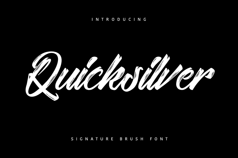
Quicksilver Font is a distinctive typeface known for its dynamic and fluid character design, which evokes a sense of movement and spontaneity. Its letterforms are characterized by irregular shapes and varying stroke widths, creating a casual and playful appearance.
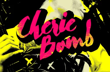
This font is often used in contexts requiring whimsy or informality, such as graphic design projects for children’s books, casual branding materials, or creative advertising. Quicksilver Font’s unique style helps it stand out in designs that aim to be light-hearted and unconventional.
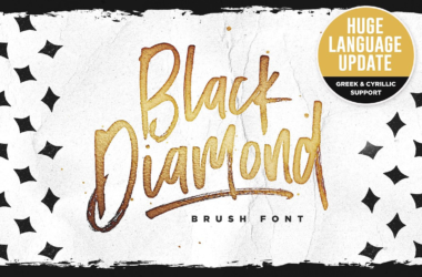
You can find more free Brush fonts here.
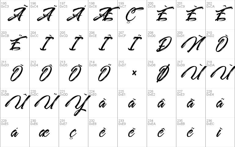
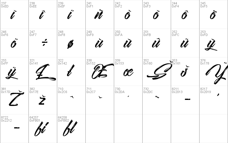
Uppercase, Lowercase & Symbols Font
History of Quicksilver Font
Quicksilver font, known for its whimsical and dynamic design, is deeply entrenched in graphical communication. First introduced in the late 20th century, it quickly became synonymous with creative and energetic typographic expression. With its irregular shapes and playful swashes, this font captures the essence of spontaneity and motion, making it a go-to choice for designers aiming to inject vibrancy into their projects.
Despite its casual appearance, the creation of Quicksilver was a deliberate effort by typographers to bridge the gap between traditional typography and the burgeoning demand for innovative and expressive fonts in digital media. Over the years, Quicksilver has maintained its popularity and evolved, with numerous variants being developed to cater to the changing needs and technologies of the design world. Its enduring appeal lies in its ability to convey freedom and creativity, attributes that continue to resonate with designers and audiences alike.
Features of Quicksilver Font
Quicksilver font is distinguished by several key features that make it stand out in the world of typography:
- Irregular and Playful Shapes: Its letters feature uneven, dynamic forms that convey a sense of whimsy and spontaneity.
- Unique Swashes and Embellishments: Quicksilver includes distinctive swashes that add a creative flare, making it ideal for eye-catching headings and logos.
- Variety of Weights and Styles: The font has been expanded to include a range of weights and styles, allowing for versatile use across different mediums and designs.
- Excellent Readability: Despite its decorative characteristics, Quicksilver maintains a level of readability that makes it suitable for both titles and short text blocks.
- Compatibility with Digital Media: Designed with digital applications in mind, Quicksilver translates well on screens, making it a favorite for web design and online content.
- Conveys Motion and Energy: The forward-leaning letters and irregular shapes suggest movement and action, perfect for projects that convey excitement or innovation.
How to Use Quicksilver Font
Incorporating Quicksilver font into your designs can significantly enhance the visual appeal of your projects. Here are some detailed guidelines on how to effectively use this font:
1. Selecting the Right Context
Quicksilver’s playful and dynamic nature makes it well-suited for creative and informal projects. Consider using it for:
- Marketing Materials: Adds a vibrant touch to flyers, posters, and brochures.
- Logo Design: Its unique character helps in crafting memorable logos.
- Event Invitations: Ideal for invitations to parties, weddings, or any event where a touch of whimsy is desired.
- Web Design: Enhances user engagement through visually appealing headings and banners.
2. Pairing with Other Fonts
To maintain visual harmony and readability in your designs, it’s crucial to pair Quicksilver with more subdued fonts for body text. Good combinations include:
- Serif fonts like Times New Roman or Garamond for a classic look.
- Sans-serif fonts like Arial or Helvetica for a modern appeal.
3. Choosing the Right Weight and Style
Quicksilver comes in various weights and styles, allowing designers to choose the perfect fit for their needs. Pay attention to:
- Bold weights for headings or statements that need to stand out.
- Lighter weights for subtler emphasis or use in longer texts.
4. Implementing Web and Digital Media
When using Quicksilver for web or digital projects, ensure:
- Webfont Compatibility: Check that the version of Quicksilver you are using is optimized for web use to ensure smooth rendering across browsers.
- Responsive Design Considerations: Test how the font scales on different devices and screen sizes to maintain legibility and aesthetics.
5. Usage in Printed Materials
For printed projects, the font’s scalability is critical. Ensure that:
- The font’s playful attributes are not lost when printed in smaller sizes.
- Legibility is retained for text-heavy designs by possibly pairing it with a more readable font for body text.
By adhering to these guidelines, designers can leverage Quicksilver font to bring energy and creativity to their projects, ensuring their work stands out while maintaining clarity and purpose.