Raleway Font Family
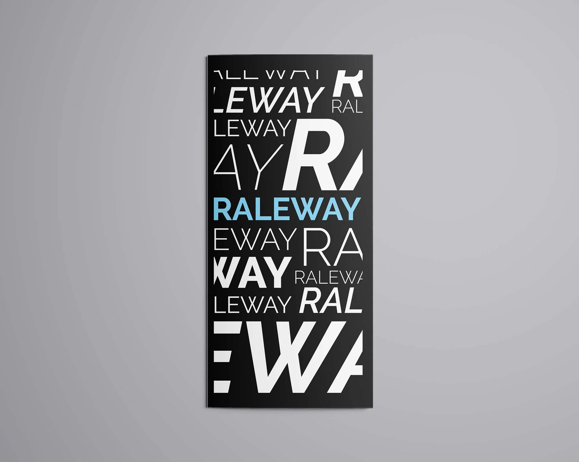
Raleway Font Family is a sans-serif typeface collection that originated as a single thin weight but has since expanded into a 9-weight family including italics. Initially designed by Matt McInerney as a display type for titles, it was expanded into a full set of weights and an italic version to provide more versatility for user interface design and text-heavy projects.
Characterized by its elegant and clean lines, Raleway has been embraced for its modern yet timeless appeal, making it a popular choice for various digital and print applications. It is widely used in branding, web design, and editorial projects, admired for its readability and stylish geometric nuances.
You can find more free sans-serif fonts here.
Uppercase, Lowercase & Symbols Font
History of Raleway Font Family
Raleway Font Family is a sans-serif typeface that echoes the modernist era of the 1920s and ’30s but with a contemporary edge. Designed by Matt McInerney, initially as a single thin weight, it was expanded into a nine-weight family by Pablo Impallari and Rodrigo Fuenzalida in 2012. Its development followed the principles of geometric sans-serif first introduced by Paul Renner’s Futura and Erbar Grotesk, but Raleway brings its unique twist to the genre.
McInerney was motivated by Avant Garde and Futura when crafting Raleway’s thin, pins-straight letters, and it was later suggested that curvature and roundness be added to the edges to soften its appearance without diluting its modernist essence.
Characteristics of Raleway Font Family
Raleway stands out for its distinct characteristics, making it a versatile and attractive choice for various design projects. Here are some key features that define Raleway font family:
- Geometric Shapes: Raleway incorporates geometric shapes in its character construction, contributing to its modern and clean appearance. This is evident in the circular shape of letters like ‘O’ and the square form of ‘E.’
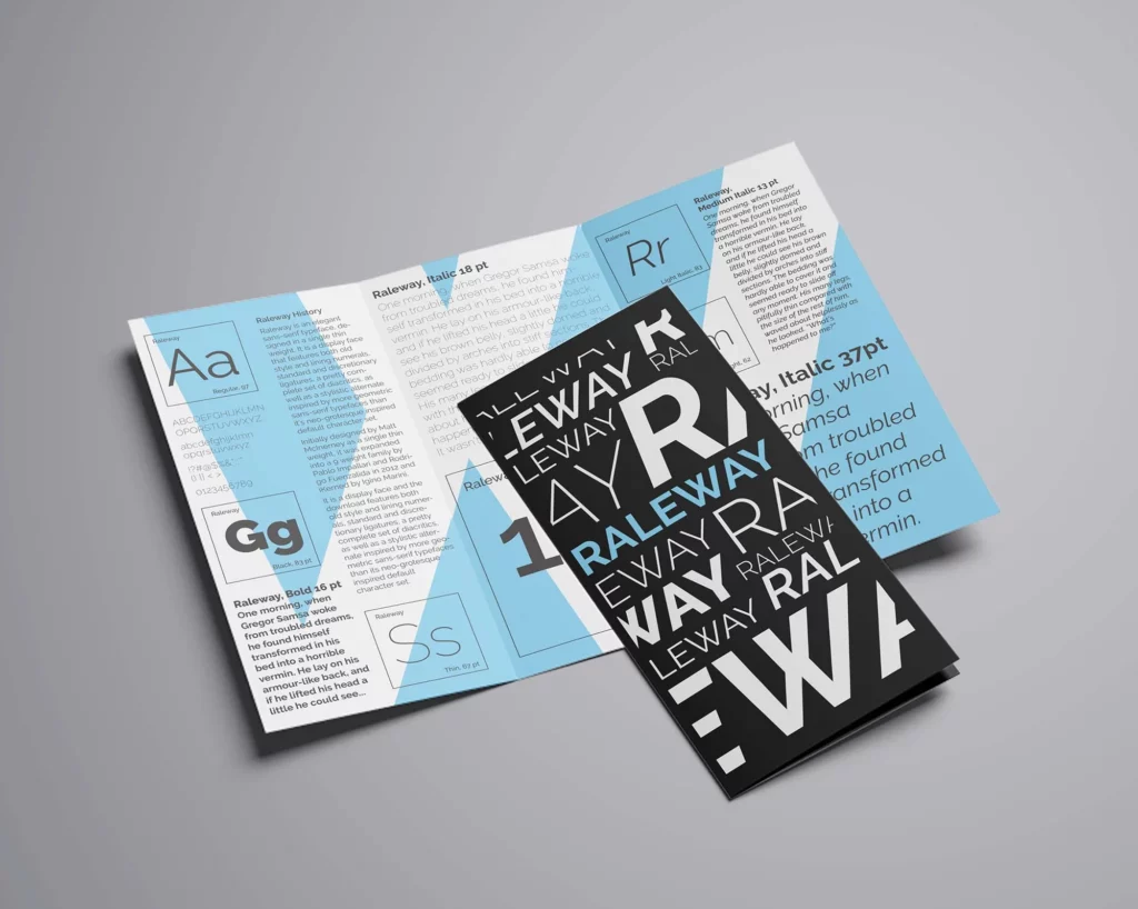
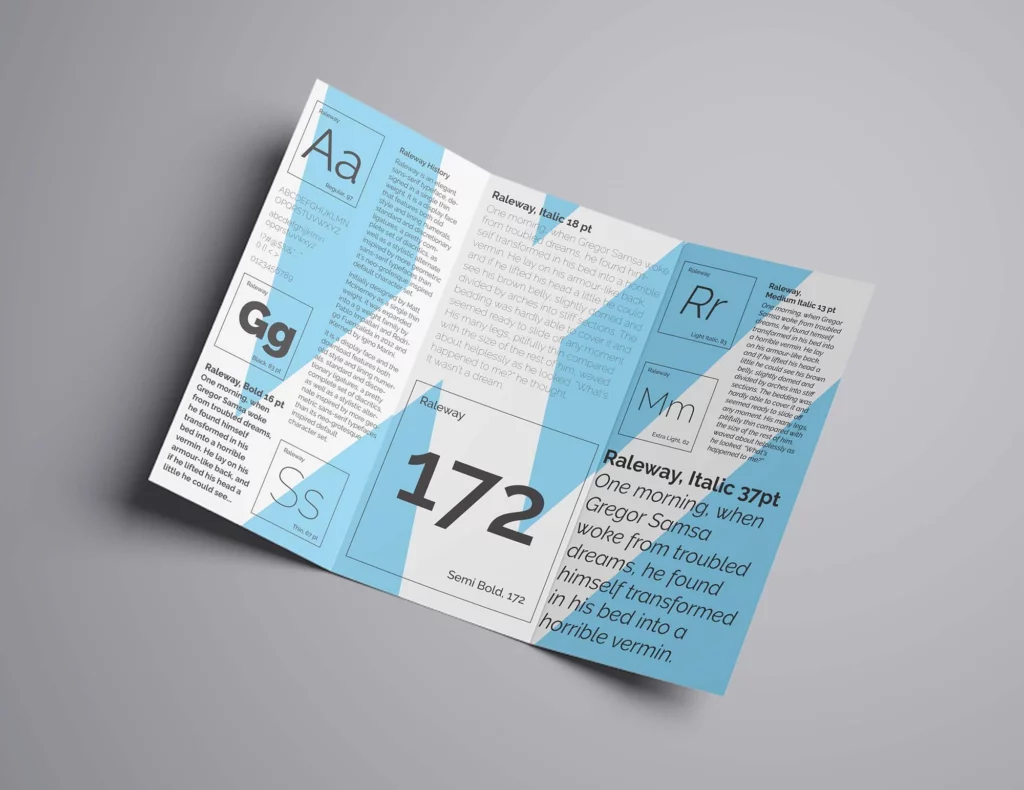
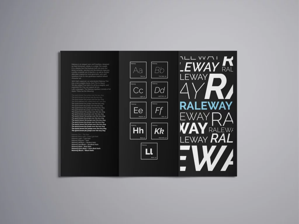
- Nine Weights: The font family offers a range of nine weights, from Thin (100) to Black (900). This variety allows for flexible use in typography, making it suitable for everything from delicate body text to bold headlines.
- Distinctive ‘W’: One of the unique elements of Raleway is its distinctive ‘W’, which has a notable gap separating its two middle strokes. This feature adds a certain elegance and uniqueness to texts.
- Optimized for Display and Text: While originally designed as a display font, Raleway has been optimized over time to perform well in text settings, making it highly adaptable for print and web projects.
- International Character Set: Raleway Font Family supports a wide range of languages and comes with an extensive character set, which includes not only standard Latin alphabets but also Latin Extended, Cyrillic, and Greek characters, catering to a global audience.
- Stylistic Alternates and Ligatures: The font also offers stylistic alternates and ligatures, which can be utilized to enhance the typographic character of any project, adding more personalization and flair.
These features collectively contribute to Raleway’s popularity and functionality, making it a go-to font for designers looking for a blend of traditional elegance and modern simplicity.
Applications of Raleway Font Family
Raleway Font Family’s clean lines and modern aesthetic make it a versatile font for myriad applications. Whether in print or digital format, its various weights and styles adapt seamlessly to diverse design contexts.
Below are some key environments where Raleway shines.
1. Web Design
Raleway is a popular choice for web design, thanks to its readability and style flexibility. It’s commonly used for site headers and body text, providing a sleek look while ensuring content is easy to read. Its range of weights means designers can create contrast and hierarchy, making website content more engaging and navigable.
2. Branding and Logo Design
The font’s contemporary feel and distinct character make it an excellent branding and logo design option. Businesses aiming for a modern, sophisticated image often choose Raleway for their logos, business cards, and other branding materials. Its unique ‘W’ and geometric shapes make a memorable impression on brands.
3. Editorial and Publishing
In the realm of publishing, Raleway Font Family finds its place in magazines, e-books, and print publications. It’s particularly favored for headers and subheaders, balancing aesthetic appeal with functionality. The font’s availability in multiple weights makes it suitable for the nuanced needs of editorial design, from feature articles to captions.
4. Advertising and Marketing Material
For advertising and marketing, Raleway’s adaptability is key. Its elegant yet unobtrusive design works well in brochures, flyers, and online ads, where capturing attention while conveying information is critical. The font’s stylistic alternates and ligatures add a custom touch to campaigns, enhancing brand identity.
5. User Interfaces (UI)
In UI design, readability and user experience are paramount. Raleway Font Family, with its clean lines and open forms, ensures that text is legible even at small sizes, making it a suitable choice for app and software interfaces. Its wide language support also makes it an inclusive option for global products.