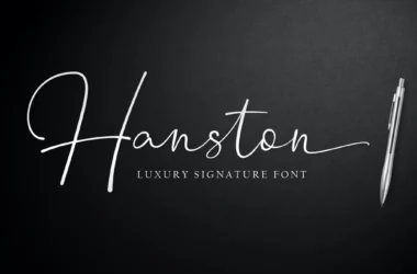
Rudge Font
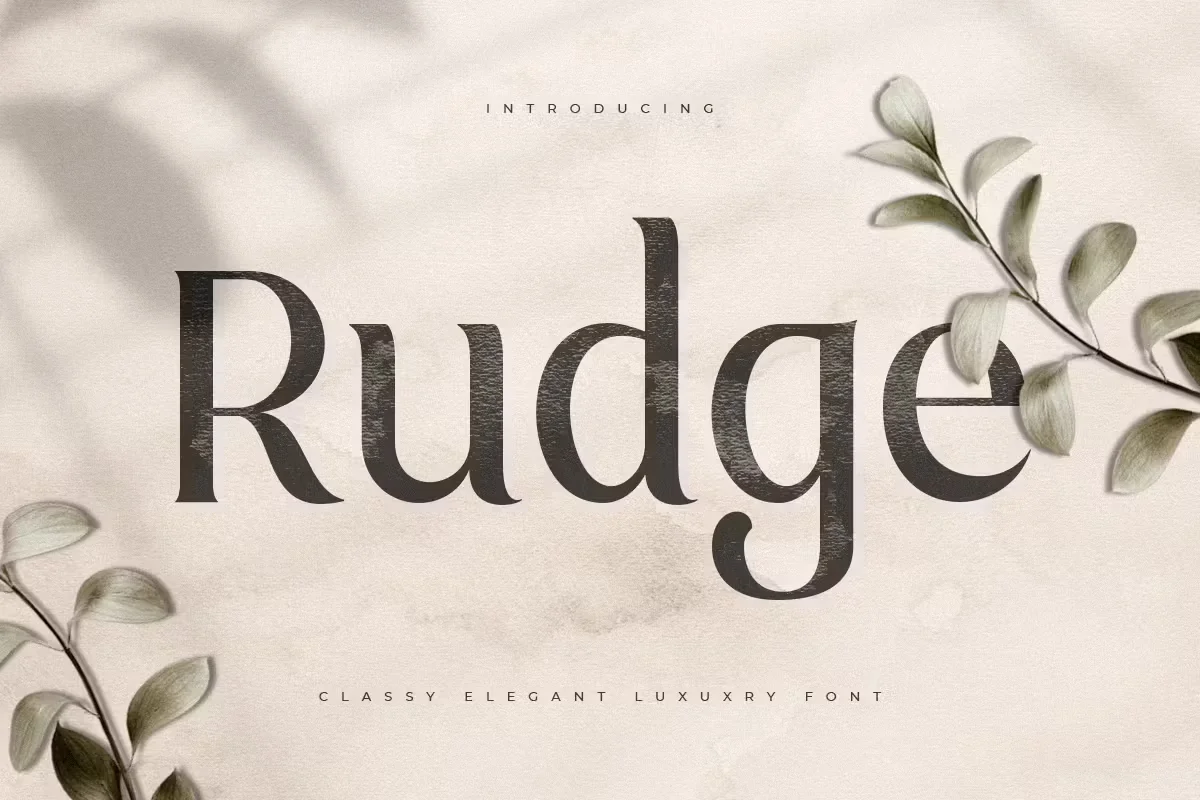
Rudge Font is a distinctive typeface known for its unique blend of classic and contemporary styles. Characterized by its elegant yet readable appearance, Rudge Font offers print and digital media versatility.
Its design incorporates varying weights and distinctive letter shapes, making it suitable for various applications—from headline text in magazines and newspapers to body text in books and websites. The font’s balanced proportions and subtle details contribute to its overall aesthetic appeal, making it a popular choice among graphic designers and typographers seeking to add sophistication and clarity to their projects.
You can find more free Luxury fonts here.
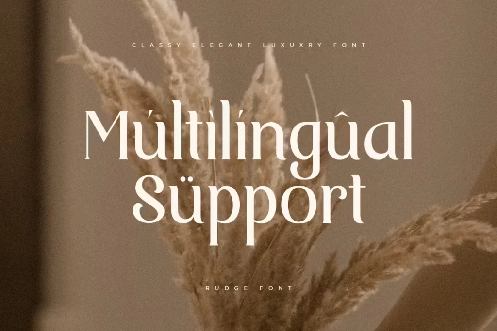
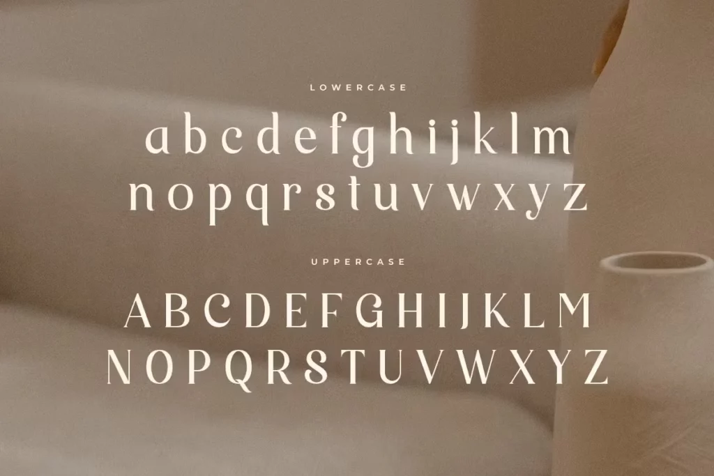
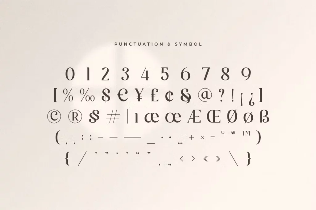
Uppercase, Lowercase & Symbols Font
Origin and History of Rudge Font
Rudge font is a quintessential example of the Art Nouveau style, a design movement known for its organic forms and devotion to craftsmanship. It was first conceived by William H. Rudge, an influential American printer and publisher who lived during the height of the Art Nouveau period. Rudge was not a type designer by trade. Still, his passion for fine book production led him to commission the creation of a typeface that would reflect the values of his era. This typeface would stand as a tribute to the marriage of art and industry that Art Nouveau embodies.
Rudge entrusted renowned American type designer, Frederic Goudy, with the task. Goudy was famed for his prolific output of typefaces, many still in use today. He and Rudge shared a vision for an elegant yet approachable typeface, sophisticated yet not overbearing. The resulting font, Rudge, was Goudy’s homage to his patron’s legacy and the artistic movement that inspired it.
Characteristics of Rudge Font
Rudge font, with its distinctive features, captures the essence of the Art Nouveau movement through several key characteristics:
- Organic Forms: True to the Art Nouveau ethos, this font exhibits graceful, organic forms and curves, mirroring the natural world. Its letters flow smoothly, evoking a sense of fluidity and natural elegance.
- Elongated Shapes: Many of the characters in the Rudge typeface are elongated, contributing to a sense of height and sophistication. This stylistic choice enhances the aesthetic appeal of text composed in Rudge, making it ideal for titles and headers.
- Unique Serifs: The serifs in Rudge are crafted with particular attention to detail. Rather than being purely functional, they add a decorative element to the text, with varying designs that complement the organic nature of the font.
- Slight Contrast in Stroke Weight: While maintaining readability, Rudge features a subtle variation in stroke weight. This contrast adds depth and dimension to the typeface, distinguishing it from more uniformly weighted fonts.
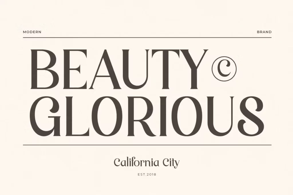
- Versatility: Despite its distinct style, Rudge remains remarkably versatile. It can be used effectively in various design contexts, from book covers and editorial layouts to branding and digital interfaces.
Together, these characteristics make Rudge Font a testimony to the aesthetic inclinations of the Art Nouveau period and a timeless choice for contemporary design projects seeking a blend of elegance, history, and natural beauty.
How to Use Rudge Font
Utilizing Rudge Font in your design projects allows you to infuse them with classic elegance and historical depth. Below are some tips for effectively incorporating this font into your work.
1. For Print Design
- Book Publishing: Given its roots in book production, Rudge is especially suited for literary and historical publications. Use it in titles, chapter headings, or quotes to add a touch of classic sophistication.
- Invitations and Stationery: Rudge’s elegance makes it perfect for wedding invitations, event announcements, and high-end stationery. Pairing it with a suitable script font can enhance its Art Nouveau characteristics.
2. For Digital Design
- Website Headings and Banners: Use Rudge Font to create distinctive and elegant website headings, banners, and footers. Its unique characteristics can help your website stand out, providing a memorable user experience.
- Branding Materials: For brands that embody timeless elegance or root their identity in heritage, Rudge can add a layer of sophistication to logos, business cards, and other branding materials.
3. Pairing with Other Fonts
- When pairing Rudge with other fonts, choose those that complement rather than compete with its Art Nouveau aesthetic. Simple, sans-serif fonts for body text can balance Rudge’s decorative nature in headings.
- Avoid pairing with fonts with similar decorative or elaborate features, as this can overwhelm the design.
4. Accessibility Considerations
- While Rudge Font exudes elegance, ensure that its application does not compromise readability, especially in smaller sizes or dense texts. It’s best used in larger print sizes or as accent text in digital formats.
- In digital environments, maintain a strong contrast between text (using Rudge) and its background to ensure it is legible for all users, including those with visual impairments.
By keeping these guidelines in mind, you can leverage this font to enhance your design projects, making them visually appealing and rooted in the rich tradition and aesthetic of the Art Nouveau movement.
This font is free for personal use; click here for commercial use.