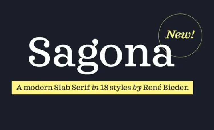
Sagona Font Family
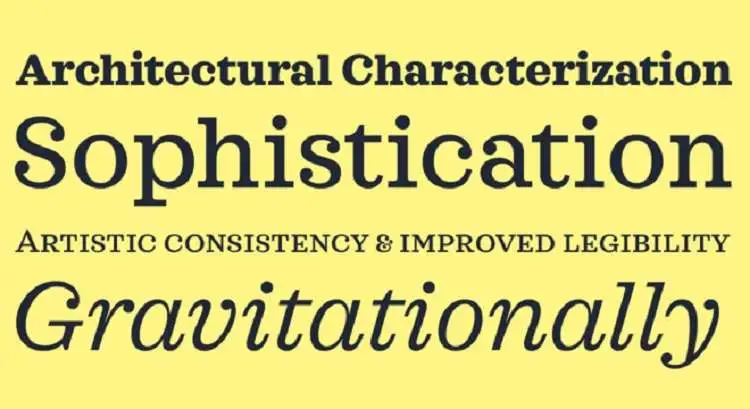
Sagona Font Family is a contemporary, versatile typeface collection that blends modern and classical characteristics. Designed with attention to clarity and readability, Sagona features various weights and styles, making it suitable for multiple design projects, from digital media to print. Its distinct qualities include well-proportioned letterforms, a balanced contrast between thick and thin strokes, and thoughtful character spacing.
This font family is designed to provide designers with a high degree of flexibility, allowing for its application in corporate branding, editorial layouts, and user interface design. With its professional yet approachable appearance, Sagona is a valuable asset for creating compelling visual narratives.
You can find more free Slab serif fonts here.
Uppercase, Lowercase & Symbols Font
History of Sagona Font Family
Sagona Font Family is a contemporary serif typeface that was created by René Bieder in 2016. Its design is a harmonious blend of classic serif elegance with modern features, making it versatile for print and digital applications. Sagona stands out for its distinct character forms and a wide range of weights and styles, encompassing light, regular, medium, bold, and extra-bold, along with matching italics for each weight.
This typeface is particularly noted for its high legibility and for balancing traditional typeface characteristics with contemporary nuances. Sagona has been widely adopted for branding, editorial, and advertising purposes thanks to its ability to convey messages with clarity and style.
Characteristics of Sagona Font Family
Sagona Font Family boasts several defining characteristics that contribute to its popularity and widespread use in various design projects:
- Versatile Weight Range: It offers an expansive range of weights, from light to extra-bold, accommodating a wide array of design needs and ensuring versatility across print and digital mediums.
- Matching Italics: Each weight of the typeface comes with a corresponding italic version, allowing for more expressive typography and a consistent visual hierarchy.
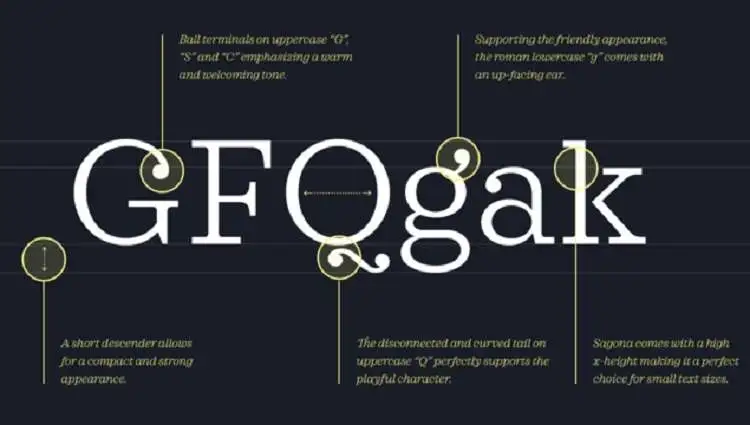
- Unique Character Forms: Sagona is distinguished by its unique character forms, which blend traditional elegance with modern design elements, enabling it to stand out in any context.
- High Legibility: Designed with legibility in mind, Sagona ensures that text is readable in small and large sizes, making it ideal for body text and headlines.
- Contemporary Feel: While it draws inspiration from classic serif typefaces, Sagona incorporates contemporary nuances that give it a modern, stylish edge.
- Comprehensive Language Support: Sagona’s extensive language support makes it suitable for international projects and applications.
- Flexible Use Cases: Its balanced characteristics make Sagona a perfect choice for branding, editorial design, advertising, and online content, highlighting its adaptability and appeal across different mediums.
Benefits of Using Sagona Font Family
Using the Sagona Font Family offers numerous advantages for designers and content creators, further solidifying its standing as a preferred choice for various projects.
Some of the key benefits include:
1. Enhanced Readability
Sagona’s careful design prioritizes clarity and legibility, making it exceptionally readable across various applications, from print to digital platforms. This ensures that messages are effectively communicated to the audience, regardless of the medium.
2. Aesthetic Versatility
With its blend of classic and modern elements, Sagona adds a touch of elegance and sophistication to any project. Its wide range of weights and styles makes it adaptable to different design aesthetics, from formal documents to creative visuals.
3. Brand Identity Development
Sagona is ideal for creating or enhancing brand identity. Its distinct character forms and versatility allow brands to express their personality and values clearly and memorably, helping to build a solid visual identity.
4. Cross-Medium Consistency
The availability of a comprehensive range of weights and matching italics enables designers to maintain visual consistency across various mediums, including digital advertising, print material, and online content. This coherence is crucial for brand recognition and message consistency.
5. International Appeal
With its extensive language support, Sagona is suitable for global projects, ensuring that designs can connect with a broad audience without language barriers. This makes it an invaluable asset for international brands and campaigns.
6. Dynamic Text Hierarchies
Using different weights and styles within the same font family creates dynamic and effective text hierarchies, making information easily navigable and aesthetically pleasing.
Application of Sagona Font Family
Sagona Font Family’s versatility and unique characteristics suit various applications, from corporate branding to creative projects. Here are specific ways in which Sagona can be utilized effectively:
- Corporate Branding: Sagona’s elegant yet modern design makes it an excellent choice for businesses looking to establish a solid and distinctive brand identity. It can be used in logos, business cards, letterheads, and corporate presentations to convey professionalism and sophistication.
- Editorial Design: Magazines, newspapers, and online publications can benefit from Sagona’s high legibility and range of weights. It’s ideal for setting body text that’s easy to read and attention-grabbing headlines and subheadings.
- Advertising: Whether for print ads, billboards, or online banners, Sagona’s distinct character forms and versatility help create impactful messages that capture audience attention.
- Web Design: Sagona is well-suited for digital platforms, offering clear readability and aesthetic appeal for website typography, including navigation menus, article content, and call-to-action buttons.
- Packaging Design: For products that require an air of elegance and quality, Sagona can be applied to packaging and labels, enhancing the visual appeal and standing out on shelves.
- Social Media: Brands can use Sagona to maintain a consistent visual identity across social media platforms. Its wide range of weights and italics is perfect for creating diverse content that remains cohesive and on-brand.
- Book Publishing: From cover design to body text, Sagona’s readability and aesthetic versatility make it suitable for publishing, helping to create books that are both beautiful and accessible to readers.
By leveraging Sagona Font Family in these various applications, designers and brands can balance style and function, ensuring their visual communications are engaging and effective.