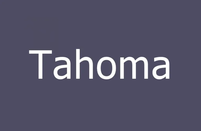
Tahoma Font
Tahoma Font is a humanist sans-serif typeface that Matthew Carter designed for Microsoft Corporation. Released in 1994, Tahoma was intended for use in digital screens and user interfaces.
It features tight letter spacing, a large x-height, and distinct characters to enhance readability, especially on low-resolution displays of the time. Tahoma was widely used in Windows operating systems and became a staple for many web pages and digital documents due to its clear and legible presentation.
You can find more free sans-serif fonts here.
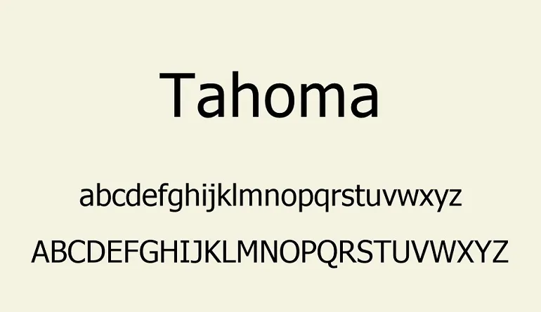
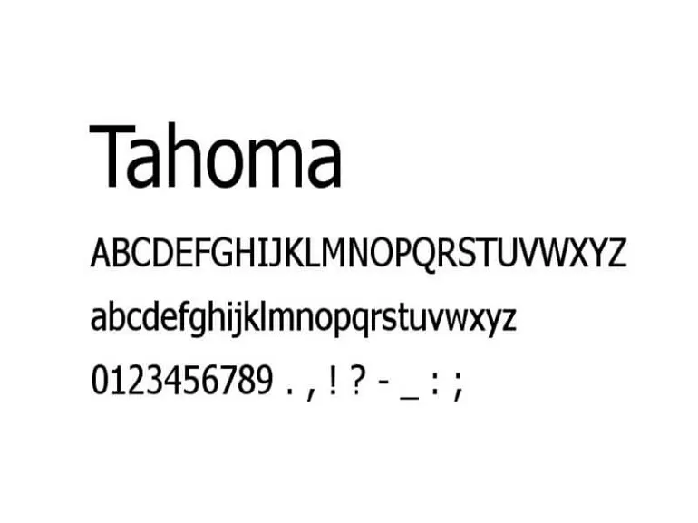
Uppercase, Lowercase & Symbols Font
History of Tahoma Font
The genesis of Tahoma Font lies in the quest for a clean, easily readable screen font. Matthew Carter designed it at the direction of Steve Balmer at Microsoft. The font was to provide a humanist sans-serif that could overcome the low resolution of computer screens, which were widely considered inadequate for text display. Tahoma was introduced in 1994 with the launch of Windows 95, joining the performance-oriented typography movement.
Carter’s design walks the line between geometric precision and the softer, more natural line work often associated with traditional typefaces. This blend of attributes gave Tahoma a commanding visual presence on screen. It quickly resonated with designers tasked with creating digital experiences that could showcase extensive text without sacrificing readability or aesthetic appeal. It wasn’t just a font; it was a solution to a pressing design challenge of the time.
Use of Tahoma Font
The utilitarian appeal and inherent versatility of Tahoma Font have made it a staple in both digital and print design. It’s uniquely positioned to tackle diverse design challenges, making it a go-to choice for various applications:
- Web Design and User Interfaces: Tahoma’s clarity and legibility, even at smaller sizes, make it an excellent choice for website text and user interfaces. Its ability to maintain readability across different screen resolutions ensures a consistent user experience.
- Corporate Branding and Documentation: Many businesses prefer Tahoma for their internal and external communication because of its professional yet approachable demeanor. It’s widely used in corporate documents, reports, and presentations.
- Accessibility Projects: Given its high legibility, Tahoma is often used in projects aimed at improving accessibility. Its clear distinction between characters reduces reading errors for those with dyslexia or other reading difficulties.
- Desktop Publishing and Digital Media: From newsletters to e-books, Tahoma’s adaptability makes it fitting for a broad range of publishing needs, ensuring content is engaging and easy to digest.
- Educational Materials: Tahoma’s simplicity and legibility have made it a favorite among educators and instructional designers, particularly for materials designed for early readers or non-native English speakers.
Pros and Cons of Tahoma Font
Every font comes with its own set of strengths and weaknesses, and Tahoma is no different. Here are the pros and cons to consider when using Tahoma Font in your design projects.
Pros
- Readability: Tahoma’s open counters, even stroke widths, and generous x-height make it highly readable even at small sizes. It resists pixelation at lower resolutions, staying clear and clean on screens of all qualities.
- Wide Use: Tahoma’s availability, being a system font, makes it an attractive choice for online and software projects. It provides a level of consistency, knowing it is likely to be installed on the user’s system.
- International Appeal: Its clear, modern design with no quirky letterforms means it is readable and approachable to a broad, international audience, which is vital for user interface (UI) and user experience (UX) design.
Cons
- Lack of Distinction: Tahoma can sometimes blend into the background due to its common usage. In branding or more unique design contexts, Tahoma Font can lack the distinctiveness needed to stand out.
- Simultaneous Impersonal Image: For text-heavy print materials, Tahoma’s association with user interfaces can create a utilitarian and unemotional feel that is not always appropriate, depending on the branding message.
- Adaptability Challenges: Its clean and modern design can make it challenging to adapt to projects with a warmer or more expressive brand identity.