Times New Roman Font
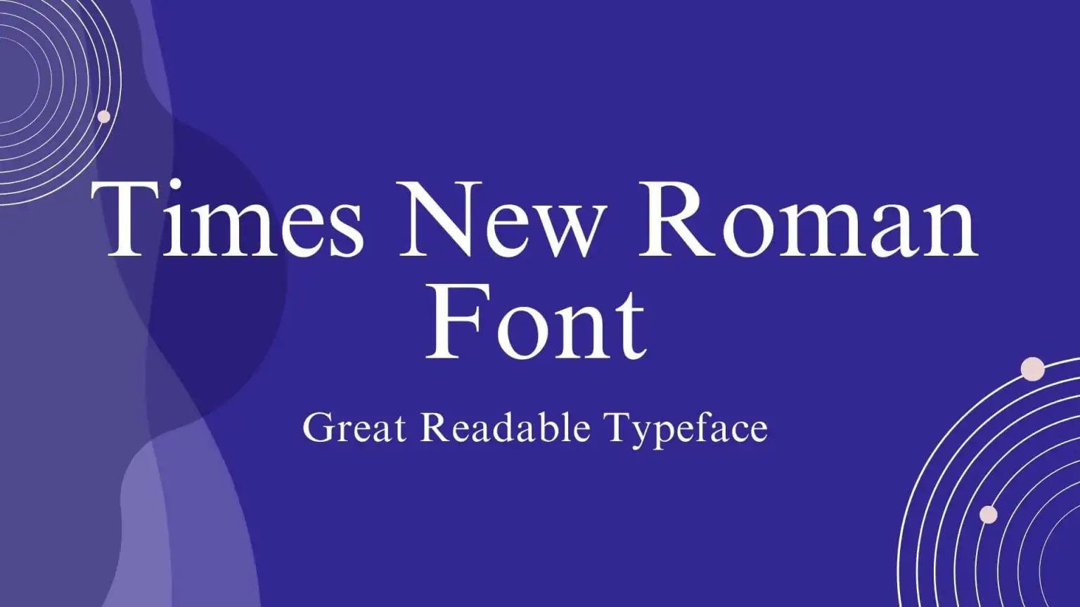
Times New Roman Font is a serif typeface designed for legibility in body text. It was commissioned by the British newspaper The Times in 1931 and designed by Stanley Morison and Victor Lardent at the English branch of Monotype.
Characterized by its crisp, clean, and compact structure, Times New Roman has become one of print and digital media’s most widely used typefaces. Its popularity stems from its versatile and neutral design, making it a staple for books, documents, and web content.
You can find more free Serif fonts here.
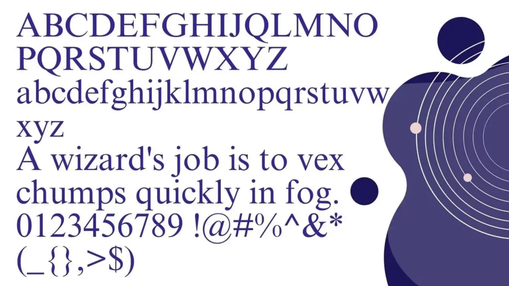
Uppercase, Lowercase & Symbols Font
History of Times New Roman
Times New Roman Font, one of the most ubiquitous typefaces in the world, was designed for the British newspaper The Times in 1931 by Stanley Morison and Victor Lardent. Morison, a consultant for the Monotype Corporation, was tasked with creating a new text typeface that was more legible and economical in space and ink usage in response to criticisms of The Times’s previous typography.
The design was inspired by earlier, more classical letterforms, specifically those from the late Renaissance period, but with a modern twist to improve readability and printing efficiency. Officially released to The Times on 3 October 1932, Times New Roman quickly became famous for book printing due to its elegance and readability. Its widespread adoption was further propelled when it was included with Microsoft Word, making it one of the most recognized fonts globally.
Characteristics of Times New Roman
The characteristics of Times New Roman Font make it distinctive and highly functional for a wide range of applications:
- Serif Typeface: It features small lines or strokes attached to the ends of letters, a hallmark of serif designs. These serifs contribute to its traditional appearance and readability.
- Economical Space Usage: Its design allows for more text in a given space without sacrificing legibility, making it ideal for newspaper columns and dense text blocks.
- Vertical Stress: Unlike many other typefaces, the stress of the letters in Times New Roman is vertical, which aids in its legibility and professional look.
- Slightly Condensed Letters: The characters are designed to be somewhat condensed, enabling more efficient use of space without appearing crowded.
- Readability: The design of Times New Roman prioritizes clarity and readability, even in small sizes, which is why it remains a popular choice for body text in print and digital media.
- Distinct Italics: Its italic variant is not merely a slanted version of the regular typeface but has distinctly styled letters, enhancing the emphasis and style of text passages.
Uses of Times New Roman
Times New Roman Font’s versatility and classic appeal have made it a preferred choice across various mediums. Here’s a closer look at where and how this typeface is commonly used:
1. In Print Media
- Newspapers and Magazines: Its original design was for newspaper print, offering excellent readability and space efficiency. These characteristics continue to make it a favored option for magazine and newsprint articles.
- Books: Times New Roman is widely used in the publishing industry, especially for the body text of many printed books. Its readability and elegant aesthetic make it suitable for various literary works, from fiction to academic textbooks.
2. In Academic and Professional Documents
- Research Papers and Essays: Many academic institutions and publications mandate the use of Times New Roman Font for its clear, formal appearance. Its uniformity and readability make it ideal for dense, text-heavy documents.
- Official Reports and Documents: The typeface’s professional and clean look leads to its frequent selection for business reports, legal documents, and other professional materials that require a formal presentation.
3. In Digital Media
- Web Content: While a wider variety of fonts are available for web use, Times New Roman remains a popular choice for body text on websites due to its ubiquity and the fact that it’s pre-installed on most devices.
- Email and Correspondence: Times New Roman Font is often chosen for its professional and familiar look for formal emails and digital correspondence.
Its long-standing presence and functionality across different platforms underscore Times New Roman’s enduring legacy in design and typography.
Pros and Cons of Times New Roman
Like any other typeface, Times New Roman Font has strengths and limitations. Here’s a brief rundown of its pros and cons:
Pros
- Universality: One of Times New Roman’s most significant advantages is its widespread presence and recognition. Almost every computer and word processing system comes pre-installed, ensuring that documents created in this font are easily accessible and displayed consistently across different platforms.
- Professional Appearance: Times New Roman Font is synonymous with a formal and professional look, making it a go-to choice for academic papers, business reports, and official documents.
- Readability: Thanks to its careful design, it maintains high legibility even at small sizes, vital for dense text layouts like newspapers and books.
- Efficient Space Usage: Its slightly condensed characters allow for more words per page, which can reduce printing costs for publications and documents.
Cons
- Overuse: Its very universality can be a drawback, as it may impart a generic or dated appearance to documents, leading to a lack of differentiation in materials that aim to stand out.
- Not Optimal for Digital Media: While Times New Roman Font remains readable on digital screens, the evolution of display technology and web fonts has introduced alternatives that might be more suited to digital readability and aesthetics.
- Lack of Distinctiveness: For branding or design-centric projects, Times New Roman may not convey the unique identity or creative flair that more specialized fonts can provide.
- Perceived as Traditional: In contexts that value innovation and modernity, the classic design of Times New Roman might be perceived as too conservative or old-fashioned.

