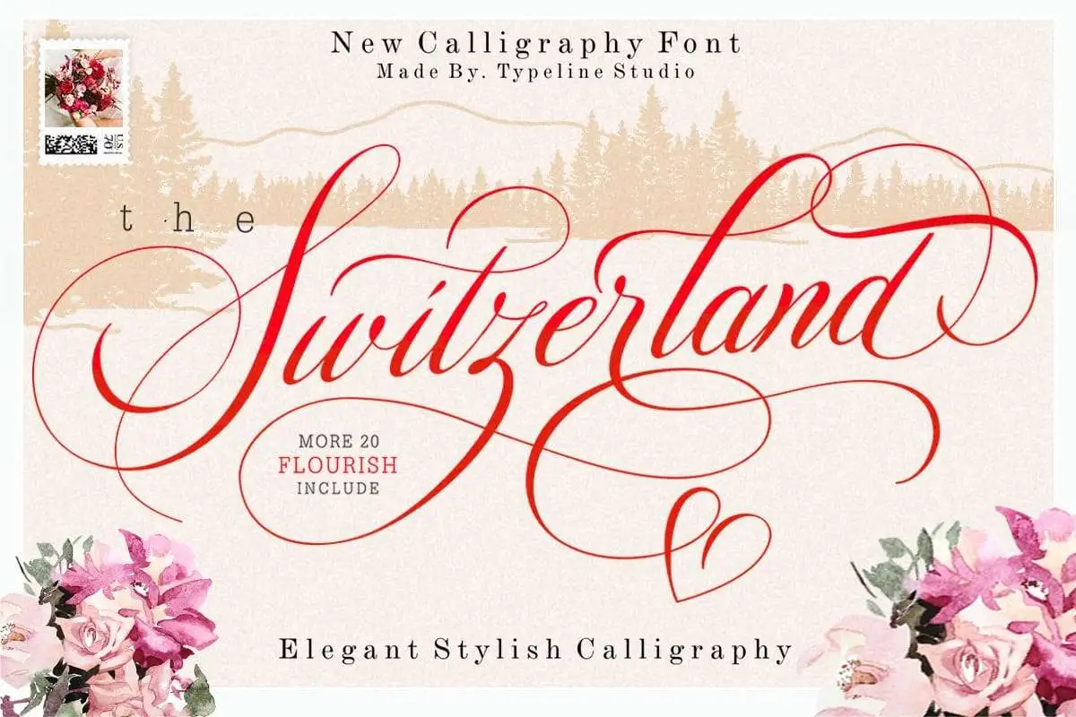
Switzerland Font
Switzerland Font, commonly known as Helvetica, is a neo-grotesque sans-serif typeface designed in 1957 by Swiss typeface designer Max Miedinger. It is a modern sans-serif typeface known for its simple design and geometrically straight forms.
The particularities of its design lie in its moderate measure and the great variety of uses that can be given to it, ranging from identification signage to corporate imaging. It reflects the concepts of Swiss Design: simplicity, legibility, and balance, and it is still quite popular among graphic designers due to its classic looks.
You can find more free Calligraphy fonts here.
Uppercase, Lowercase & Symbols Font


Characteristics of Switzerland Font
- Clean Lines: The font has straight lines with no extra curves, which makes it compatible with modern fonts.
- Modernist Simplicity: Unlike other fonts, which incorporate very complicated features, Helvetica incorporates no such features to ensure easy reading of the text in documents.
- Balanced Proportions: The characters and objects are elegant with balanced proportions, so they do not look off-balanced.
- Versatility: It is ideal for almost all forms of media, whether magazine or Internet-compliant, which makes it versatile.
- Clarity: Its usability elements include clarity, which maintains the text’s readability regardless of size and formatting.
- Neutrality: Due to its less-demanding appearance, it can easily pass on information without dominating the content it is placed on, which makes it effective for branding applications.
- Timeless Aesthetic: The design elements of Helvetica are appropriate for use today, even though the typeface is more than six and a half decades old.
History of the Switzerland Font
Originally in simple black and typeface, the story of the Switzerland Font or the Helvetica has always aimed at achieving the goals of modernist design. Founded in 1957, it originated when simplicity and rationality were developed into the basis for graphic design.
In 1957, Max Miedinger and Eduard Hoffmann, who established the Haas Type Foundry in Switzerland, attempted to create a new typeface that did not represent a specific nationality or culture but was dominant enough for the new media they used then. What was originally called Neue Haas Grotesk was later renamed Helvetica since Helvetia is the name of Switzerland in Latin.
However, it was in the 1960s and the 1970s that Helvetica really started to take off, especially in adverts and company logos, where that clean and modern look was desirable. The general use of Helvetica in almost every media type made it synonymous with modern font usage, which influenced many subsequent typefaces. It remains a contemporary, usable typeface in both print and web media.
How to Use Switzerland Font
Therefore, to use the Switzerland Font in your design projects, you must know how best to use it, depending on its features.
Choosing the Right Weight
Helvetica uses thin to bold weights for the thickness of the lines. It is important to choose an appropriate weight depending on factors such as the situation and purpose if you are interested in gaining more weight or losing it in specific areas. The lighter weights of the typeface are more suitable for the body text, while the headline text can be set in bolder weights to draw attention.
Maintaining Consistency
To ensure that your design looks perfect, you should adhere to the following rules when using fonts on your website: Avoid cluttering a project with different weights and styles of the same font type; set one clear primary type hierarchy in a project.
Pairing with Other Fonts
To use Helvetica with other fonts, choose those that will leave the final look as clean and professional as Helvetica. Serif fonts can give contrast that adds a touch of sophistication, whereas other sans-serif fonts should be selected not to overpower the balance.
Adjusting Spacing
Be mindful of the spaces between the characters to avoid confusion and also the spaces between the lines to maintain harmony. Helvetica generally gets a small boost from a higher letter gap, particularly in larger point sizes for headings or signs.
Using Color Effectively
As Helvetica is unaligned in its nature, adding color can shift the design’s overall perception. Use colors that fit into the general layout and uphold the branding company’s image and logo; adequate contrast should be observed to make the text visible.
With these factors in mind, you can wisely use the Switzerland Font to create remarkable, businesslike projects and deliver clear, unobtrusive messages.