Nexxa Font
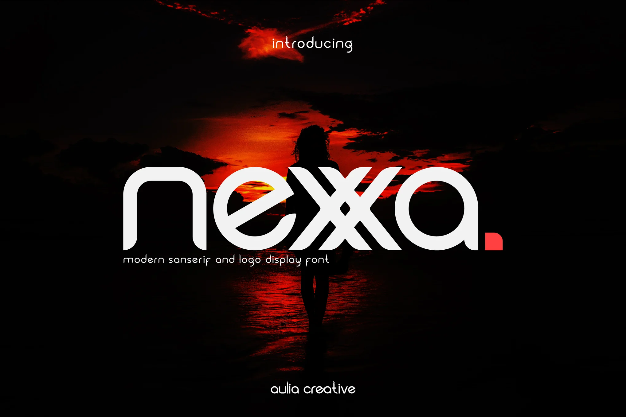
Nexxa Font is a geometric sans-serif font developed by Ryoichi Tsunekawa and under the Dharma Type. Often describing the design as sharp-edged, geometric, and proportional, Nexxa reflects the sophisticated, contemporary design language with the predominance of minimalism. That basically means that due to its geometrical form and Aegean Modern look and feel, logos can be successfully applied in branding, editorial, digital interfaces, and advertising initiatives.
This font derives inspiration from particular geometric typefaces like Futura, but it has been designed to provide a better contemporary look for professional and corporate uses. Comes in various variants of light to bold, this typeface results in the Nexxa versatility, suitable for both, headings, body, and titles. One of the major benefits of Nexxa is its extreme legibility in even the smallest sizes and its clean, unassuming design, giving it considerable appeal to designers hoping to present projects professionally, sleekly, and modernly.
You can find more free sans-serif fonts here.
Uppercase, Lowercase & Symbols Font
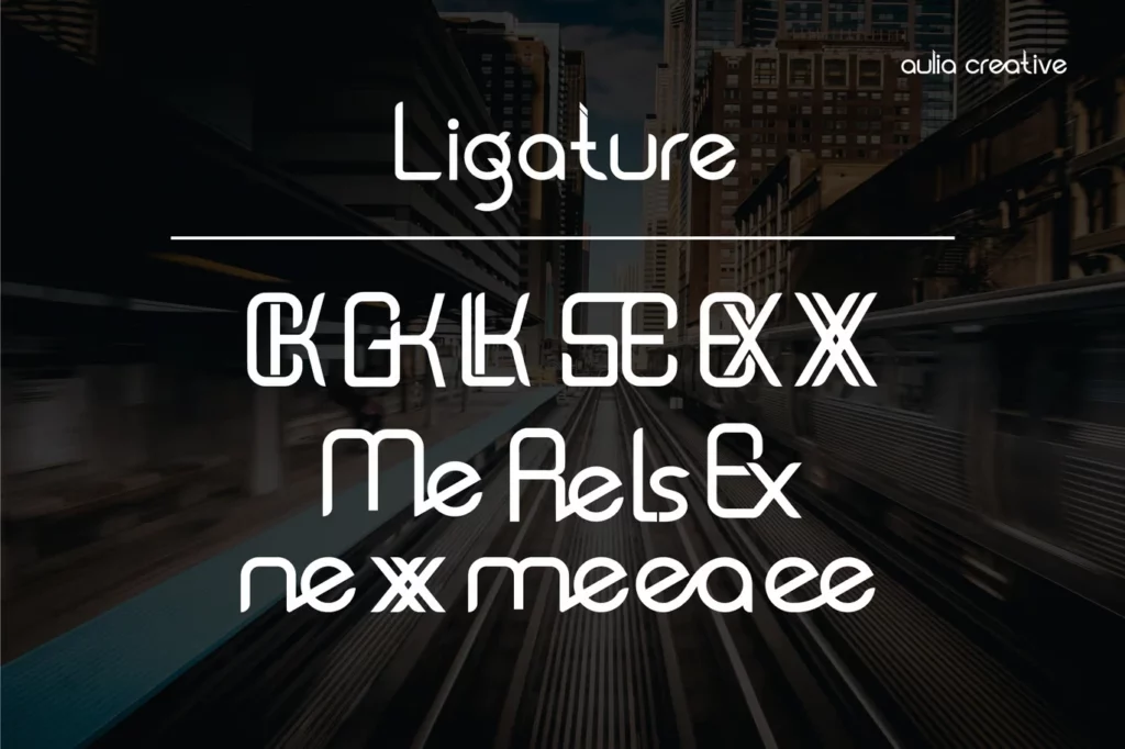
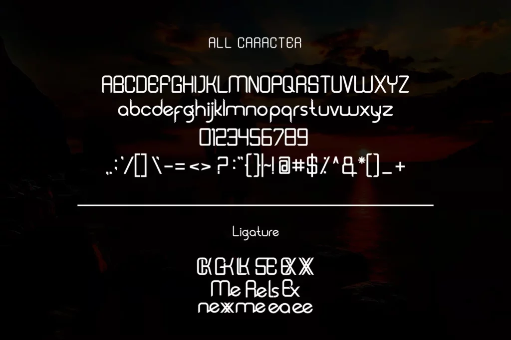
Origins of Nexxa Font
Nexxa Font, launched by Ryoichi Tsunekawa, the Dharma Type font designer, became the typeface of a geometric sans-serif typography of the contemporary world. As a style, Dharma Type specializes in clean and functional fonts, and Nexxa carries this tradition with its sleek lines, beautifully drawn curves, and clear intention not to distract from the message.
Nexxa, inspired by such typefaces as Futura and Avenir, is an attempt to harmoniously combine traditional geometric forms of typefaces and a contemporary design that reflects the tendencies in modern branding. Its clean lines and cut edges make it an ideal symbol in various contexts, including corporate identity and multimedia.
With the continual release of readable and fashionable font styles, Nexxa is a beloved font introduced by Dharma Type for professional and casual use. It is geometric and flexible, making it suitable for designers who want a clean and more contemporary look in their design objects.
Features of Nexxa Font
Nexxa Font provides numerous aspects useful for all designs, branding, and digital media. Here are some of its key features:
- Geometric Structure: Nexxa has a sans-serif font structure that is clean and geometric, that look’s precise and up to date. This makes it appealing and incredibly readable regarding how its visual elements are proportioned and organized.
- Sharp Angles and Clean Lines: It seems modernized, although not kinetic, and this owes to the sharp angles accompanied by sleek and straight-line work. This clarity in design makes it appropriate for use in offices, organizations, and companies.
- Versatile Weight Range: Sometimes Nexxa offers several variants of the type by weight – from the light to the bold one, available to achieve various aims. As such, it is ideal for headlines and body text to ensure coherence in use for applications across the project.
- Minimalist Aesthetic: To add to the design’s clarity, Nexxa does not heavily ornament its text, which would have detracted from its look. Employed in the minimalist style, the logo is great for today’s branding in tech, fashion, and media industries.
- High Legibility: Nexxa is a more geometric sans-serif typeface with even typographic proportions, making it extremely clear at smaller point sizes. Obviously, this feature is extremely handy regarding web design, user interfaces, and editorial layouts – anything in clarity.
- Contemporary Appeal: Nexxa has restraint of old-style geometric sans-serifs and modern concepts, which position the typeface as appropriate for brands that need a clean look but are not outdated.
- Balanced Proportions: Letters in Nexxa are proportioned to create a harmonious rhythm, improving readability and design. This makes it versatile for multi-use, such as for advertisements and computer-related solutions.
- International Character Support: Several releases of Nexxa are characterized by extended character sets and the support of multiple languages making it versatile.
In conclusion, Nexxa Font is where Geometry met minimalism and sheer modernity, and it is a convenient tool for designers and stressful work that needs plain, clear, and advanced typography.
How to Use Nexxa Font
To get the best out of the Nexxa Font, one should look at it for what it is, an elegant, geometric typeface well suited to contemporary design applications.
Branding and Identity Design
When it comes to branding and identity all around, the corporate and cleaned-up appearance of Nexxa is definitely going to appeal to tech and lifestyle companies. Having Nexxa as the main font for the brands adds professionalism especially when accompanied by simple graphics and high contrast color palate. In logos, Nexxa’s bold or all-caps variants form impressive and easily recognizable brands that communicate reliability and contemporaneity.
Headlines and Titles in Digital and Print
For headlines and titles of digital and print media, Nexxa’s distinctive angles give the necessary proportions while not overpowering the design. Nexxa Font Bold or Black is best utilized for headlines; though if one combines it with a serif, using it for the body of the text also looks great. Controlling page layouts and uppercase Nexxa headings helps create an uncluttered and functional visual flow that is easy to follow.
Body text in Print & Digital Media
For body text used in shorter content, Nexxa’s regular or light weight ensures the text remains easily legible, making it ideal for screens, products, or call-out type content. As for the longer text, using the Nexxa with another serif type pulls off the comfort for readers, other than the lineality and neatness.
User Interfaces and Digital Applications
As for graphic design work and every UX/UI element, Nexxa Font offers benefits within sizes, making it perfect for navigation menus, buttons, and labels. Its geometric forms are quite suitable for minimalistic UI bits, enhancing the overall straightforward and unproblematic use.
Social Media Graphics and Marketing Collateral
The bold weights are perfect for all things concerning social media graphics and marketing, ensuring that designs stand out from a sea of viral content. It is suitable for product launches or ads because it follows contemporary and sleek design tendencies, guaranteeing a comprehensible and clean look across platforms.
This font is free for personal use; click here for commercial use.

