Bank Gothic Font
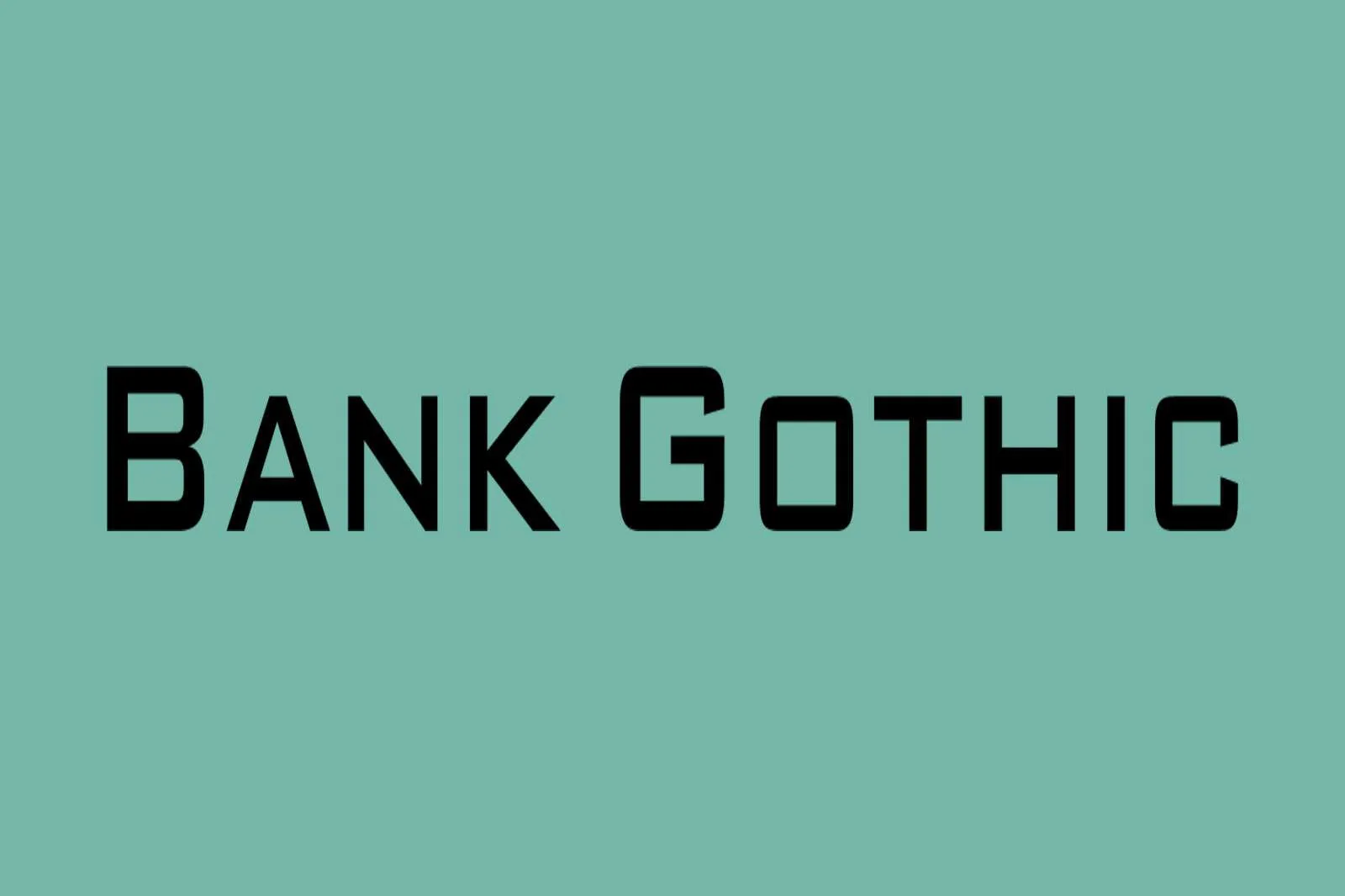
Bank Gothic Font is a rectilinear geometric sans-serif typeface designed by Morris Fuller Benton in 1930 for the American Type Founders (ATF). It is characterized by its square, block-like appearance and industrial aesthetic.
Bank Gothic is distinguishable by its uniform weight, lack of serifs, and compact letter spacing, which contribute to its highly legible and bold appearance. It has been widely adopted in various media, including film, television, and advertising, and is emblematic of modernity and strength.
You can find more free sans-serif fonts here.
Uppercase, Lowercase & Symbols Font

Origins of Bank Gothic Font
Bank Gothic Font has its roots in the early 20th century, a time marked by the world wars and significant industrial and architectural advancements. The font’s crystallization occurred during artistic upheaval when the Bauhaus principles of simplicity and form met the complex demands of a modernizing society.
Initially seen in advertising, the clean, no-nonsense appearance of Bank Gothic made it an instant hit for brands looking to project an image of trustworthiness and technological prowess—attributes in high demand during the dawn of the modern age.
Characteristics of Bank Gothic Font
Bank Gothic is distinguished by its geometric structure and industrial appearance, reflecting the ethos of efficiency and progress that defined its era of inception. Here are the key characteristics that set it apart:
- Square Shapes: Each character is designed to focus on square shapes, contributing to the font’s overall sturdy and block-like appearance.
- Large x-height: The font has a large x-height, enhancing its readability at various sizes and making it a versatile choice for print and digital media.
- Uniform Line Weight: Bank Gothic Font is notable for its uniform line weight, which gives it a clean, cohesive look across all characters.
- Minimalist Aesthetic: True to the minimalist design philosophy, Bank Gothic lacks adornment, with simple, straight lines and geometric forms.
- Distinctive G and Q: The font’s G and Q letters are particularly distinctive, each with unique tail treatments that stand out within text settings.
- Wide Range of Weights: It offers a variety of weights, from light to bold, allowing designers to create a dynamic range of contrast within their compositions.
- Futuristic Vibe: Overall, the typeface exudes a futuristic vibe, making it a popular choice for science fiction and technology-themed projects.
These attributes have cemented Bank Gothic’s status as a go-to typeface for projects requiring boldness, reliability, and forward-thinking.
Usage of Bank Gothic Font
The distinctive characteristics of Bank Gothic have allowed it to flourish in a multitude of applications, transcending its initial industrial and advertising roots to become a staple in modern design work.
Here’s how it is being used across different media:
1. In Film and Television
Bank Gothic Font has been the font of choice for numerous film and television title sequences, especially within the science fiction and action genres. Its futuristic aura complements the thematic elements of these stories, creating an instant visual connection to the genre for viewers.
Films and series that deploy Bank Gothic for their titles or promotional materials tap into the font’s inherent suggestion of advancement and the cutting-edge, setting the tone before the narrative begins.
2. Video Games
The video game industry has also embraced Bank Gothic, using it for everything from cover art to in-game interface elements. Its readability and bold presence make it ideal for immersive gaming experiences, where it can convey critical information without breaking the stylistic immersion of the game world.
Whether used in the title, for menu options, or in HUD (Heads-Up Display) elements, Bank Gothic adds a layer of sleek, professional polish to the game interface.
3. Corporate Branding
Bank Gothic Font conveys strength, stability, and innovation in corporate branding. Companies in the technology sector and those seeking to project a modern, forward-thinking image often incorporate Bank Gothic into their logos, product packaging, and marketing materials.
Its clean lines and geometric form symbolize precision and reliability, qualities highly prized in today’s fast-paced business environments.
4. Advertising Campaigns
Bank Gothic maintains its historical association with advertising by bringing a touch of modernity and professionalism to campaign visuals. Its ability to stand out, even in crowded visual spaces, makes it a favored choice for print ads, posters, and digital banners.
Advertisers leverage their impactful aesthetic to catch the eye, communicate authority, and evoke a sense of cutting-edge technology or ideas.
5. Web and Mobile Design
The digital realm has not been left behind in leveraging Bank Gothic’s potential. Web and mobile design professionals use the font to create user interfaces that are both functional and stylish, capitalizing on its high legibility and contemporary vibe.
From fintech applications to tech start-up websites, Bank Gothic helps establish a user-friendly environment that radiates confidence and tech-savviness.
Tips for Using Bank Gothic Font
When incorporating Bank Gothic into your design projects, consider the following tips to maximize its effect and ensure your work stands out with precision and style:
- Pairing with Complementary Fonts: Bank Gothic Font works well as a headline or title font. When pairing it with body text fonts, choose sans-serif options that are similarly clean and modern but with a slightly contrasting style to ensure readability and visual interest.
- Use for Impact: Given its assertive and bold nature, use Bank Gothic for elements you want to stand out, such as call-to-actions, headings, or any part of your design meant to draw immediate attention.
- Contrast with Color: Bank Gothic’s industrial and minimalist vibe is enhanced when set against vibrant backgrounds or used with contrasting color schemes. This makes it especially suitable for modern or technology-themed designs.
- Scale Appropriately: The font’s readability makes it versatile for both large and small text, but always test different scales to find the perfect balance for your specific application. Larger uses showcase their unique characteristics, while smaller text maintains legibility.
- Limit Use for Body Text: Bank Gothic’s uniform weight can make lengthy passages appear monotonous despite their readability. Use it sparingly for body text, and consider softer, more traditional fonts for larger blocks of text to ensure reader comfort.
- Explore Weight Variations: Use the different weights available to create a hierarchy and emphasis in your design. Lighter weights work well for subheadings or secondary information, while bolder weights make strong statements.
- Maintain Spacing Control: Carefully adjust letter and line spacing to preserve readability and visual harmony. Bank Gothic may require more letter spacing in all caps or smaller sizes to keep the text clear and legible.
By following these guidelines, you can leverage Bank Gothic Font’s unique qualities to enhance your design projects, whether for print, digital, or mixed-media platforms.