Impact Font
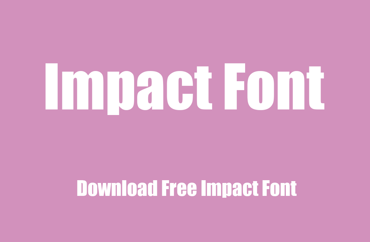
Impact Font is a sans-serif typeface characterized by its thick strokes and compressed letters, designed to grab the viewer’s attention. Created by Geoffrey Lee in 1965 and later released through the Stephenson Blake foundry, it was designed for use in headlines and advertising to make a bold statement.
With its tight letter spacing and heavy, uniform weight, Impact is particularly effective for short texts or phrases when a strong visual impact is desired.
You can find more free sans-serif fonts here.
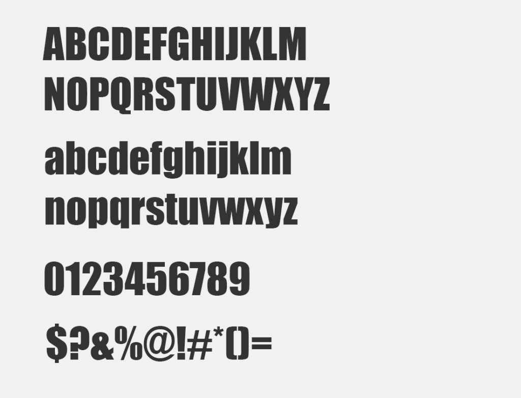
Uppercase, Lowercase & Symbols Font
History of Impact Font
Impact Font is a sans-serif typeface designed by Geoffrey Lee in 1965 and released by the Stephenson Blake foundry of Sheffield. It was created during a period when print and television advertisements required catchy and bold fonts to quickly attract viewer attention.
Impact, with its thick strokes and compressed letters, was specifically designed to make a strong impression while remaining legible at small sizes. This made it an ideal choice for headlines and posters. Over the years, its use has transcended print media, becoming widely popular in digital formats, especially in memes, due to its ability to convey messages succinctly and emphatically.
Key Features of Impact Font
- High x-height and narrow build: Impact’s design includes a high x-height, which contributes to its readability at smaller sizes. The narrow build of the characters allows for impactful headline creation without occupying excessive horizontal space.
- Thick strokes: The typeface features uniformly thick strokes that ensure its letters stand out even when viewed from a distance, making it perfect for both print and on-screen display.
- Tight letter-spacing: The compact letter spacing in Impact font aids in creating a sense of urgency and importance, which is why it’s often used in headlines and advertisements.
- Lack of brackets on the stems: The vertical and horizontal strokes meet without any bracketing, giving the font a solid and square appearance that adds to its commanding presence.
- Compact and solid silhouette: The overall design of Impact is compact and robust, making it an excellent choice for situations where space is limited but the text needs to be highly visible.
Uses of Impact Font
Impact font has found a broad range of applications across various mediums, adeptly serving diverse communication needs. Its ability to create a powerful visual impression without sacrificing legibility makes it a favoured choice in several contexts.
1. Advertising and Marketing
Impact’s bold and condensed profile makes it perfect for print ads, billboards, and web banners where space is limited, and messages need to be conveyed quickly and efficiently.
2. Web Design and Digital Content
The font’s high visibility ensures that website headers and online advertisements grab attention. Its use in meme culture exemplifies its effectiveness in delivering content that is both engaging and easily consumable.
3. Corporate Branding
Some companies utilize Impact for their logos and branding materials to project strength and reliability.
4. Product Packaging
Impact Font is often seen on product labels and packaging to highlight brand names or key information, ensuring they stand out on shelves.
5. Editorial and Publishing
Magazines and newspapers may employ Impact for headlines and captions to draw readers into articles.
6. Video and Multimedia Productions
Impact Font is a go-to choice for titles and credits in videos, as well as for on-screen text in multimedia presentations, due to its clear visibility even at smaller sizes or from a distance.

