Lucinda Font
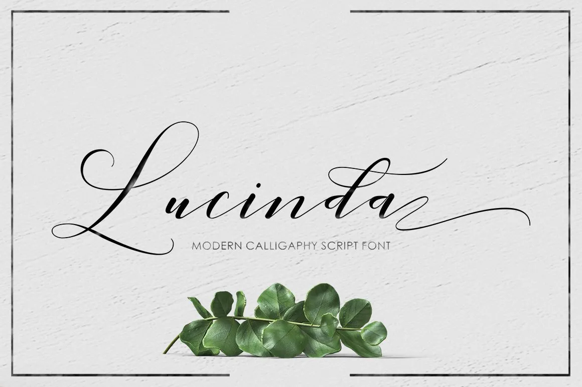
Lucinda Font, commonly known as Lucinda, encompasses a family of related typefaces designed by Charles Bigelow and Kris Holmes in 1985. Distinguished for its clarity and versatility, Lucinda is intended to be highly legible at small sizes, a trait that makes it exceptionally useful for both screen display and printing purposes.
Lucinda’s family includes a variety of styles ranging from those suitable for body text to decorative and script variants, enabling its use in a wide array of applications, from office documents to creative design projects. Its design philosophy emphasizes legibility and simplicity, ensuring Lucinda remains popular among professional and casual users.
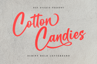
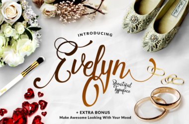
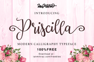
You can find more free Calligraphy fonts here.
Uppercase, Lowercase & Symbols Font


History of Lucinda Font
Lucinda font family, known for its clarity and readability on computer screens, was created by Charles Bigelow and Kris Holmes in 1985. Combining Bigelow’s background in type history and design with Holmes’ skills in lettering and calligraphy, this duo developed Lucinda as one of the earliest fonts designed specifically for digital displays. The name “Lucinda,” derived from the Latin word “lucidus”, meaning “bright” or “light,” reflects the font’s design intention: to be easy to read.
Lucinda covers many typefaces, including serif, sans-serif, and calligraphy, making it versatile for text and display use. It was also among the first typefaces to include various international characters and symbols, anticipating the global use of digital fonts. Over the years, Lucinda has been adapted and expanded to suit emerging technologies and platforms, proving its enduring appeal and functionality in the digital age.
Characteristics of Lucinda Font
Lucinda font family is known for its clean and crisp appearance, making it a popular choice among designers and typographers. Its design principles are rooted in the traditional forms of typefaces, yet it has a modern and contemporary feel.
Some key characteristics of Lucinda include:
- Clarity and Legibility: Lucinda fonts are designed with high clarity and legibility, featuring open letterforms and ample spacing. This makes them particularly effective for on-screen reading, where pixelation often diminishes readability.
- Versatility: Lucinda’s family encompasses a variety of styles, such as Lucinda Sans, Lucinda Serif, Lucinda Console, Lucinda Handwriting, and more. This range allows for its application in diverse contexts, from body text to decorative headings.
- International Character Support: Lucinda was designed to include a wide range of international characters and symbols from its inception. This made it one of the pioneering fonts supporting global communication via digital platforms.
- Adaptability to Technologies: Lucinda has been refined to work seamlessly with evolving digital technologies over the years. It performs well on low-resolution screens and scales effectively to higher-resolution displays.
- Design Aesthetics: With influences from classical Roman lettering and modern sans-serif design, this font balance traditional elegance and contemporary simplicity.
Applications of Lucinda Font
Lucinda font family enjoys widespread use across various platforms and mediums, thanks to its versatility, clarity, and aesthetic appeal. Below are some of the primary applications where this font has made a significant impact:
1. Digital Media and Web Design
This font is extensively used in digital media and web design for its clarity and readability on computer screens. Lucinda Grande, for instance, was the system font for Apple’s macOS until Yosemite, enhancing user interface readability. Web designers often choose Lucinda Sans and Lucinda Grande for text content to ensure ease of reading on various devices.
2. Printed Materials
Despite its origins as a font for digital displays, Lucinda’s clean lines and precise forms translate well to printed materials. Lucinda Serif and Lucinda Bright are preferred choices for printed books, magazines, and corporate materials, where their legibility at small sizes is particularly valued. Their elegant design extends well to more formal applications, such as wedding invitations and event programs.
3. Programming and Code Editors
Lucinda Font Console is a monospaced font variant of the Lucinda family, making it a popular choice for programming environments and code editors. Its clear distinction between characters reduces the likelihood of errors, a crucial factor in coding. The font is appreciated for its readability, even at small sizes, which helps prevent eye strain during long coding sessions.
4. Branding and Logo Design
Lucinda’s range of styles, including Lucinda Calligraphy, offers unique branding and logo design options. Its versatility allows brands to select a style that best conveys their identity, whether they aim for a more traditional look with Lucinda Serif or a sleek, modern feel with Lucinda Sans.
5. Accessibility Applications
Given its high readability, Lucinda fonts are often used in applications targeting users with visual impairments or dyslexia. This font’s clear and distinct letterforms assist in reducing reading errors and strain, making digital content more accessible to a broader audience.
6. Educational Materials
Educators and textbook publishers utilize this font for their legibility and neutrality. Lucinda Serif, for example, is a common choice for the body text in textbooks and educational websites, as it facilitates easier reading for learners of all ages.