Metrisch Font
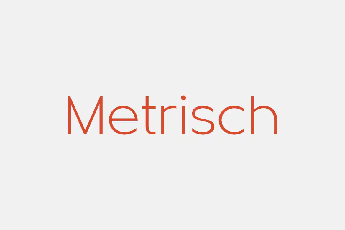
Metrisch Font is a modern sans-serif typeface characterized by its clean lines, geometric shapes, and contemporary aesthetics. Designed with readability and versatility, Metrisch offers a range of weights from thin to bold, making it suitable for various design applications, from digital interfaces to print media. Its uniformity and simplicity enable designers to use it for both text-heavy documents and minimalist, impactful headlines, embodying a balance between functionality and style.
You can find more free Modern fonts here.
Uppercase, Lowercase & Symbols Font


History of Metrisch Font
The story of Metrisch font begins with its creators, who sought to bridge the gap between the artistic nature of letterforms and the pragmatic demands of modern design. Influenced by the Bauhaus movement, which prized form follows function, the font was conceptualized as elegant and practical.
Stemming from this philosophy, the typeface was meticulously crafted to ensure consistency and clarity in communication, whether in print or on the web. Drawing on the principles of geometric sans-serif fonts, Metrisch offers a humanistic twist, thanks to its subtle variations in strokes, inviting readers into its balanced and legible world.
Features of Metrisch Font
Metrisch font is distinguished by its unique features that make it stand out in typography. Below are some of the key characteristics that define this versatile typeface:
- Geometric Design: Rooted in the principles of the Bauhaus movement, Metrisch boasts clean, geometric lines that offer a modern and minimalist aesthetic, making it suitable for a wide range of design projects.
- Humanistic Touch: Despite its geometric foundation, Metrisch incorporates subtle variations in strokes and open forms that add a warm, humanistic quality, enhancing its legibility and appeal.
- Wide Range of Weights: The font is available in multiple weights, from thin to extra bold, allowing designers to achieve the perfect typographic hierarchy in their projects.
- Large x-height: Its generous x-height improves readability, especially in small sizes, making it an excellent choice for both digital screens and print materials.
- Open Apertures: The open apertures in characters like
c,eAnd `s` ensure clarity and legibility, even in less-than-ideal printing conditions or smaller sizes on digital displays. - Versatile Application: Metrisch’s clean and adaptable design makes it perfect for branding, editorial design, UI design, and more.
- Multilingual Support: Offering broad multilingual support, Metrisch caters to a global audience, making it an ideal option for international projects.
- Web and Print Friendly: Designed to perform beautifully across various mediums, Metrisch ensures that your text looks sharp and legible whether viewed on a digital platform or printed material.
These features collectively contribute to Metrisch Font’s versatility and popularity among designers, reinforcing its position as a noteworthy addition to the modern typographic landscape.
Uses of Metrisch Font
Metrisch font boasts versatility, making it an excellent choice for various applications. Here’s how you can harness its potential:
Branding and Identity
Metrisch’s clean and modern aesthetic makes it particularly suited for branding and identity projects. Its geometric structure conveys professionalism and sophistication, creating a solid and memorable impression. Companies aiming for a contemporary image often incorporate Metrisch into their logos, business cards, and branding materials to stand out in today’s competitive market.
Web and UX/UI Design
The font’s readability and straightforward, uncluttered forms are ideal for web design and user interfaces. Websites and applications benefit from uniformity and legibility, ensuring a seamless user experience. Metrisch can be particularly effective for headers, menus, and buttons, contributing to a sleek and user-friendly interface.
Editorial and Publishing
For magazines, books, and other publications, Metrisch provides both elegance and functionality. Its balanced proportions and clean lines ensure legibility over long texts, making it a preferred choice among editors and typographers. Whether in printed form or digital media, the font enhances readability and adds a modern touch to editorial content.
Advertising and Marketing
In the realm of advertising, Metrisch helps messages stand out. Its distinctiveness captures attention, while clarity ensures the intended message is communicated effectively. From billboards to online ads, the font adapts well to various mediums, making it a versatile tool for marketers.
Packaging Design
Metrisch has also found its way into packaging design, where it helps products shine on the shelves. Its simplicity and elegance complement product designs without overwhelming them, allowing brand messaging to take the forefront.
By leveraging the unique characteristics of Metrisch font, designers and creatives can enhance their projects across various mediums, ensuring both aesthetics and functionality are met.
How to Use Metrisch Font
To make the most out of Metrisch font in your projects, here are some essential guidelines:
- Selection of Weight and Size:
- Use lighter weights for body text to ensure readability, especially in lengthy paragraphs.
- Opt for bolder weights in headings and titles to establish hierarchy and draw attention.
- Pairing with Other Fonts:
- Pair Metrisch with a serif font for an elegant contrast that suits editorial and branding purposes.
- For a modern and minimalist design, combine Metrisch with another geometric sans-serif font, ensuring differentiation through weight and size for a clear hierarchy.
- Color and Contrast:
- Utilize contrasting colors to enhance legibility and highlight essential elements in your design.
- Keep the color palette limited to maintain a clean and uncluttered aesthetic, allowing Metrisch’s simplicity to shine.
- Spacing and Alignment:
- Pay attention to letter and line spacing to improve readability and overall appearance. Generally, wider spacing complements Metrisch’s geometric nature.
- Use alignment to create a visual order, with left or justified alignment preferable for body text to support a more structured layout.
- Usage in Digital vs. Print:
- For web and digital design, ensure the font is tested across different devices and screen sizes for consistent readability.
- In print, consider the texture and weight of the paper as it can impact how the font is perceived.
By adhering to these recommendations, designers can fully leverage the potential of Metrisch font to create visually appealing and functional designs across various applications.
Conclusion
At the crossroads of functionality and aesthetic pleasure, the Metrisch font shines as a beacon for designers seeking a modern yet timeless typographic solution. With a firm understanding of its history, a vision for its uses, and a guide for implementation, you’re now equipped to integrate Metrisch into your projects with confidence and creativity.
Breathe new life into your designs with Metrisch – the font that’s not just another typeface but a testament to typography’s union of beauty and purpose. After all, in visual communication, the right type can speak louder than words.
This font is free for personal use; click here for commercial use.