Silka Font Family
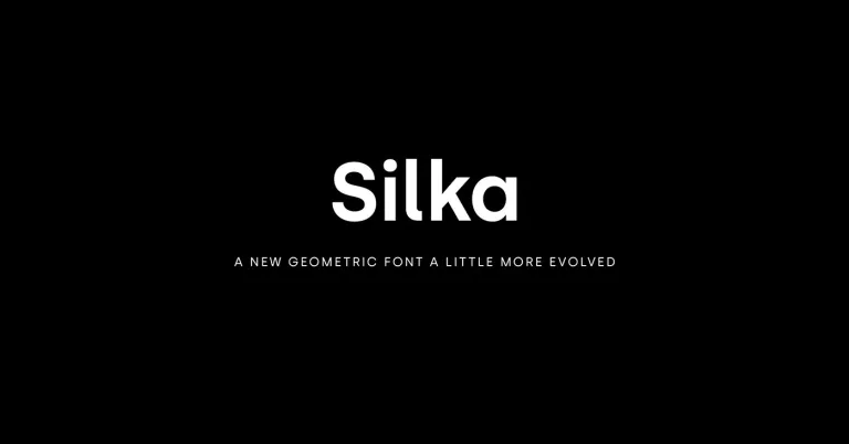
Silka Font Family is a modern sans-serif typeface characterized by its geometric structure and near-monolinear form. It balances functional simplicity and aesthetic elegance, making it suitable for various applications.
With its clean lines and open characters, Silka conveys crispness and clarity in the text, making it an excellent choice for printed materials and digital displays. This font family typically includes a variety of weights and styles, from light to bold, providing flexibility and support for hierarchy in typographic design. Ideal for branding, editorial, and signage, Silka offers designers a contemporary palette for crafting compelling visual narratives.
You can find more free sans-serif fonts here.
Uppercase, Lowercase & Symbols Font


History of Silka Font Family
Silka Font Family, designed by Atipo Foundry, is a contemporary sans-serif typeface characterized by its geometric structure and functional elegance. Launched in the latter half of the 2010s, Silka has quickly become favoured for its modernist appeal and clarity in digital and print mediums. Its design is simple and readable, making it a versatile choice for various applications, from corporate branding to editorial design.
The family comprises multiple weights and styles, providing designers with a comprehensive toolkit for typographic expression. Through its balanced proportions and deliberate design choices, the Silka Font Family exemplifies the harmony between form and function, embodying a sleek, forward-facing aesthetic that resonates with contemporary visual culture.
Features of Silka Font Family
Silka Font Family is distinguished by a series of features that make it stand out among sans-serif typefaces:
- Geometric Structure: True to its modernist influences, Silka is built on a geometric foundation, offering a clean, objective form that enhances its legibility and aesthetic appeal.
- Versatile Weight Range: It includes an extensive range of weights, from thin to extra bold, allowing for dynamic typographic hierarchy in any layout.
- Italic Variants: Each weight has a complementary italic variant, providing emphasis and stylistic expression flexibility.
- OpenType Features: Silka supports various OpenType features, such as ligatures, alternate characters, and fractions, which enable more refined and varied typographic design.
- Large X-height: The typeface boasts a large X-height, contributing to its small size legibility, clarity, and readability.
- Extended Character Set: Designed for global communication, Silka includes an extended set of glyphs to support multiple languages and scripts.
- Optimized for Digital and Print: Meticulously engineered for performance in digital displays and printed materials, ensuring consistency and beauty across all mediums.
Usage of Silka Font Family
The Silka Font Family is renowned for its versatility, making it suitable for various applications. Its clear, legible design, paired with a wide range of weights and styles, offers endless possibilities for creatives across multiple fields.
Here are some key areas where Silka shines:
1. Corporate Branding
Silka’s modern and elegant appearance makes it an excellent choice for corporate branding initiatives. Companies looking to convey reliability, professionalism, and innovation frequently adopt Silka for their logos, business cards, and official letterheads. Its geometric structure, aligned with functional elegance, embodies a contemporary aesthetic that can significantly enhance brand identity.
2. Editorial Design
In editorial design, Silka’s readability and versatile weight range make it ideal for print and digital publications. Whether for magazine articles, newspapers, or online blogs, Silka ensures that the text is approachable and enjoyable. Its ability to maintain clarity at various sizes makes Silka a go-to for captions and footnotes.
3. Web and User Interface Design
Given Silka’s optimization for digital displays, it’s a popular web and UI design choice. Its legibility on screens, combined with a large x-height, ensures that web content and user interfaces are accessible and easy to navigate. The availability of italics and an extended character set also offers designers the flexibility to create dynamic and inclusive digital experiences.
4. Advertising and Marketing
Grabbing and holding attention is paramount in advertising and marketing materials. Silka’s range from thin to extra bold weights allows for impactful typographic hierarchy, enabling brands to highlight key messages effectively. Its modernist appeal supports creative campaigns that aim to stand out visually while conveying clear messages.
5. Packaging Design
For products that demand an eye-catching shelf presence, Silka Font Family offers a solution that combines aesthetic appeal with functional design. The clean lines and geometric forms of Silka help create attractive and easy-to-read packaging, ensuring that product information is communicated effectively.