Tips For Optimizing Print Fonts For Clarity And Readability

Introduction
Print fonts have been evolving for hundreds of years, and there is a wide array of options to pick from. Whether it be a classic serif font like Times New Roman, a quirky script font like Lobster Two, or an extra bold sans serif like Impact, each one has its place in the print world. Making sure you choose the right font can help make an impact on your audience and make printed materials more memorable.
By carefully considering the history and purpose behind each type of font you use, you can create materials with incredible styles that will leave an impression on everybody who reads them.
Here are some tips for optimizing your print fonts:
Choose Typefaces That Are Easily Legible
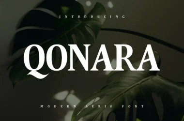
Selecting typefaces that are easy to read is key when it comes to optimizing print fonts for clarity and readability. Serif typefaces like Times New Roman, Garamond, and Georgia are great options because they have small “feet” at the ends of their strokes which helps guide the eye along the text easily. Sans serif fonts like Arial and Helvetica are also popular choices as they tend to be simpler in design which makes them easier to read in smaller sizes.
Consider Line Spacing & Letter Spacing
When choosing your font size, it’s important to consider both line spacing (the amount of space between lines) and letter spacing (the amount of space between characters). Both should be slightly increased from their default settings so that the lines don’t appear too cramped together or too far apart. This will help ensure optimal readability for your printed materials.
Pay Attention To Font Weight & Style
The weight (thickness) and style (italicized or not) of your font can also have an impact on its legibility. Generally speaking, thicker font weights are easier to read while italicized styles should be avoided unless absolutely necessary as they tend to be harder on the eyes over long periods of time. If you do use italics, try pairing them with bolder weights so that they stand out more clearly against the rest of your text.
A Guide to Choosing the Right Print Fonts
The right font can make or break a design project. Whether you’re creating a brochure, a poster, or an invitation card, the font you choose will have a huge impact on how your work is perceived. It’s important to select fonts that are easy to read and convey the right tone for the message. Here’s what you need to know about choosing the right fonts for your print projects.
Typeface vs Fonts
The terms “typeface” and “font” are often used interchangeably, but they mean two different things. A typeface is an entire family of related fonts (e.g., Helvetica). A font is simply one member of that family (e.g., Helvetica Bold). When selecting fonts for print projects, it’s important to understand the difference between these two terms.
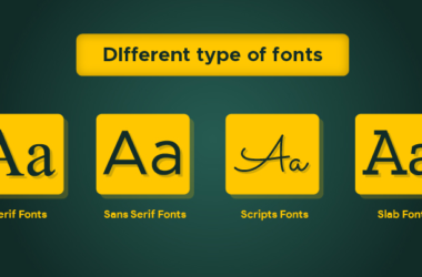
Serif vs Sans-Serif Fonts
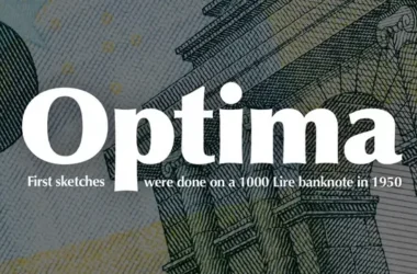
Another important distinction when selecting typefaces for print projects is between serif and sans-serif fonts. Serif fonts have small decorative strokes at their ends (e.g., Times New Roman), while sans-serif fonts don’t have any such extra strokes (e.g., Arial). Serif fonts are often seen as more traditional and formal, while sans-serif fonts are viewed as modern and clean. Generally speaking, serif fonts are better suited for text-heavy documents like books or magazines, while sans-serif fonts work best when there isn’t much text involved for example in posters or headlines.
Consider Your Audience
Different types of fonts are better suited to different types of readers. For example, if you’re designing something for children, consider using a more playful font that will be easier for them to read. On the other hand, if you’re designing something intended for older adults, opt for a more classy font that won’t distract from the content.
It’s also important to consider whether your audience has any accessibility needs that need to be taken into consideration when choosing fonts. For example, people with problems may have difficulty reading certain fonts so it’s important to pick one that is easy to read and figure out.
Make Your Content Easier To Read
Another important factor when choosing a font is how legible it is on a printed page. If your text isn’t easy to read then readers will likely give up before they even get halfway through your document. Stick with simple sans-serif fonts like Arial or Helvetica as these are generally easier to read than serif fonts like Times New Roman or Garamond.
Additionally, try to avoid overly decorative fonts as these can make text difficult to process and comprehend quickly, especially if it includes multiple colors or shadows which can cause eyestrain over time.
Experiment With Modifying And Combining Fonts
You don’t always have to stick with just one type of font when designing print documents. It can often be helpful to experiment with combining two different fonts together in order to create an interesting contrast between them while still maintaining legibility and clarity. You can also modify existing fonts by increasing letter spacing or adjusting line height in order to make them easier on the eyes and more readable overall.
Clarity and Readability Matter
When it comes to print fonts, clarity and readability are two of the most important factors. The font you choose will determine how easily your readers can understand what you’re saying. Whether you’re a designer creating an eye-catching advertisement or a business owner looking to promote your product, having a clear and legible font will help ensure that your message is heard loud and clear.
Why Clarity Matters
Clarity is essential when selecting a typeface for your piece of work. Not only should the letters be easy to distinguish from one another, but they should also be consistent in shape throughout the entire alphabet. This means that all uppercase letters have the same shape, all lowercase letters have the same shape, and all numbers have the same shape. Consistency in letterforms helps create an overall sense of harmony throughout the entire text block.
However, too much harmony can make it difficult for readers to quickly recognize individual letters which is why it’s important to find a balance between consistency and contrast within the font family you choose. For example, some typefaces may use bolder weights of certain characters while keeping others more subtle this creates visual interest while maintaining clarity.
Why Readability Matters
Readability refers to how easy or difficult it is for a reader to process text on paper or screen. It’s not just about how good a font looks it also needs to be functional for its intended purpose. A readable typeface should have generous counters in the white space inside each character so that individual letters don’t blend together into one giant blob when printed out at small sizes. It should also feature thick strokes that are easy to follow with your eyes as they move across the page or screen.
Additionally, any decorative elements within the typeface should be minimal otherwise, they could distract from the message you’re trying to communicate. All of these factors combine to create a typeface that makes reading easier and more enjoyable for readers than if they were presented with something difficult or illegible.