Biennale Font Family
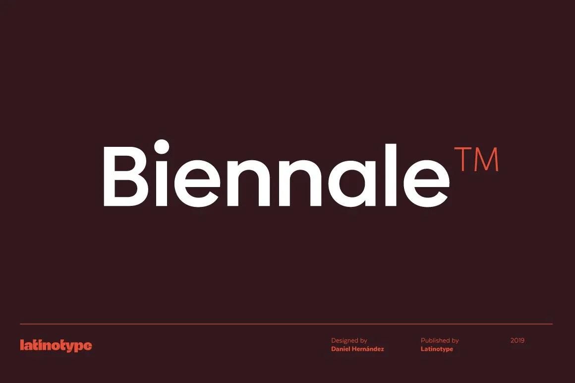
Biennale Font Family is a contemporary typeface collection that is celebrated for its versatility and aesthetic appeal. Characterized by its clean lines and modern design, Biennale is crafted to meet the diverse needs of graphic designers, branding professionals, and digital creatives.
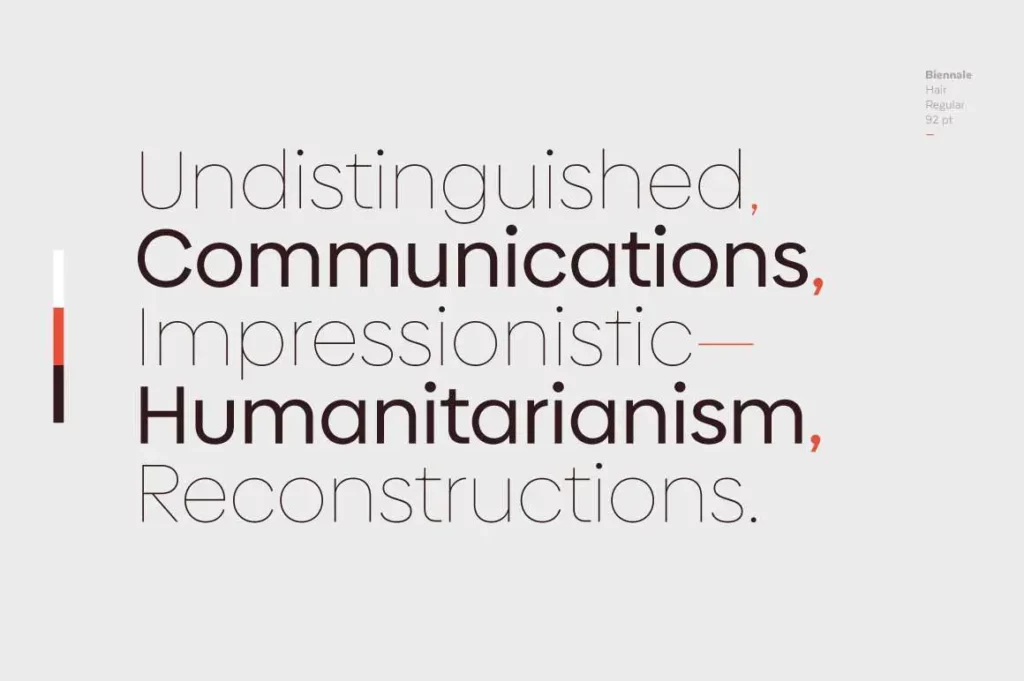
From its elegant light weights to its bold and impactful heavy weights, this font family offers a range of styles suitable for various applications, whether for print media, digital interfaces, or corporate branding. Its readability and character make it popular among professionals seeking a blend of modernity and functionality in their typography selections.
You can find more free sans-serif fonts here.
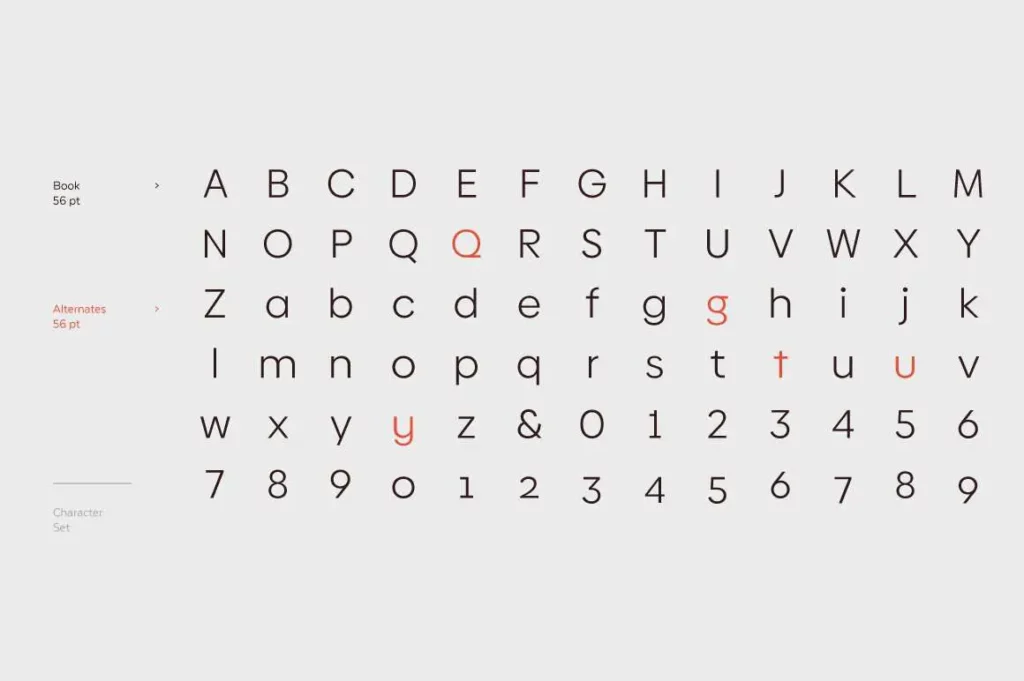
Uppercase, Lowercase & Symbols Font
Features of Biennale Font Family
Biennale Font Family is distinguished by its unique characteristics, making it an exemplary choice for various design projects. Here are some of its standout features:
- Versatility in Application: Biennale is designed to be versatile, suitable for both digital screens and print media, across a wide range of applications from branding projects to editorial designs.
- Wide Range of Weights: The family includes multiple weights, from light to bold, allowing designers to create dynamic typographic hierarchies.
- Distinctive Italic Styles: Apart from the standard styles, Biennale features beautifully crafted italics that add elegance and emphasis to any text.
- Extended Character Set: It supports an extended character set, providing comprehensive language support for global projects.
- Special Ligatures and Alternates: Biennale has a set of unique ligatures and alternate characters, allowing designers to add a personal touch to their work.
- Optimized for Readability: Carefully designed with readability in mind, Biennale ensures that text is legible at various sizes, making it ideal for headings and body text.
Applications of Biennale Font Family
Biennale Font Family’s unique features enhance its applicability across many design spaces, showcasing its versatility and effectiveness in engaging audiences in various contexts.
Here are some noteworthy applications:
1. Branding and Identity
Biennale’s wide range of weights and distinctive italics make it an excellent choice for branding projects. Its ability to adapt from sophisticated logos to comprehensive brand identity materials ensures coherence and elegance across all brand touchpoints.
2. Editorial Design
Biennale’s optimized readability and extensive character set cater to complex editorial needs, whether for magazines, newspapers, or online publications. It provides a seamless reading experience, from headlines to body text, making it a go-to option for editors and designers alike.
3. Digital Experiences
In digital design, Biennale shines in user interfaces and digital platforms, offering clarity and legibility across devices. Its versatility ensures that text remains engaging and readable, enhancing user experience on websites, apps, and digital publications.
4. Advertising and Marketing
Biennale’s special ligatures and alternates offer creative flexibility for advertising campaigns and marketing materials. This allows brands to craft unique, attention-grabbing messages that stand out in crowded marketplaces.
5. Packaging Design
On packaging, Biennale adds a touch of elegance and differentiation. Its variable weights can emphasize product names and descriptions, while its distinctive italics and special characters allow for creative expressions that captivate consumers.
Usage of Biennale Font Family
Biennale Font Family can be used in many ways to enhance textual content aesthetically and functionally. Below are some detailed use cases illustrating its versatility:
- Web Design and User Interfaces: Biennale’s clean lines and readability make it an excellent choice for website headings, body text, and interface elements, ensuring a cohesive and user-friendly digital experience.
- Corporate Communications: From internal memos to annual reports, Biennale’s range of weights and styles can convey information with clarity and stylistic consistency, reflecting the company’s brand values.
- Creative Projects: Designers can utilize Biennale’s special ligatures and alternates in artistic projects, posters, and invitations to inject personality and uniqueness into their works.
- Social Media Content: For compelling social media posts and advertisements, Biennale’s distinctive italics and bold weights can highlight key messages or call-to-action prompts, making them stand out in a busy feed.
- E-Commerce Platforms: In product descriptions and promotional banners, Biennale’s legibility at various sizes ensures that customers can easily read and understand product offerings, enhancing the shopping experience.
- Educational Materials: The font’s readability makes it suitable for textbooks, e-learning modules, and academic websites, facilitating a comfortable learning environment for students of all ages.
By leveraging Biennale Font Family’s comprehensive features, designers and brands can effectively communicate their messages across multiple platforms and touchpoints, ensuring legibility and visual appeal.