Budweiser Font
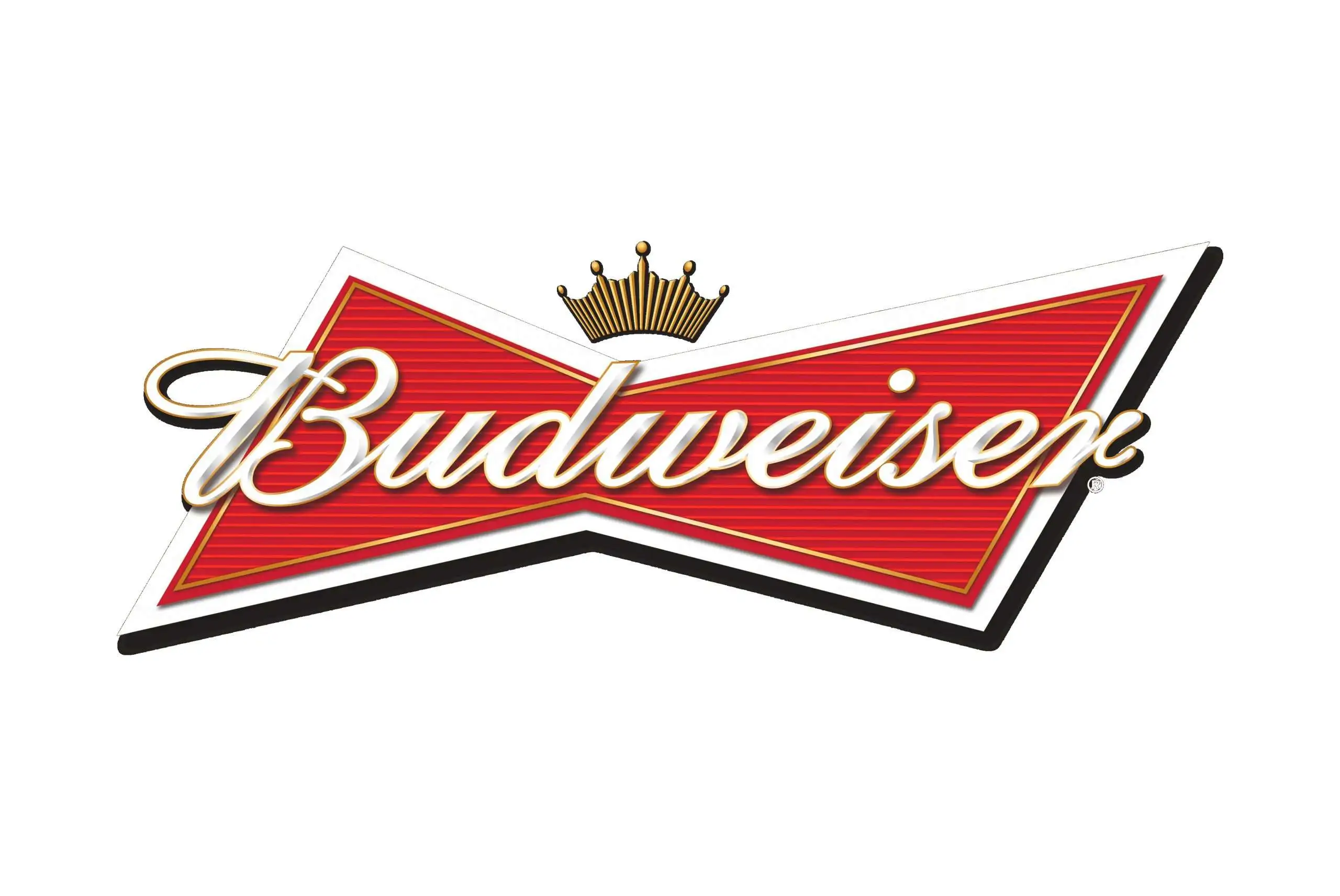
Budweiser Font, often associated with the branding of the famous American beer, channels a sense of tradition and timeless appeal. This custom typeface is recognized for its bold, serif characters that convey a sense of robustness and reliability, mirroring the beer’s longstanding history and its position in the beverage industry.
Its distinctive style aids in making the Budweiser brand instantly recognizable, contributing significantly to the brand’s visual identity.
You can find more free Logo fonts here.
Uppercase, Lowercase & Symbols Font

History of Budweiser Font
The story of Budweiser font is entwined with the very origins of the Anheuser-Busch brewing company. A tale that begins in the mid-1800s when Adolphus Busch, a German immigrant, married into the Anheuser family and ultimately became a partner in the brewery business. The iconic Budweiser logotype as we know it was first introduced in 1876.
This was during a time when the burgeoning advertising industry in America was discovering the power of visually striking fonts to create brand recall. Since its inception, Budweiser font has undergone subtle changes in line with design trends while staying true to its original essence, a marker of consistent and confident design.
Elements of Budweiser Font
Budweiser font, with its distinctive look and feel, is built on a foundation of certain key elements:
- Script Style: Mimicking the fluidity of handwriting, the script style of this font adds a personal touch that connects with consumers, suggesting a sense of heritage and authenticity.
- Bold and Italicized Characters: These features lend the font a dynamic presence, ensuring that the brand stands out on billboards, in commercials, and on merchandise.
- Custom Ligatures: Unique connections between letters, particularly noticeable in the way certain characters flow into each other, are a hallmark of Budweiser font, enhancing its uniqueness.
- Serifs and Swashes: Small embellishments at the ends of the strokes add a classic decorative element, contributing to the overall elegance and sophistication of the typeface.
- Contrast in Stroke Width: The variation between thick and thin strokes within each letter creates a visual rhythm, drawing attention to the brand name and making it memorable.
Impact of the Budweiser Font
The influence of Budweiser font extends beyond mere branding; it has etched a distinctive identity for the beer in the global marketplace. Its careful construction and thoughtful details resonate with a broad audience, creating a visual language that is both familiar and inviting.
1. Global Brand Recognition
This font has played a pivotal role in the beer’s global brand recognition. Its unmistakable appearance on labels, advertisements, and merchandise acts as a beacon for Budweiser enthusiasts around the world. It has helped the brand stand tall amid a crowded market of competitors, making it not just recognizable, but iconic.
2. Emotional Connection
This typeface goes beyond aesthetics to forge an emotional connection with its audience. The script’s suggestion of heritage and tradition conveys warmth and nostalgia, making Budweiser not just a beer, but a story in every sip. This emotional appeal is instrumental in building customer loyalty and fostering a sense of belonging among its consumers.
3. Marketing and Advertising Impact
In marketing and advertising, this font is a powerful tool. Its bold and dynamic characteristics ensure that the brand remains prominent and impactful across various media platforms. Whether it’s a television commercial, a billboard, or social media advertising, the font’s presence enhances Budweiser’s messaging, making it more persuasive and memorable to viewers.
4. Design Flexibility
Despite its strong historical roots, Budweiser font exhibits remarkable design flexibility, adapting to modern trends while retaining its classic appeal. This adaptability ensures that Budweiser’s visual identity remains relevant and engaging across generations, embodying both the legacy and the future of the brand.

