The Difference Between Serif And Sans-serif Fonts
Introduction
When it comes to designing a text-based project, the choice between using a serif or sans-serif font can have a huge impact on how viewers treat the material. Serif fonts are easily identifiable as having protruding edges at the end of their letters and tend to be used for more formal or traditional applications. Sans-serif fonts, on the other hand, lack any extra features like these and create a much more modern, contemporary feel.
They tend to be much easier to read in small sizes because there are no distracting additions that take away from the text itself. Ultimately though, both styles of font should be used appropriately depending on the goal of the design project as they each have their own unique qualities that make them special.
The Importance of Font In Design And Communication
The font is often given less thought than other aspects of design and communication, but the typeface makes an enormous impact on the final product. Whether you’re designing a logo, laying out content for a brochure, or crafting social media posts, the font selection can influence how your message is perceived by the reader.
The wrong font choice can make the content look unprofessional or hard to read, while the right one can create an air of authority and legibility. To ensure your design has maximum impact on its audience, carefully consider both the style and size of font that are best suited for your message, it could make all the difference in whether people will stick around to consume information or move on to something else entirely.
Fonts can be divided into two distinct categories: serif and sans-serif. Serif fonts feature ornamental lines and tails that adorn the character of each letter, while sans-serif typefaces are more modernized with a minimalistic style. Regardless of their differences, both types offer unique design options for any project.
What Are Serif Fonts?
Serif fonts are typefaces with small decorative strokes at the end of each letterform. These strokes are called serifs, hence the name “serif font.” The main purpose of these serifs is to create a visual connection between letters, which makes text easier to read in long passages. It also helps create a sense of cohesion and structure in paragraphs, which can be helpful when designing logos or other types of visuals.
The Origin Of Serif Fonts
Serif fonts originated in the Roman Empire and were first used in stone carvings and inscriptions. They eventually found their way into printing presses in the fifteenth century, where they quickly became popular due to their legibility and longevity on paper. Since then, serif fonts have become staples for print media such as books and magazines, as well as digital media like websites and apps.
As technology has evolved over time, so have serif fonts which started out as simple strokes have now been transformed into intricate designs that can help convey different messages depending on their style and weight. This versatility makes them extremely popular amongst modern graphic designers who are looking for ways to add personality to their work without compromising legibility or readability.
What Are Sans-serif Fonts?
The term “sans-serif” literally means “without serifs” in other words, sans-serif fonts are those without the extra strokes at the ends of each letter. Serif fonts have these extra strokes, making them look more traditional and formal. In comparison, sans-serif fonts tend to look contemporary, modern, and minimalistic, they also take up less space on the page or screen than their serif counterparts. This makes them perfect for headlines or titles with limited space available.
Sans-serif fonts are also easier to read on screens because their lack of extra strokes makes them appear clearer and sharper on digital devices such as computers or smartphones. This is particularly important when it comes to web design, if your site visitors have difficulty reading your text, they’re likely to leave quickly without engaging with it further. That’s why many websites use sans-serif fonts for both headings and body text.
It’s also important to note that not all sans-serif fonts are created equal, some have thicker strokes than others or different letter shapes depending on how stylized they are. It’s worth taking the time to explore different options before settling on one for your project, as this will help ensure that it looks its best in whatever medium it will be displayed in.
Choosing The Right Font
Choosing the right font is an important part of any design project. It’s more than just picking a typeface that looks good, it’s about selecting a font that conveys the intended message and meets the needs of the audience.
Font Categories
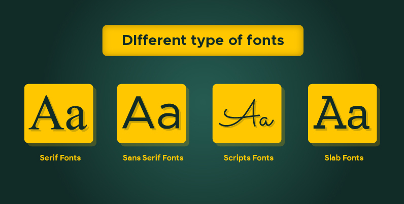
When it comes to font selection, there are five basic categories to consider: serif, sans serif, script, display, and monospace. Serif fonts feature decorative flourishes at the ends of characters, Sans serif fonts are clean and simple. Script fonts are elegant, Display fonts are bold and attention-grabbing, And monospace fonts have evenly spaced letters. Knowing which category you need will help narrow down your choices.
Intended Use
The purpose of your project should be one of the first things to consider when selecting a font. Different types of projects require different types of fonts. For instance, if you’re designing a logo or website banner, you may want to use a display font with bold lettering to draw attention to your message. If you’re creating lengthy documents such as reports or newsletters, you may want to use a serif or sans serif typeface for easier readability.
An Important Rule
Once you’ve narrowed down your choices based on category and intended use, it’s important to remember one key rule, keep it simple. Too often people try to cram too many typefaces into their designs in an effort to make them look more interesting or unique, but all this does is make them look busy and confusing. Stick with two fonts maximum for any given design project. This will ensure that your design looks polished and professional without overwhelming viewers with too much text.
Conclusion
Serif and sans-serif font styles both have their place in design, it’s just up to you to decide which one is right for your project. Whether you’re looking for something classic and timeless or modern and minimalistic, there’s sure to be a font out there that can help bring your vision to life. So make sure to take some time to explore different font options before making your decision.