Frutiger Font
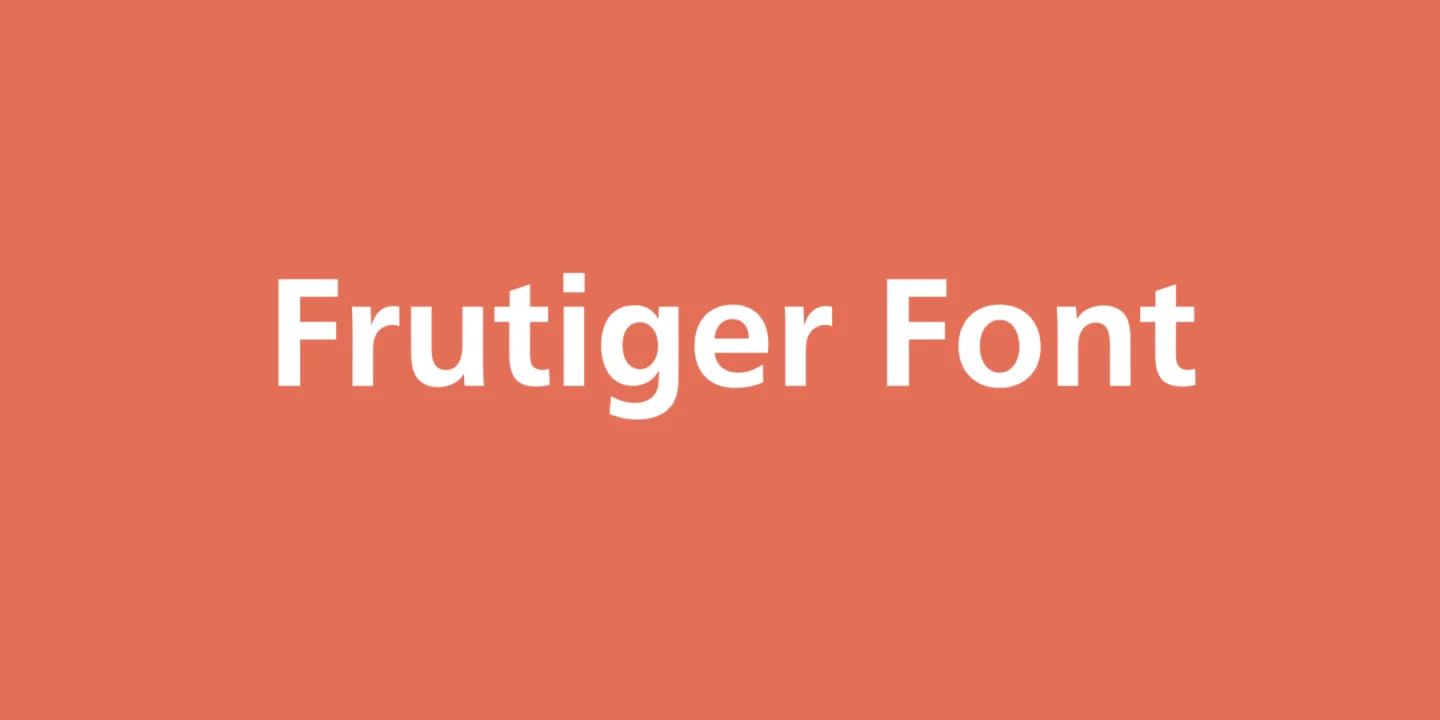
Frutiger font is a sans-serif typeface renowned for its clarity and legibility at a distance, making it a popular choice for signs, official documentation, and corporate identity projects. Created by Swiss typeface designer Adrian Frutiger in 1968, it was initially designed for use in the Charles de Gaulle Airport to facilitate clear and easy navigation.
Characterized by its clean, modern aesthetic, the Frutiger font family includes various weights, ensuring versatility across print and digital mediums. Its design emphasizes uniformity and neatness, with ample spacing between characters, which enhances its readability.
You can find more free sans-serif fonts here.
Uppercase, Lowercase & Symbols Font


History of Frutiger Font
The story of the Frutiger font began in the mid-20th century when the growing complexity of airport signage became a significant issue. It was 1968 when Adrian Frutiger was commissioned to design a typeface for signage at the newly constructed Charles de Gaulle Airport in Paris. His brief required a font that would be highly legible from a distance and at high speeds, under the stresses of time and weather, and across linguistic and cultural barriers.
To meet these demanding criteria, Frutiger meticulously crafted a typeface with every nuanced detail serving the singular purpose of clarity. Named after its designer but released by his friend and colleague Heidrun Osterer, Frutiger was the perfect marriage of form and function, and it quickly became the benchmark for modern humanist sans-serif typefaces.
Characteristics of Frutiger Font
Frutiger font is distinguished by several key characteristics contributing to its widespread acclaim and utility in various applications. These include:
- Humanist Qualities: Frutiger is often described as a humanist sans-serif font. This means it incorporates aspects of calligraphic traditions, making it appear more approachable and readable than geometric sans-serif typefaces.
- Open Letterforms: The design of Frutiger features open and easily discernible letterforms. This openness helps increase legibility at a distance and under less-than-ideal conditions (like fast movement or low visibility), making it ideal for signage.
- Distinctive Ascenders and Descenders: The font has prominent ascenders and descenders relative to the x-height, contributing to its aesthetic elegance and improving readability.
- Moderate X-height: Its x-height treads a fine line – not too high nor too low. This balance is crucial for readability, ensuring that individual characters are distinguishable and that text blocks are cohesive.
- Variety of Weights and Styles: Frutiger comes in a wide range of weights and styles, from Ultra Light to Black, including condensed versions, providing flexibility for different design projects.
- Clear, Resonant Numerals: The numerals in Frutiger are designed for clarity, with open forms and set widths, making them highly legible in diverse applications.
These characteristics make Frutiger a typeface of elegance and function, perfectly suited to its original role in airport signage and beyond.
Usage of Frutiger Font
The versatility of Frutiger Font has cemented its place in a myriad of applications, transcending its original purpose. Its clarity and elegance make it a favored choice for various platforms and projects.
1. Signage Systems
Frutiger’s design originated in airport signage, making it a go-to typeface for public signage systems worldwide. Its legibility at a distance and under varied lighting conditions ensures it remains a staple in high-traffic areas, from transportation hubs to urban wayfinding.
2. Corporate Branding
Given its modern yet timeless appeal, Frutiger has been adopted by numerous companies for branding purposes. Its clean lines and humanist qualities help create welcoming and professional logos and corporate materials, supporting brand identity and communication goals.
3. Digital and Print Media
The digital realm, including websites and mobile apps, benefits from Frutiger’s readability on screens of all sizes. Similarly, in print media, from books to annual reports, its legibility in text blocks and display headings makes it a popular choice among designers.
4. User Interfaces
In software and application design, user interface readability is paramount. With its open letterforms and distinct character shapes, Frutiger enhances user experience by making navigation elements and content easy to read.
5. Education and Academic Publishing
Educational materials and textbooks benefit from fonts that reduce eye strain and improve comprehension. Frutiger’s clear numerals and balanced x-height support create texts accessible to learners at all levels.