Heineken Font
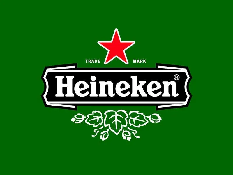
Heineken font refers to the unique typeface associated with the Heineken beer brand. Characterized by its distinctive, bold, and slightly italicized letters, this font captures the brand’s energy and commitment to quality.
While not commercially available for public use, its iconic style contributes significantly to Heineken’s worldwide brand recognition, embodying excitement and sophistication.
You can find more free Logo fonts here.
Uppercase, Lowercase & Symbols Font

History of Heineken Font
The history of Heineken font traces back to the late 19th century, embodying a heritage that’s as rich and nuanced as the beer it represents. The origin of Heineken’s distinctive typography can be linked to the brand’s inception in 1864 when Gerard Adriaan Heineken purchased a brewery in the heart of Amsterdam. Initially, the typographic choices for the brand were rooted in the prevailing styles of the era, featuring ornate serifs that reflected the craftsmanship and quality of the beer.
However, the most iconic evolution of Heineken font emerged in the 1960s, when the company undertook a comprehensive rebranding to modernize its image. This redesign introduced the slanted ‘e’, famously known as the ‘smiling e’, designed to evoke a sense of friendliness and approachability. The adjustment transformed the Heineken visual identity into a more contemporary and internationally appealing brand.
Elements of Heineken Font
Heineken font is distinct, embodying characteristics that set it apart from traditional typefaces. Here, we break down its essential elements:
- Vibrant Green Color: This font is instantly recognizable by its unique green shade, which symbolises the brand’s visual identity. This colour represents vitality, freshness, and the natural ingredients of their brews.
- Slanted ‘e’: The slanted ‘e’, or the ‘smiling e’, is perhaps the most iconic aspect of the Heineken typeface. It adds a sense of friendliness and approachability to the brand’s identity.
- Serif Typeface: Originally, Heineken font featured ornate serifs, indicative of the brand’s rich heritage. Over time, these have evolved to more subtle serifs, balancing tradition with modernity.
- Bold and Italicized Stance: This font is often displayed in a daring and italicized format, conveying movement, dynamism, and a forward-thinking ethos.
- Consistent Letter Spacing: The uniform spacing between letters ensures the brand name is easily readable and visually impactful, contributing to the font’s memorability.
Together, these elements fuse to create a font that is an integral part of Heineken’s brand identity and a standout example of effective typographical design in branding.
Benefits of using Heineken Font
Heineken font enjoyably intersects the boundaries of creative design and brand consistency, offering many benefits for the brand and the designers who work with it.
Below are the key advantages:
1. Enhanced Brand Recognition
Utilizing this font, with its unique shade of green and the ‘smiling e’, significantly bolsters brand recognition. This distinctive look ensures that consumers can instantly identify the brand across various platforms, whether on a digital screen or a physical product label.
2. Emotional Connection
The ‘smiling e’ and the vibrant green of Heineken font are not just aesthetic choices—they are cleverly designed to evoke specific emotions. The smiling ‘e’ conveys a sense of friendliness and warmth, inviting consumers to engage with the brand personally. In contrast, green symbolizes freshness and natural ingredients, reinforcing the brand’s commitment to quality.
3. Versatility
Despite its uniqueness, this font maintains a high level of versatility. Its bold, italicized stance allows for readability in many contexts, from advertising billboards to digital media posts. The consistent letter spacing and the balance between tradition and modernity make the font adaptable to formal and casual communicative purposes.
4. Memorability
The distinctive elements of Heineken font and its historical roots make it highly memorable. This memorability is crucial in crowded marketplaces where brands vie for consumer attention. A memorable font contributes to a memorable brand identity, enhancing consumer recall and loyalty.
5. Coherence Across Branding
Adopting a consistent visual language, as Heineken has done with its font, ensures coherence across all branding elements. From packaging to advertising and even to digital branding, the consistent use of this font ensures a unified brand experience for consumers, fostering trust and reliability.

