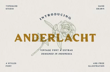
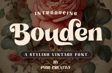
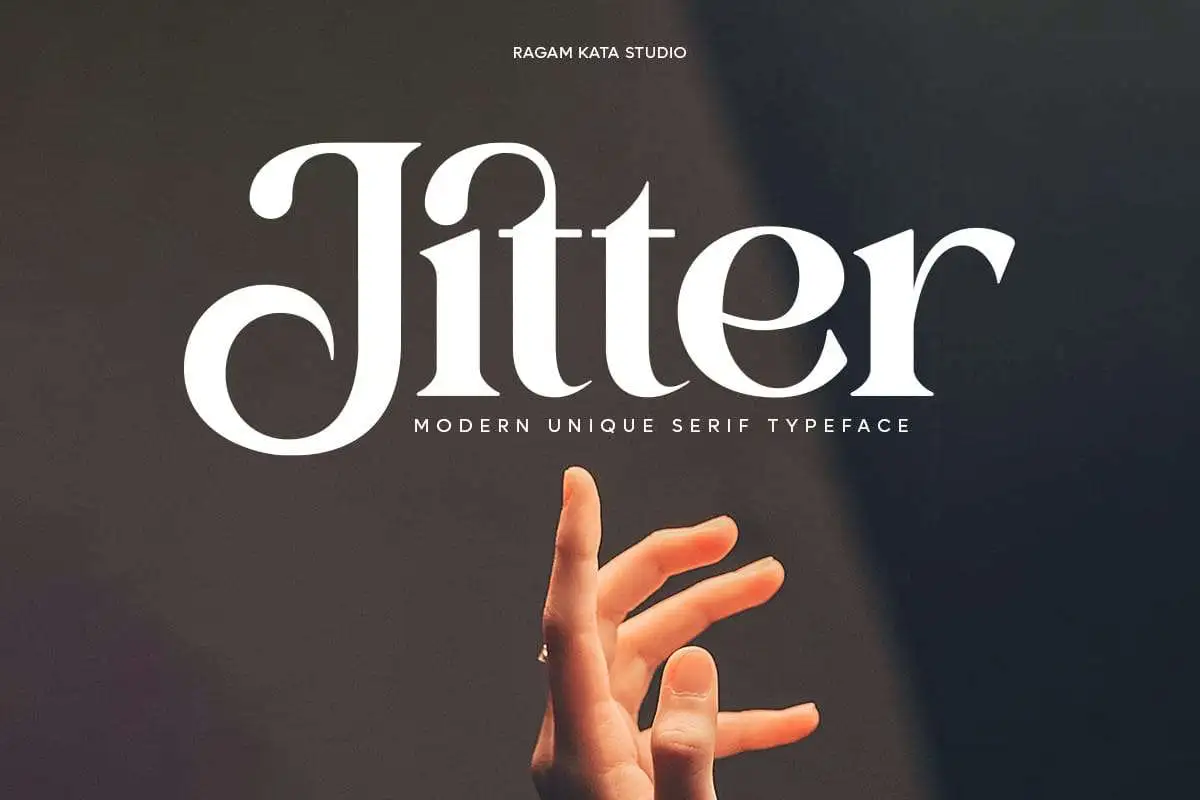
Jitter Font
Jitter Font refers to a type of typographic design where the characters display intentional variations and irregularities. These discrepancies might include character size, baseline alignment, or spacing, creating a dynamic, seemingly handcrafted effect.
The purpose of Jitter Font is to add a personal, organic touch to digital text, making it feel more natural and less machine-generated. Such fonts are trendy in creative projects and designs, aiming to convey a casual, approachable feel.
You can find more free Retro fonts here.
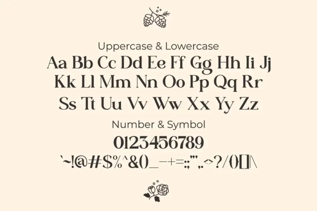
Uppercase, Lowercase & Symbols Font

What is Jitter Font?
Jitter font is a category of typefaces characterized by intentionally introducing subtle or pronounced distortions to letterforms. These distortions can take various forms, including shifts in baseline, x-height, stroke width, slight rotations, or asymmetrical spacings. The resulting text appears to “jitter” on the page, creating a dynamic and expressive aesthetic that traditional typefaces lack.
The design intent behind this font is to infuse a sense of human touch and imperfection into what can often be a sterile medium—the digital screen or printed page. This font adds a layer of personality and emotion that resonates with audiences more tactilely.
Key Features of Jitter Font
Jitter font is defined by its unconventional design approach, and specific vital features set it apart from mainstream typefaces. When used thoughtfully, these features can drive the desired design message home and ensure a piece stands out. However, they also come with challenges that designers must understand and overcome.
1. Intentional Irregularities
Subtle shifts are the defining characteristic of this font. They can manifest as intentional letter size, shape, or position variations. These irregularities interrupt the text’s rhythm, directing the eye in unpredictable ways and fostering a dynamic reading experience.
2. Dynamic Alignment
Jitter font often defies the constraints of a typical grid layout. This can mean that the baseline of some letters may be skewed, or the x-height of others may vary. While this can create striking text, it can make consistent alignment a significant challenge, especially in responsive web design or across different viewing platforms.
3. Variable Stroke Widths
The stroke widths in this font is far from uniform. This dramatic variation heightens the contrast between thick and thin, giving the text an almost calligraphic quality. However, it also means a potential increase in visual noise, which, if not controlled, can make the text difficult to read.
Pros and Cons of Using Jitter Font
Like any design element, this font has its strengths and weaknesses. Designers must consider these factors when deciding whether to incorporate this typeface into their projects.
Pros
- Uniqueness: Jitter font stands out in a sea of standardized typefaces. They can offer a brand a unique voice and help it differentiate itself.
- Expressiveness: These fonts are dynamic, making them ideal for creating a sense of movement or adding energy to static designs.
- Engagement: The human eye is naturally attracted to motion and novelty. This font can engage viewers and keep them interacting with a design longer.
Cons
- Readability: Excessive Jitter can hamper the legibility of a text. When using Jitter font, it’s essential to balance expressiveness with the primary function of conveying information.
- Inconsistencies: Not all Jitter font is creat equal. In some cases, the Jitter may feel overdone or arbitrary. When using Jitter font, it’s crucial to ensure that the design choices serve the narrative or design purpose.
- Overuse Concerns: Jitter font can be overused like any novel design element. When every other word is jittery, the effect loses its impact and can become visually exhausting.