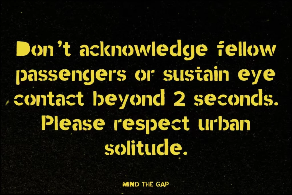
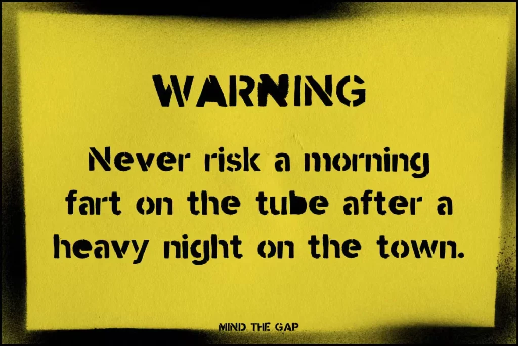
Mind the Gap Font
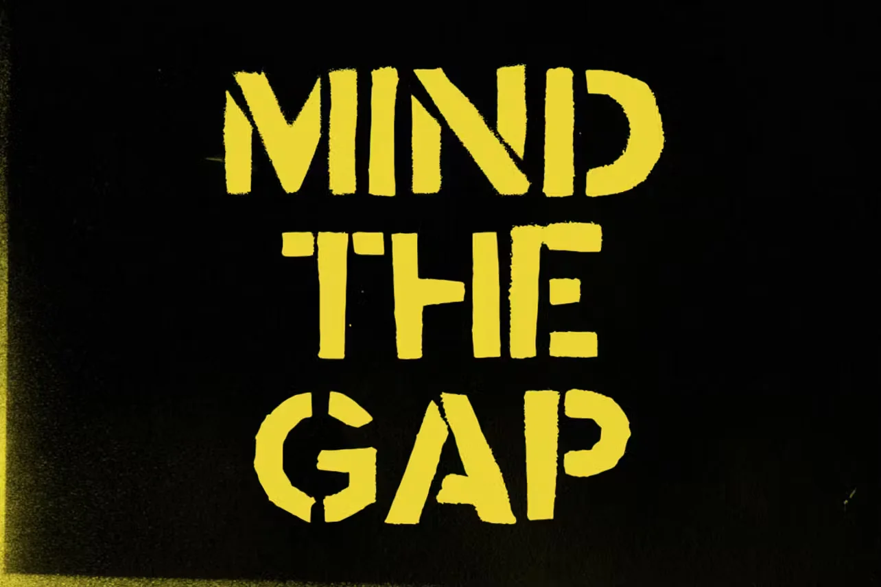
Mind the Gap font is a display typeface reminiscent of the cautionary signage in subway systems, notably those of the London Underground. Characterized by its clean, sans-serif letters and straightforward legibility, it evokes a sense of order and alertness.
This font capitalizes on the iconic phrase “Mind the Gap, ” which warns passengers of the space between the train door and the platform edge. Its distinctive styling makes it suitable for various design applications, from public safety announcements to novelty items, where a touch of urban sophistication is desired.
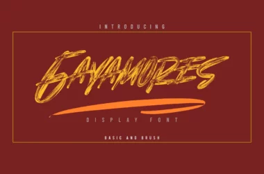
You can find more free Graffiti fonts here.
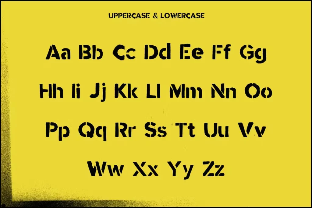
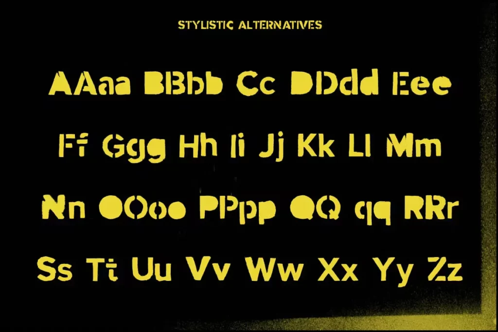
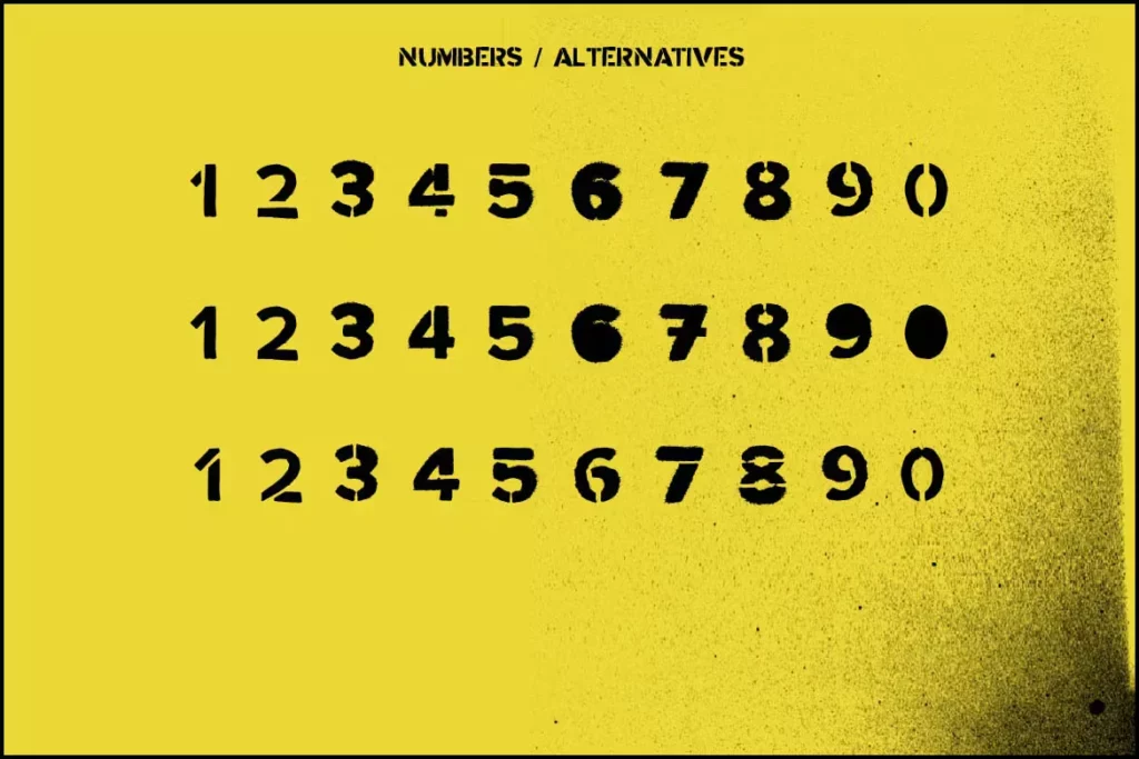
Uppercase, Lowercase & Symbols Font
History of Mind the Gap Font
Mind the Gap Font is a contemporary creation with a nod to the historical context of typography. It is inspired by the mid-century modern era of design, with a focus on simplicity and clean lines.
Typeface was designed with an eye on digital and print media usability, making it an optimal choice for projects that demand clarity and a touch of retro-futurism. The name is an homage to the famous “Mind the Gap” typography found in the London Underground, which has become an iconic visual symbol of the city.
Characteristics of Mind the Gap Font
Characteristics of Mind the Gap Font include:
- Simplicity and Clean Lines: True to its mid-century modern inspiration, this font features a minimalist design emphasising cleanliness and readability. This simplicity makes it highly versatile and suitable for various applications.
- Rounded Edges: Unlike many fonts with sharp, clear-cut edges, Mind the Gap boasts softly rounded edges, giving it a more approachable and friendly appearance. This subtle characteristic adds a unique charm without sacrificing legibility.
- Variable Weight: The font includes a variety of weights, from light to bold, allowing for a dynamic range of expression within a single typeface. This flexibility makes it an excellent choice for both body text and headlines.
- Geometric Shapes: Drawing inspiration from the geometric focus of the mid-century design movement, Mind the Gap incorporates geometric shapes into its character design, lending it a structured yet elegant look.
- Optimized for Digital and Print: Designed with modern usage, Mind the Gap performs excellently across digital platforms and print, ensuring consistency and clarity in every medium.
- Historical Allusions: The font subtly integrates elements reminiscent of the London Underground’s iconic typography, providing a hint of nostalgia alongside its forward-thinking design.
These characteristics together make Mind the Gap Font a tool for text display and an element of design that enhances the aesthetic and emotional impact of any project it graces.
Benefits of Using Mind the Gap Font
With its retro-modern aesthetic and versatility, this font offers various benefits for designers, including:
1. Readability and Aesthetics
Mind the Gap is highly legible. The clear and open letterforms mean that, when used appropriately, this font can be read swiftly without any unnecessary strain. This readability does not come at the expense of style. The Mind the Gap Font’s sleek, modern look adds a touch of sophistication to any project without being overwhelming.
2. Versatility
Mind the Gap is a versatile typeface that can adapt to many design needs. Whether developing a user interface, crafting a corporate identity, or designing a publication, Mind the Gap can be your go-to font. Its various weights and styles make it a chameleon in the world of typography, seamlessly fitting into any design scheme.
3. Timelessness
The timeless design elements of Mind the Gap ensure that your work does not age quickly. It’s a typeface with a contemporary feel rooted in traditions that have proven to withstand the test of time. In a world where trends can change drastically, this font provides a stable and stylish option for the long run.
4. Crossing Cultures and Languages
Mind the Gap Font is designed with a global audience in mind and is ideal for multilingual projects. Its clean design allows for clear communication across languages, making it an excellent choice for any international venture where clear, concise communication is key.
This font is free for personal use; click here for commercial use.