Segoe UI Font
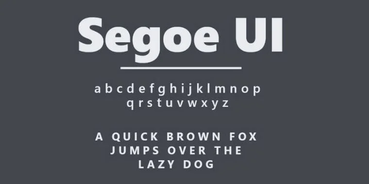
Segoe UI Font is a sans-serif typeface part of the Segoe family of fonts. Steve Matteson designed it at Agfa Monotype and, later, Microsoft. Introduced as the default font for the Windows Vista operating system, Segoe UI has been used extensively across Microsoft products, providing a clean and legible interface for user experience.
Its character set supports a wide range of languages, and the font itself is known for its sleek, modern appearance, which makes it favourable for both digital screens and print media. The design of Segoe UI focuses on readability and simplicity, aiming to convey information most efficiently.
You can find more free sans-serif fonts here.
Uppercase, Lowercase & Symbols Font
History of the Segoe UI Font
Segoe UI font, synonymous with Microsoft’s visual identity, embodies clarity and readability. Its origins trace back to 2004, when it was specifically designed for user interfaces, offering an aesthetically pleasing experience across Microsoft’s products and digital platforms. Crafted by type designer Steve Matteson, Segoe UI is part of the Segoe family, which encompasses a range of fonts tailored for various applications and devices.
Its widespread use began with Windows Vista and Microsoft Office 2007, marking a significant shift towards a more modern design philosophy. The font’s design is characterized by open forms and a neutral yet friendly appearance, making it accessible to a broad audience. Over the years, Segoe UI has been adapted and expanded, including adding new weights and characters to support a wide array of languages and scripts, further solidifying its role as a core element of Microsoft’s design language.
Characteristics of Segoe UI Font
Segoe UI Font is distinguished by several key characteristics that contribute to its popularity and extensive use in digital interfaces:
- Legibility: Its high legibility makes it easy to read on screens of all sizes, from mobile devices to large monitors.
- Neutral Aesthetics: The font features a clean, uncluttered design that is neutral yet has a friendly and approachable feel, fitting a wide variety of uses.
- Open Forms: The characters have open forms, which means there is more space inside letters such as ‘e’ and ‘a, enhancing readability.
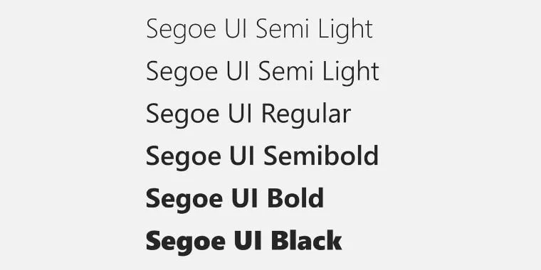
- Versatility: Segoe UI includes a wide range of weights from light to bold, making it adaptable for text body and headings.
- Global Script Support: The font family has been expanded to include characters and symbols from many global languages and scripts, ensuring its usefulness in international applications.
- Modern Appearance: The font has a contemporary look aligns with today’s design trends, making it suitable for modern software and applications.
- Designed for Interfaces: Its design is optimized for user interfaces, ensuring that text is approachable and easy to interact with, enhancing the user experience.
Usage of Segoe UI Font
Segoe UI Font’s integration across Microsoft’s suite of products and beyond has played a pivotal role in defining the user experience of millions. Its application spans several key areas:
1. Operating Systems
Primarily, Segoe UI has been the default system font for Windows since the release of Windows Vista. It provides a consistent and easy-to-read interface for users navigating menus, dialogue boxes, and other system interfaces.
2. Microsoft Office Applications
From Word to PowerPoint, Segoe UI Font ensures that documents, presentations, and emails have a modern and straightforward aesthetic. This uniformity helps maintain a seamless visual flow across all Microsoft Office applications.
3. Web Design and UI Development
With its inclusion in the broader Segoe family, Web designers and UI developers frequently utilize Segoe UI for its readability and neutrality. It is often chosen for user interfaces in web applications and websites for its clarity on screen and compatibility with Microsoft’s design principles.
4. Branding and Marketing Materials
Microsoft uses Segoe UI Font in its marketing materials, emphasizing the brand’s identity through typography. This application extends to digital advertisements, printed brochures, and corporate communications, creating a cohesive corporate visual identity.
5. Accessibility
The font’s attributes contribute significantly to the accessibility of digital content, helping users with visual impairments to read better and understand on-screen information. Segoe UI’s high legibility is particularly beneficial in settings that require precise and straightforward communication.
Pros and Cons of Segoe UI Font
Adopting Segoe UI across various platforms has introduced a range of advantages and limitations. Here, we explore the pros and cons of this font better to understand its impact on user experience and design.
Pros
- Enhanced Readability: One of the foremost strengths of Segoe UI is its exceptional readability across different digital environments, which improves user engagement and accessibility.
- Versatile Design: The font’s wide range of weights and styles make it highly versatile and suitable for various applications, from user interface design to marketing materials.
- Unified Brand Identity: For Microsoft, Segoe UI is a core element of its visual identity, ensuring brand consistency across its software and hardware products.
- Global Language Support: Its broad support for various languages and scripts makes it an ideal choice for global applications, fostering inclusivity and broader reach.
- Modern Aesthetic: The contemporary design of Segoe UI aligns with modern aesthetics, making it relevant and appealing for current and future software interfaces.
Cons
- Limited Distinctiveness: Given its widespread use, particularly in Microsoft products, Segoe UI Font may offer limited distinctiveness for brands looking to differentiate themselves through typography.
- Potential Licensing Restrictions: There may be licensing restrictions or requirements outside of Microsoft environments, potentially complicating its adoption for some users or developers.
- Perceived as Overused: Its association with Windows and Microsoft Office could lead to a perception of overuse, possibly detracting from its uniqueness in specific contexts.
- Optimization for Digital Displays: While optimized for screen use, its performance in printed materials may not be ideal for all printing projects, limiting its versatility in traditional media.