Steelers Font
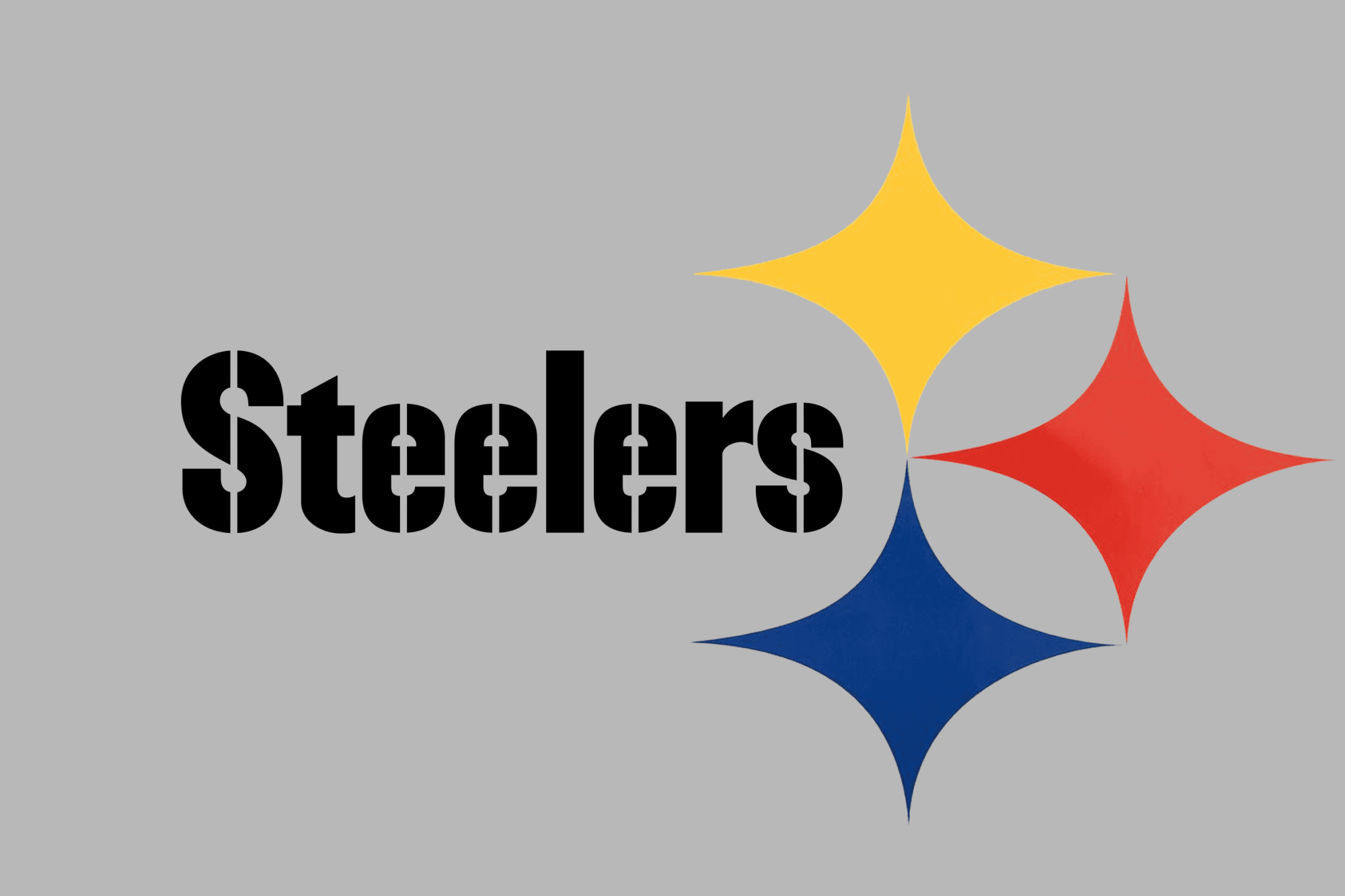
Steelers font refers to the distinctive typeface associated with the Pittsburgh Steelers, an American football team based in Pittsburgh, Pennsylvania. Characterized by its bold, angular contours and sharp edges, this font reflects the toughness and competitive spirit of the team.
It’s commonly seen in the team’s logo, promotional materials, and merchandise, contributing to the Steelers’ brand identity and fan culture.
You can find more free Logo fonts here.
Uppercase, Lowercase & Symbols Font
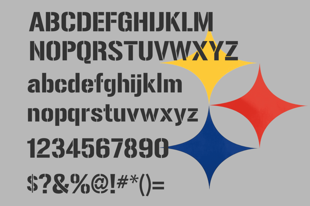
History of the Steelers Font
To understand the Steelers Font, we must first travel back to the 1960s—a landmark football and graphic design era. Founded in 1933, the Steelers embarked on a branding transformation to align with their growing presence in the NFL. The classic ‘Steelers’ font emerged from this, typifying the strength, solidity, and tradition the team is renowned for.
The font’s roots lie in a designer whose vision transcended the world of sports. Its creation resulted from circumstance, as so many enduring designs are. Yet, when its form came into being, it seemed like it had always existed, perfectly suiting the persona of one of football’s most storied franchises.
Characteristics of the Steelers Font
Steelers Font is characterized by features that capture the essence of the team’s identity, visually conveying strength, dynamism, and a deep-rooted heritage.
Notable characteristics include:
- Bold Block Letters: This font uses thick block letters that stand out and convey a sense of solidity and presence.
- Sharp Angles: Unlike round, soft typefaces, the Steelers Font incorporates sharp angles that suggest motion and aggression, mirroring the physicality of football.
- Italicized Stance: The letters lean forward, giving the impression of movement and forward momentum, reflecting a team always driving towards victory.
- Gold Outline: Often encased in a gold outline or shadow, the font pays homage to one of the team’s primary colours, enhancing visibility and tying it closely to the team’s visual identity.
- Unique “Steel” Texture: In certain applications, the font is rendered with a steel texture, nodding to Pittsburgh’s industrial heritage and the team’s ironclad determination.
Usage of the Steelers Font
The usage of the Steelers Font transcends merely appearing on team merchandise and promotional material; it has become a symbolic representation of the Pittsburgh Steelers’ brand across various platforms. Here is a detailed overview of how this font is employed:
1. On Team Gear
The most visible use of this font is on the team’s gear, especially the jerseys, helmets, and the legendary Terrible Towels. This font makes the player numbers and names immediately recognizable, creating a strong visual identity on the field.
2. Official Communication
From press releases to social media posts, the Steelers Font is an integral part of the team’s communication strategy. It ensures consistency across all platforms, reinforcing the team’s brand identity.
3. Fan Merchandise
A wide array of Steelers merchandise, including t-shirts, caps, and banners, features the iconic font, allowing fans to wear and display their support for the team physically. This has not only bolstered team spirit but also turned the font into a symbol of community among fans.
4. Stadium Signage and Decor
Inside and outside Heinz Field, this font adorns signs, banners, and murals, enveloping fans in the team’s identity the moment they enter the stadium. This immersive experience is crucial for building the atmosphere on game days.
5. Digital Media
The Steelers Font has adapted well to the digital age, prominently featured on the team’s official website, mobile apps, and digital advertising. This consistent visual branding helps unite the team’s digital presence with its physical one.

