Glittery Font
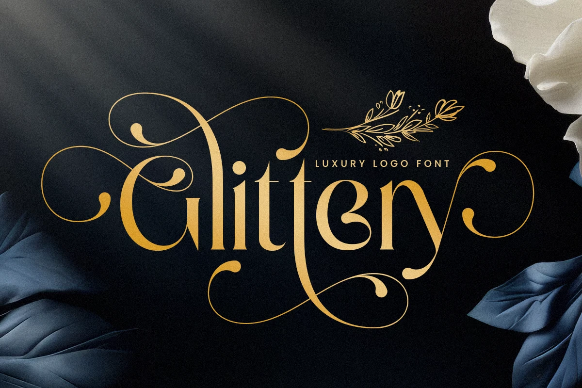
A glittery font is a font that has a glittering and sparkly appearance and is created to mimic glitter in the real sense. This effect is usually realized with gradient, texture, and layer styles that imitate the image of light reflection from small and shining particles.
Shiny fonts are widely used in web design and are often applied as headings, invitations, and decorations for graphic design if you need a shine or celebration note. These can be rather expressive and overstated or simple and almost lyrical to fit into various artistic designs.
You can find more free Script fonts here.
Uppercase, Lowercase & Symbols Font
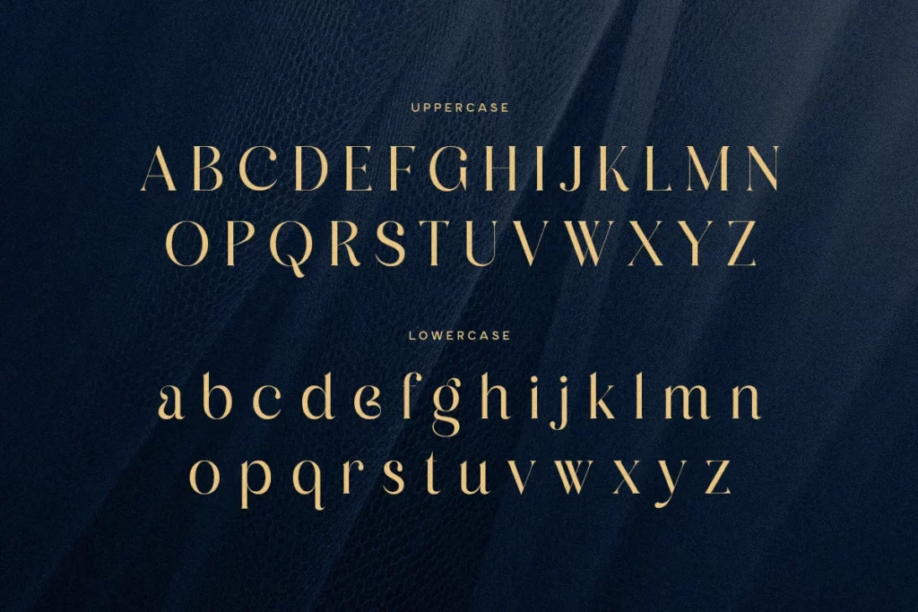
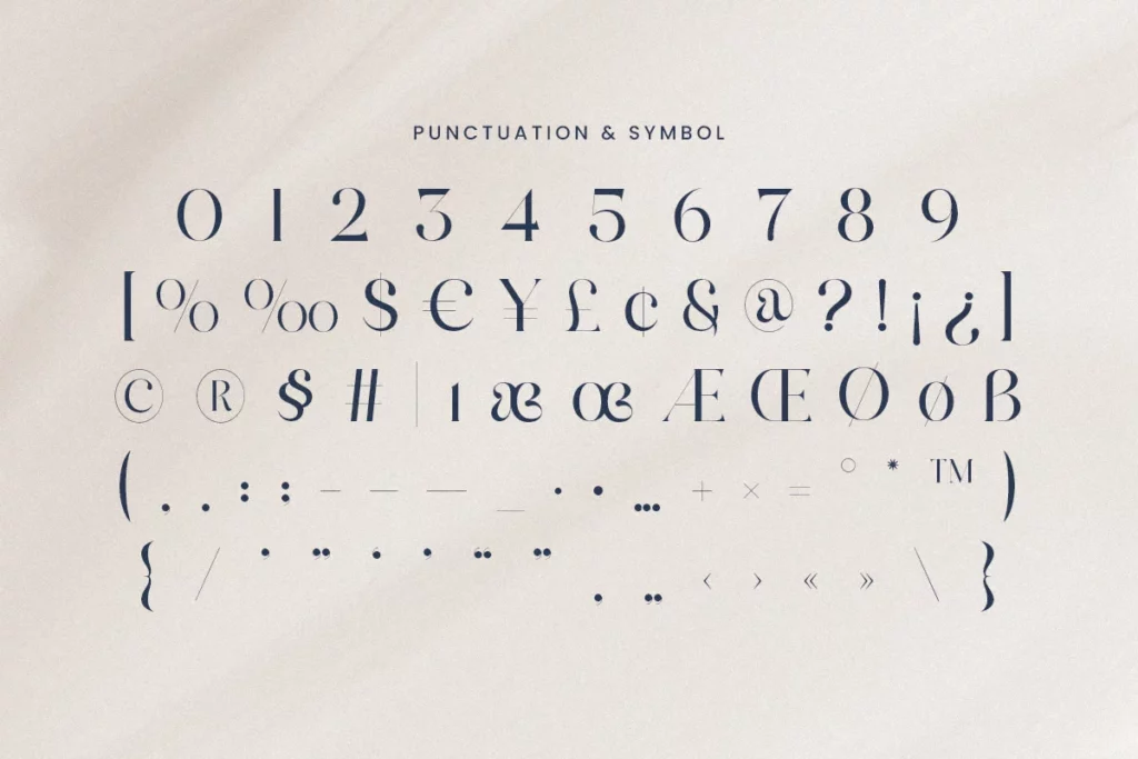
History of Glittery Font
The history of glitter fonts can be understood from the development of digital designs and typography at the end of the twentieth and twenty-first centuries. With the development of computer graphics and the advancement of digital editing tools, designers could play with texture and effects, which led to the possibility of new forms of typographical style.
The use of glossy fonts increased side by side with the growth of the internet, mainly when web designers were trying to find out how to catch the audience’s attention and make their creations vivid against the background of the constantly expanding internet clutter. Earlier, glitter effects were created by overlayers, which involved a lot of time, but with new technology available, greater details and ease are possible.
The use of glittery fonts was at its highest during the Y2K, and the fad became popular in the early 2000s. Today, they adapt to new technologies, but they still remain true to the original template and provide all sorts of variations for the old schoolers and the modern designers.
Features of Glittery Font
- Shimmering Appearance: Obviously, glittery fonts are those in which the font’s surface resembles actual glitter and is created using specific design mechanisms.
- Gradient Effects: Sometimes, add gradient effects to make the glitter look more genuine and create a feel of the real light depth.
- Textural Elements: It utilizes texture so that it recreates the sense of touch, creating an interactive image.
- Versatile Styles: These come in some designs and thicknesses, which may be conspicuous and daring to those that are discreet and playful, allowing them to be incorporated into many diverse projects.
- Layered Design: Features usually consist of additional layers and designs to make the product look as interesting as possible.
- Color Variability: Comes in several colors, providing the designer with the versatile means of choosing the most appropriate shade for the job at hand.
- Digital Flexibility: Designed primarily for the online, a set of characteristics means they are highly flexible and can be altered and improved with current image software.
- Emotional Appeal: Me has fewer energy vibrations than gold and provokes desire, romance, and happiness, so they are ideal for designs of festive or ceremonial linings.
How to Use Glittery Font
It’s important to know how to properly incorporate glittery fonts into your designs to make them more sophisticated and shiny. Here’s a detailed guide on how to incorporate these fonts into your work:
1. Selecting the Right Context
To properly choose the right context to apply glittery fonts, choose based on gathering tone and project goal. I see shiny and glittery fonts as appropriate for events that need some form of celebration or glamour.
They are perfect when used for inviting people to an event or sending out holiday cards or if the purpose of your promotion is to grab the viewers’ attention and make them associate the brand with happiness and the feeling of luxury. However, it should not be overdone since using it together with other styles creates a dull appearance because of the overwhelmed sparkle effect.
2. Combining with related font
To add insert workings well with gilt, matching glittery fonts to equal typefaces is important. This entails choosing fonts that augment readability while simultaneously allowing and or emphasizing the glittery features.
The heading is glittery, and the body text is simple and clean, so just because the heading is so intricate, you can use a simple font for the body text. Times New Roman font is good for this because it is formal and classic, and the sans-serif fonts look best for the flashy options.
3. Color Coordination
The use of colors is very critical when one is using glittery fonts. Choose a color that blends with your design palette and will give a better outlook to the glitter rather than having a color that will turn the glitter off.
If you want the outfits to be detailed and unnoticeable, you should select monochromatic or close tones. If the desired effect is high, combinations are better to make the glitter as visible as possible. It is important that any writing stays and reads as attractive to the audience as is necessary.
4. Technical Considerations
When using glittery fonts appropriately in digital designs, there is a need to consider issues to do with file formats and resolution. Sparkle features depend highly on high-resolution graphics, especially in printed media.
Also, it is possible to check compatibility with different screens and devices to maintain the font’s looks intact. If the graphical effects are scalable, incorporate vector-based glitter effects into the messages as much as possible.
It’s vital to use colorful bits, such as glittery fonts, to aim for creativity and achieve meaningful visual appeal that is not disruptive to clear communication.
This font is free for personal use; click here for commercial use.

