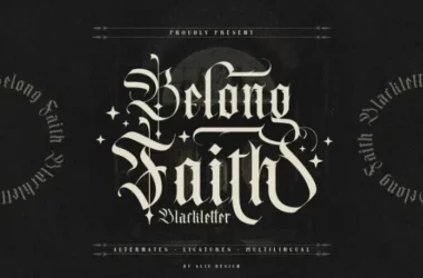
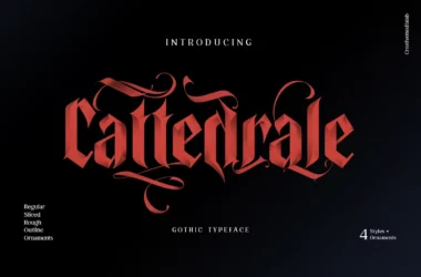
Attack on Titan Font
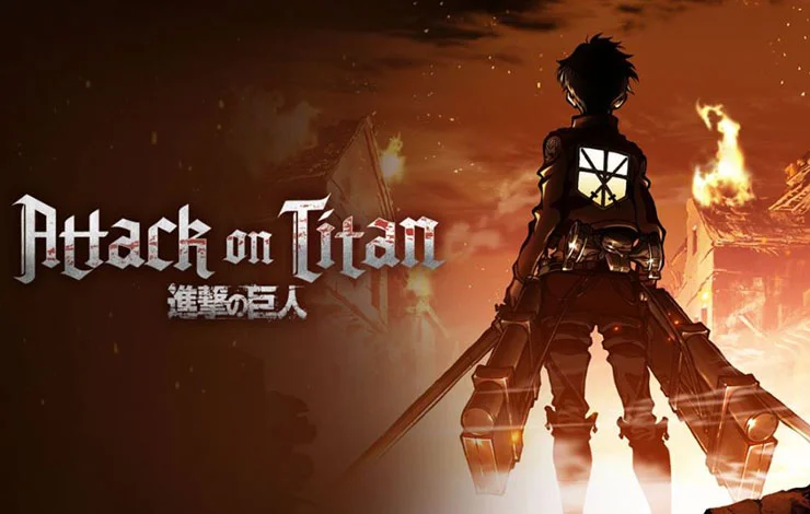
Attack on Titan font refers to the distinctive typeface used in the title logo of the popular manga and anime series “Attack on Titan.” This font captures the essence of the series’ dark and intense atmosphere, characterized by its rugged, uneven lettering that seems to echo the dystopian and confrontational themes of the narrative.
While not officially released for public use, several fan-made font versions have been created to mimic the style in the series’ promotional materials and merchandise.
You can find more free Blackletter fonts here.
Uppercase, Lowercase & Symbols Font


History of the Attack on Titan Font
From the towering walls encapsulating a perilous world to the grandiose title sequences, ‘Attack on Titan Font’ has always been about epic scale. However, it’s not just the narrative that pushes the boundaries; it’s also the intricate detailing down to typography. The show’s title has become emblematic, not just for its artwork, but for the unique font developed for its branding.
The font certainly doesn’t scream ‘anime’ in the traditional sense. Instead, it draws from gothic lettering, with sharp edges and a kind of ‘seriousness’ that commands attention, much like the story it is a part of. But where did this font, so central to the series’ branding, come from? How was it designed, and what makes it so fitting for ‘Attack on Titan’?
Elements of the Attack on Titan Font
The distinctive font used in Attack on Titan Font is characterized by several unique elements that make it instantly recognizable and deeply evocative of the series’ themes:
- Gothic Influences: The font draws heavily from Gothic typography, known for its angular, dark, and sometimes foreboding aesthetics. This choice mirrors the series’ intense and dramatic atmosphere.
- Sharp Edges: Each letter is designed with sharp, precise edges, conveying a sense of urgency and danger, much like the constant threat that the Titans pose to humanity within the series.
- Varying Thickness: The strokes of the letters vary in thickness, creating a dynamic tension within the text itself. This variability adds visual interest and depth, reflecting the complex narratives woven throughout the series.
- Slightly Distressed: The font appears slightly worn or distressed, hinting at the wear and tear of the walls and the battles waged against the Titans. This subtle touch adds a layer of authenticity and age, suggesting a story long in the making.
- Condensed Letters: The letters are tightly packed together, which makes the title more impactful and symbolizes the cramped confines within the walls and the closeness of the community fighting for survival.
These elements together create a font that is memorable and deeply symbolic of the Attack on Titan Font series, blending seamlessly with its storytelling to enhance the overall visual and emotional impact.