Bouden Font
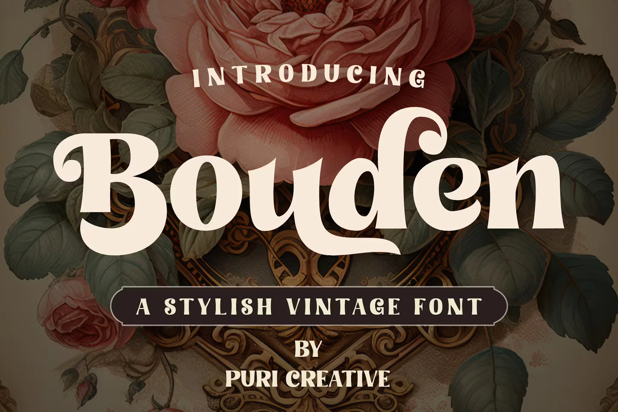
Bouden Font is a typeface that exudes strength and purpose through its robust letterforms, making it a quintessential choice for projects that demand bold visual language.
Originating from the ‘serif’ family, Bouden’s letters feature small lines or decorative features at the ends of the strokes, giving it a classic and authoritative edge.
You can find more free Vintage fonts here.
Uppercase, Lowercase & Symbols Font


Characteristics of Bouden Font
The core of Bouden Font’s allure lies in its distinctive characteristics that set it apart from its contemporaries. Here’s a closer look at what makes this font such a compelling choice:
- Boldness Personified: This font is renowned for its bold and firm-appearing glyphs. The thickness of the strokes combined with the contrast between the thin and thick lines within the letterforms commands attention and conveys a strong sense of presence. This characteristic is why Bouden is predominantly chosen for headlines, logos, and any design element where the emphasis is key.
- Classic with a Twist: Despite its boldness, Bouden possesses an unexpected subtlety within its design. While the serif elements nod to classical typography, they are not overly ornate, allowing the font to maintain a contemporary aesthetic. The ‘twist’ in its classic roots makes Bouden Font versatile—it can add gravitas to a traditional design or provide a sense of history to a modern context.
- Readability and Versatility: For a font that is so visually impactful, Bouden surprisingly maintains excellent readability. This trait is critical, especially for web designers who must ensure their typefaces are clear and readable across various devices and screen sizes. Bouden’s versatility extends beyond readability; it adapts well to different color schemes and design elements without losing character.
Applications of Bouden Font
Bouden Font finds a home in a myriad of design applications. Understanding where and how to use this typeface can significantly enhance the aesthetic and effectiveness of your design projects.
Branding and Marketing
In the realm of branding, this font is invaluable. Its commanding presence can help a brand stand out and be memorable. Logos, product names, and taglines rendered in Bouden become more than just words—they become powerful brand ambassadors that speak to the ethos and goals of the company. Bouden can elevate the message in marketing materials, ensuring it’s received with the intended weight and significance.
Editorial and Print Design
For editorial and print design, Bouden’s readability and classic yet bold appearance make it an excellent choice for titles, headers, and other prominent text elements. Whether it’s the cover of a magazine, the title of a book, or the header of a report, Bouden Font ensures that the most important message is delivered in a sophisticated and bold manner.
Digital and UI/UX Design
Fonts play a crucial role when designing for the digital world, especially in user interfaces and the broader user experience. Given the clarity and visual weight of Bouden, it’s an ideal candidate for digital environments where the challenge is to present information clearly and with an aesthetic that mirrors the brand’s image. Bouden can be integrated into UI elements, website banners, and digital ads to maintain consistency with the offline presence and lend a sense of reliability and trust.
Tips for Using Bouden Font Effectively
Despite its inherent assertiveness, using Bouden Font effectively requires a designer’s touch. Here are some tips to ensure you wield its visual power with intention and finesse.
- Pairing with Complementary Fonts: This font can be paired with various complementary typefaces to create a balanced design. Sans-serif fonts such as Helvetica or Lato work well for body text, offering a clean contrast to Bouden’s serifs. Consider a script typeface for subheadings or call-to-action elements for a more decorative approach. A strong font pairing strategy ensures the design is harmonious and every font serves its specific purpose.
- Scale and Hierarchy: Be mindful of scale and hierarchy when using Bouden Font. Its bold nature makes it ideal for headlines and titles, where scale and prominence are non-negotiable. However, within a design, it should be used sparingly to maintain readability and not overwhelm the viewer. Establishing a clear hierarchy with Bouden will guide the eye and highlight the most important content within your design.
- Contextual Integration: Integrate this font within a context that enhances its inherent character. For example, in historical contexts or designs that evoke a sense of tradition, Bouden’s classic serifs can underline the thematic elements. In contrast, modern contexts can be amplified by using Bouden for its boldness, juxtaposing with more contemporary design elements, creating visual interest and dynamism.
- Color and Texture: Using color and texture can further enhance the impact of Bouden Font. While Bouden is often used in solid colors due to its boldness, gradients or subtle textures can add depth and dimension to the type, especially in digital or print applications. Experiment with different color combinations to find a palette that complements Bouden and amplifies the overall design.
This font is free for personal use; click here for commercial use.