iPhone Font
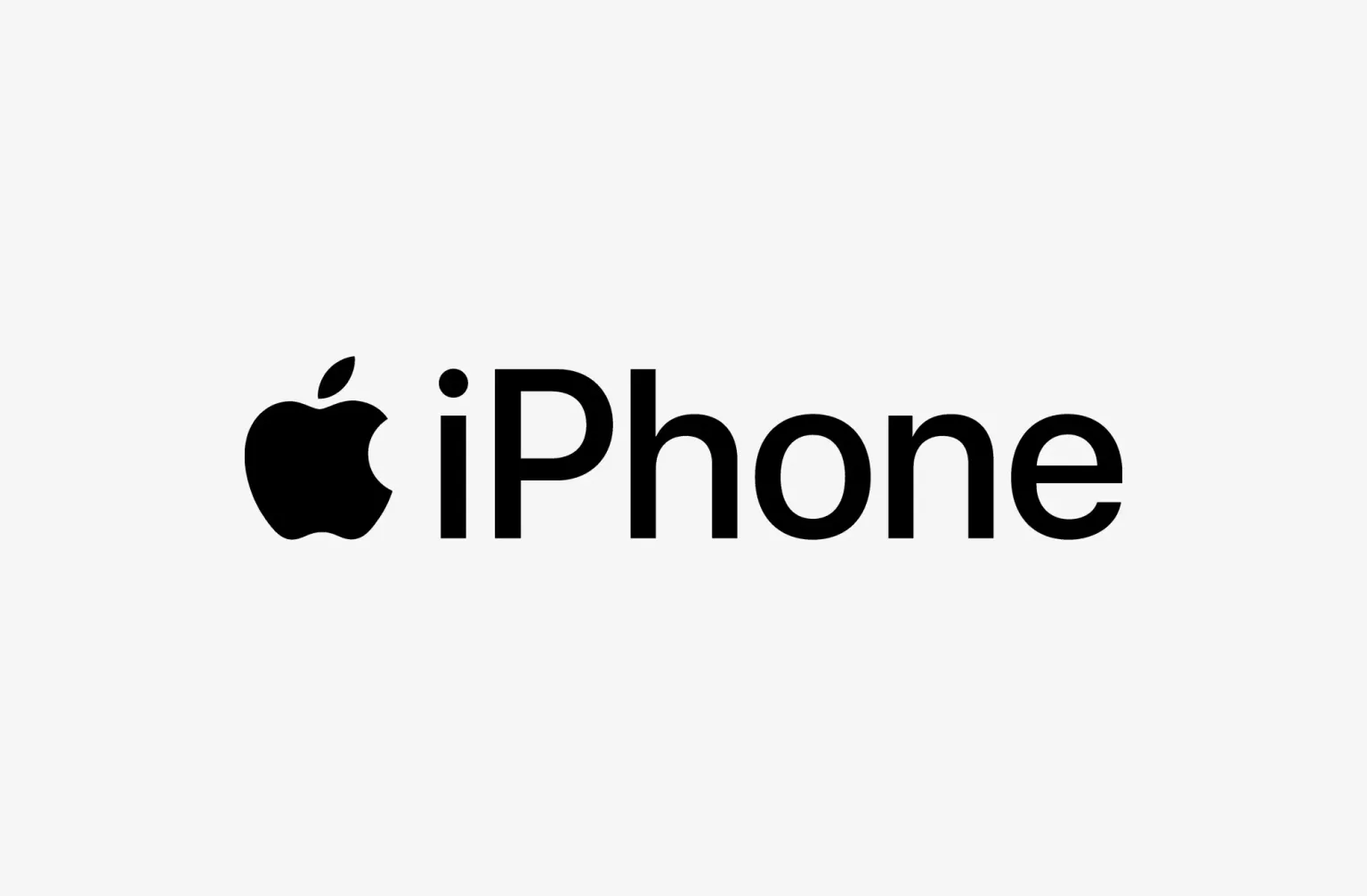
“iPhone font” primarily refers to the default typeface used in Apple’s iPhone interface and system. Historically, Apple employed “Helvetica Neue” as the standard font for iOS 4 to iOS 8. However, with the launch of iOS 9 in 2015, Apple introduced “San Francisco” as the new default font across its operating systems, including iOS for the iPhone.
San Francisco is designed for maximum clarity and readability on digital screens, featuring classic and contemporary styles that enhance the user interface’s aesthetics and functionality.
You can find more free Logo fonts here.
Uppercase, Lowercase & Symbols Font


History of iPhone Font
Apple has always been known for its attention to design. The iPhone font is no exception and has been carefully curated to reflect the brand’s minimalistic yet forward-thinking aesthetic. The iPhone’s font, often referred to as “San Francisco,” first made a significant appearance with the launch of the Apple Watch.
It was designed to be highly legible on a small screen and has since become a core part of the Apple ecosystem, extending to the iPhone, iPad, and Mac. The San Francisco font family has several variants optimized for different screen sizes and purposes, including San Francisco for text, the more compact and adaptive San Francisco Compact, and the rounded San Francisco Display.
Key Features of iPhone Font
San Francisco font, the current standard for the iPhone and other Apple devices, has features designed to enhance readability and user experience.
Here are some key features of iPhone Font:
- Dynamic Type: This feature allows the font to be easily resizable, ensuring optimal readability across all Apple devices. It adjusts the letter spacing and line height automatically, making text easier for users of all ages to read.
- Two Optical Sizes: San Francisco is available in two optical sizes: Text and Display. The Text style is optimized for smaller text sizes, improving legibility in paragraphs and smaller elements. The Display version is intended for larger text, used in headings and where text size exceeds 20 points, providing clarity at larger scales.
- Weight Variations: San Francisco offers a range of weight variations from Ultralight to Black, allowing designers to create contrast and hierarchy within their typography, making the interface more dynamic and engaging.
- Distinct Character Shapes: The font has open apertures and a taller x-height to enhance clarity. This makes each character more recognizable at a glance, which is crucial for quick reading on mobile screens.
- Proportional and Monospaced Numbers: San Francisco includes proportional and monospaced (tabular) numeric styles. Proportional numbers blend more seamlessly with body text, while monospaced numbers are crucial for aligning columns of numbers in tables and lists.
The careful consideration of these features in the iPhone’s font reflects Apple’s commitment to both aesthetic appeal and functional design, ensuring that text is beautiful, thoroughly readable, and adaptable to various contexts and needs.
Pros and Cons of iPhone Font
Like any design choice, the iPhone font has its share of admirers and critics. Here’s a look at what makes it beloved and where it might fall short:
Pros
- A Unified Brand Aesthetic: Apple maintains a consistent brand image by using the San Francisco font across its devices. This visual cohesiveness is aesthetically pleasing and reinforces a sense of brand identity and trust with consumers.
- Modern and Accessible Design: San Francisco’s design is modern, clean, and accessible. It is designed to focus on modern screen resolutions and the nuances of digital interfaces, ensuring a contemporary look that aligns with user expectations.
- Sensitive to Space: The font’s adaptive qualities allow it to remain readable and aesthetically pleasing even in challenging spaces, such as the small screen of an Apple Watch or in the compact layout of the iPhone’s home screen.
Cons
- Durability of Design: While a strong and consistent design is beneficial, there is also a risk of sameness. Some critics argue that the uniform application of the San Francisco font across various contexts can stifle creativity and lead to a lack of differentiation.
- Limited to One Ecosystem: iPhone font, like any proprietary design element, is limited to the Apple ecosystem and cannot be used by designers who work across platforms, potentially creating a barrier to entry for some users and developers.
- Subjectivity of Aesthetics: Aesthetic choices will always be subjective, and not everyone may be drawn to the particular look and feel of the San Francisco font. Some users and designers may prefer the expressive variety of other typefaces.

