Money Font
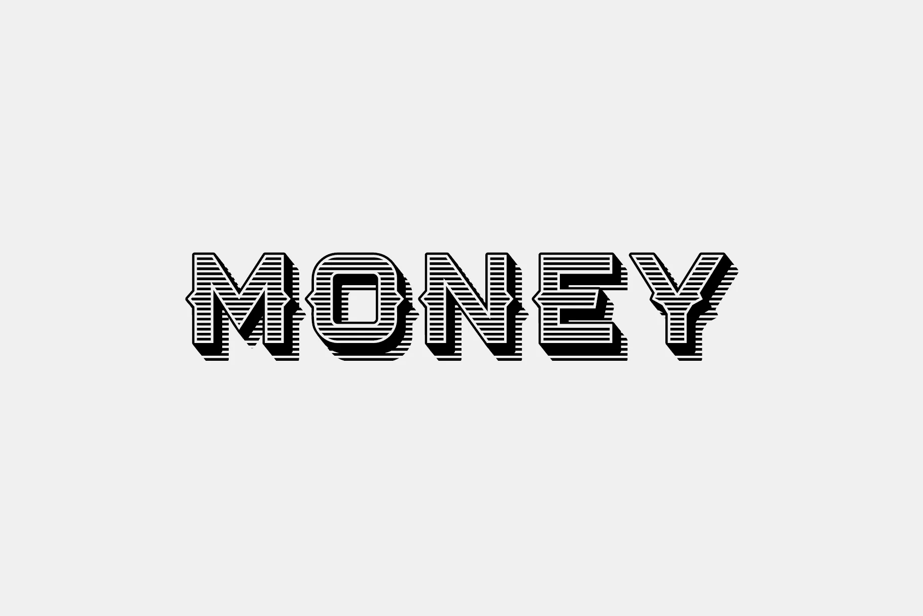
“Money Font” refers to a style of typeface that evokes thoughts of wealth, prestige, and sophistication. These fonts are often used in the branding and promotional materials of financial institutions, luxury brands, and high-end services.
They might feature sleek, elegant lines, or incorporate symbols and elements associated with currency, such as dollar signs or the appearance of engraved detail reminiscent of banknotes. The goal of using a money font is to convey a sense of trustworthiness, stability, and exclusivity.
You can find more free Display fonts here.
Uppercase, Lowercase & Symbols Font

History of Money Font
Money Font, a term that symbolizes the intricate relationship between typography and fiscal value, traces its origins back to ancient civilizations. The concept evolved from the need to authenticate currency, prevent counterfeiting, and signify wealth and stability. Early examples include the intricate designs on currency from the Roman Empire to the detailed scripts on East Asian coinage. Over centuries, as economies expanded and paper currency emerged, typography became an essential tool in the design of money.
Specialized fonts were developed to include unique, hard-to-replicate features that added a layer of security. Today, this font embodies a blend of artistry, technology, and security, showcasing not only a nation’s identity but also its technological prowess and commitment to protecting its economy.
Characteristics of Money Font
Money Font embodies several distinctive characteristics that set it apart from more conventional typography, including:
- Complexity: This font often features intricate patterns, fine lines, and detailed imagery that are difficult to reproduce accurately without advanced printing technology.
- Uniqueness: Each currency adopts a unique set of fonts and design elements, reflecting a country’s culture and history. This uniqueness also serves as a deterrent to counterfeiting.
- Microprinting: A common feature in money font is microprinting, where extremely small text that is difficult to duplicate is used. This text is often visible only under magnification.
- Security Features: Beyond the visual appeal, this font incorporates security features such as color-shifting inks, watermarks, and holograms that are integrated into the font design.
- Readability: Despite their complexity, these fonts are designed to be highly legible, ensuring that the denomination and other important information are easily recognizable.
- Durability: The fonts and designs must withstand the physical wear and tear of being handled, so they are crafted to maintain legibility over time despite fading or damage.
Tips for Using Money Font
When working with Money Font, especially for design or educational purposes, there are several key considerations to ensure effectiveness and authenticity.
Here are some tips:
Understand the Purpose
- Security: Recognize that a major role of this font is to provide security features. When creating designs intended to mimic currency, understanding how to incorporate complex elements without violating legal restrictions is paramount.
- Educational Tools: If this font is being used in educational materials, focusing on the history and design intricacies can provide valuable lessons in art, history, and technology.
Respect Copyright and Legal Restrictions
- Do Not Replicate for Fraudulent Purposes: It’s illegal to produce counterfeit currency or documents that could be mistaken for legal tender. Always ensure your design cannot be misconstrued as an attempt to create counterfeit money.
- Use Licensed Fonts: For projects that require a currency-like appearance, use commercially available fonts that are designed to look complex and secure but are licensed for such use.
Incorporate Security Features Mindfully
- Include Watermarks and Holographic Designs: For projects that benefit from added security (e.g., tickets, vouchers), consider using features inspired by Money Font, like watermarks or holographic designs, which can be legally incorporated into your project.
- Microprinting: For projects where detail is critical, consider using microprinting. This can add an authentic touch to educational materials or high-security documents, mimicking the security features of actual currency.
Focus on Legibility
- Ensure Clarity: Despite the inherent complexity of this font, the primary information should remain legible. This is crucial for documents or designs where conveying information is the main goal.
Choose Durability for Physical Products
- Material Selection: When designing something that will be handled frequently (e.g., tickets, vouchers), choose materials that preserve the legibility and integrity of this font over time.
Consider Cultural and Historical Significance
- Reflect Cultural Identity: If you’re creating a design for a specific regional event or an educational tool focusing on a particular country, research and incorporate elements from the font that reflect the country’s culture and history appropriately.
By adhering to these tips, designers, and educators can effectively use Money Font to enhance their projects, ensuring they remain educational, secure, and legal.