Montserrat Font Family
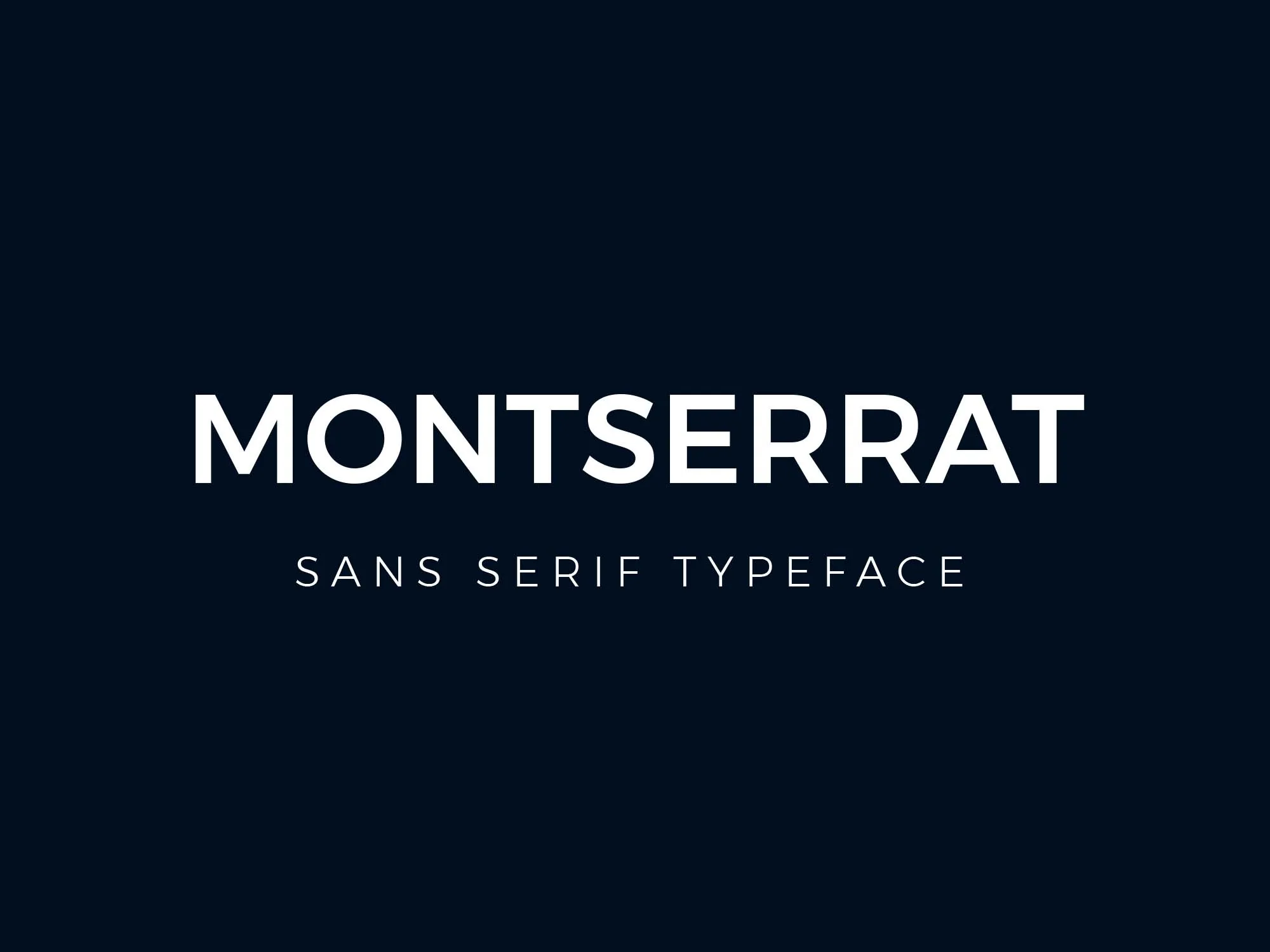
Montserrat font family is a contemporary sans-serif typeface inspired by the traditional signage found in the historical neighbourhood of Montserrat, Buenos Aires. Designed by Julieta Ulanovsky, this typeface aims to rescue the beauty of urban typography from the first half of the 20th century.
Its character set supports many languages, making it a versatile choice for global applications. Montserrat is known for its geometric curves and visual harmony, making it suitable for body text and headlines. Available in various weights, the Montserrat font family offers flexibility for designers seeking a modern, yet timeless aesthetic for their digital and print projects.
You can find more free sans-serif fonts here.
Uppercase, Lowercase & Symbols Font

History of Montserrat Font Family
The story of the Montserrat font family is as diverse as the projects it now adorns. Designed by Julieta Ulanovsky, this typeface draws inspiration from the street signage of the Montserrat neighbourhood in Buenos Aires. Much like the font, the neighbourhood speaks to a time when the vernacular was part of a grassroots revolution in typography.
The Montserrat typeface is a tribute to the Montserrat neighbourhood’s urban and independent spirit, reflective of the social and cultural movements that gave birth to street design and its rich, idiosyncratic letters, one of the characteristics that make it unique. The community signage in Montserrat is an eclectic mix of old and new, often influenced by the Art Deco movement, which can still be seen on the streets and buildings today.
Typeface Characteristics of Montserrat Font Family
Montserrat font family exhibits several key characteristics that make it stand out in the realm of typography. These features contribute to its versatility and widespread use in both digital and print design:
- Geometric Shapes: Montserrat is heavily influenced by geometric shapes, particularly circles and squares, which give it a modern, clean appearance. This aspect allows for a cohesive look in various applications, from logos to paragraph text.
- Weight Variations: With a wide range of weights, from thin to extra bold, Montserrat provides designers with a rich palette with which to work. This variability enables the font to be adaptable across different design contexts, ensuring it can be both delicate and powerful.
- Large x-height: The font’s large x-height enhances its readability and highlights the text’s distinctive character. This feature makes Montserrat particularly effective for on-screen reading, where clarity is paramount.
- Slightly Condensed Letterforms: While Montserrat is not overtly condensed, its letterforms have a subtle narrowness that allows for efficient use of space. This makes it an excellent choice for UI/UX design, where space can often be at a premium.
- Sharp Terminal Ends: The sharp finishes on certain letters, such as ‘a’ and ‘s’, contribute to the font’s modern flair. This detail adds a touch of elegance and uniqueness to the overall design.
- Character Variations: Montserrat includes a set of alternative characters that can be used to give projects a custom feel. This level of customization is appreciated by designers looking to create unique visual identities.
Use Cases of Montserrat Font Family
The Montserrat font family’s versatility and aesthetic appeal make it an excellent choice for various design projects. Below are several key areas where Montserrat can be effectively utilized:
1. Web Design
In the digital realm, Montserrat has become a favourite for web designers. Its readability and modern geometric shapes make it perfect for website headers and body text. Its availability through Google Fonts makes it easily accessible and implementable in web projects, ensuring that sites load quickly without sacrificing design quality.
2. Logo Creation
Montserrat’s range of weights and sharp terminal ends provide a sophisticated foundation for logo design. The font’s geometric precision and contemporary feel allow it to stand out in brand identities, making logos memorable and impactful.
3. Editorial Design
Montserrat offers an elegant, refined look that enhances legibility for magazines, newsletters, and online publications. Its high x-height and slight condensation allow for efficient use of space, making it an ideal choice for print and digital editorial content.
4. UI/UX Design
The slightly condensed letterforms of Montserrat make it an outstanding option for user interfaces, where space is often limited. It offers clear readability on small screens, such as mobile phones and tablets, improving user experience across various digital platforms.
5. Advertising and Marketing
Montserrat’s versatility extends to the advertising and marketing spheres, where its array of weights and character variations can be used to create engaging, attention-grabbing content. Montserrat helps convey messages with clarity and style, from billboards to social media posts.
6. Packaging Design
In the realm of packaging, Montserrat Font Family’s clean lines and geometric influences provide a modern look that can adapt to a wide range of products. Whether it’s food packaging, cosmetics, or tech gadgets, Montserrat adds elegance and professionalism to enhance brand perception.