NASA Font
NASA Font, officially known as “Nasalization,” is a futuristic typeface that pays tribute to the National Aeronautics and Space Administration’s iconic logo and visual identity.
This font captures the essence of space exploration and technology through its clean, modern lines and rounded edges, reflecting the forward-thinking vision of NASA. Nasalization is widely utilized in projects that aim to evoke the spirit of scientific discovery, innovation, and the boundless possibilities of the cosmos.
You can find more free Logo fonts here.
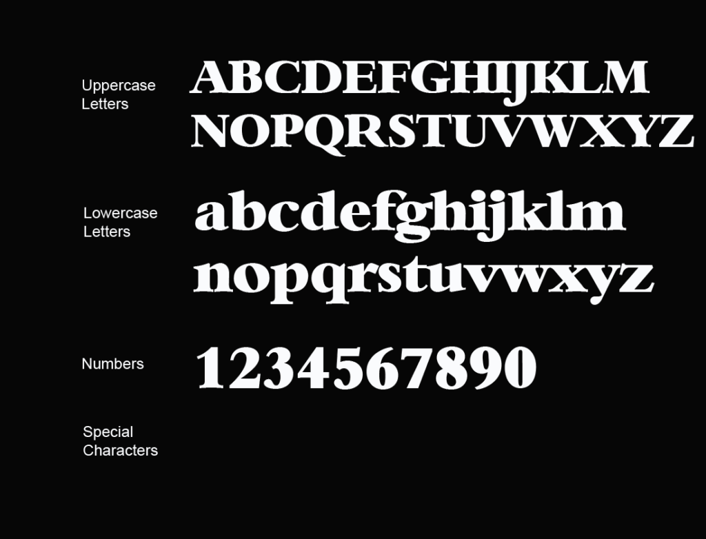
Uppercase, Lowercase & Symbols Font
History of NASA Font
In 1974, Richard Danne and Bruce Blackburn, two designers at the renowned New York brand consultancy Danne & Blackburn, received an extraordinary commission. To overhaul the visual identity of NASA. Then, known as the National Aeronautics and Space Administration, NASA was looking to modernize its look and feel. The existing ‘meatball’ insignia, a classic symbol of the space age, was deemed archaic in a world rapidly adopting sleek, futuristic visual branding.
The resulting ‘worm’ logo, a name derived from the snaky line of the new stylistic rendering of “NASA,” introduced a cleaner and more modern take on the NASA brand. The accompanying NASA font also underwent a significant update. The angular, futuristic typeface became synonymous with NASA’s bold ventures into the unknown of outer space.
Key Features of NASA Font
NASA font, integral to the ‘worm’ logo’s design, boasts several key features that contribute to its distinctive and futuristic appearance:
- Sans-serif Design: The font eschews any ornamental strokes or serifs, embodying a minimalist and sleek aesthetic that aligns with modern design principles.
- Continuous Stroke Weight: One of the hallmark characteristics of NASA font is the uniform thickness of its strokes, imparting a cohesive and streamlined look.
- Rounded Ends: Unlike sharp or flat terminations, the letters in this font feature rounded ends, which enhance its approachable and space-age feel.
- Unique Letterform Shapes: Certain letters in the font, such as ‘A’ and ‘M’, display unconventional shapes, further distinguishing the typeface from more traditional fonts.
- Optimized for Readability: Despite its stylized appearance, the font maintains high legibility at various sizes, an essential attribute for wide-ranging applications across NASA’s visual communications.
Usage of the NASA Font
NASA font, born from the desire to modernize and propel the agency’s visual identity into the future, found its application in numerous facets of NASA’s communication and branding strategy. Here is a detailed look at how the font has been utilized:
1. Branding and Identity
Central to NASA’s rebranding initiative, the font became a staple of the agency’s identity. It was prominently featured in signage, spacecraft livery, and official stationery, embodying the spirit of innovation and exploration that NASA stands for.
2. Digital Platforms
With the advent of the digital age, NASA font transitioned smoothly onto the agency’s website and social media platforms. It’s used for headers, footers, and highlighted text to ensure consistency across all digital interactions with the public.
3. Educational and Promotional Materials
The font is extensively used in educational programs, brochures, exhibition stands, and promotional materials. Its readability and futuristic aura help engage audiences, disseminating knowledge about space exploration and science in an accessible way.
4. Merchandising
NASA’s font has also become a popular element in merchandise, ranging from apparel to posters, and even toys. These products not only serve as a source of revenue but also play a crucial role in popularizing the space agency and its missions amongst the general public.
5. Beyond NASA
Interestingly, the distinct look of NASA font has inspired its use beyond the organization’s branding. It is frequently adopted in media, such as films and documentaries about space, to evoke the pioneering spirit and technological advancements associated with NASA.

