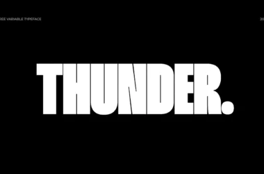
Nevis Font
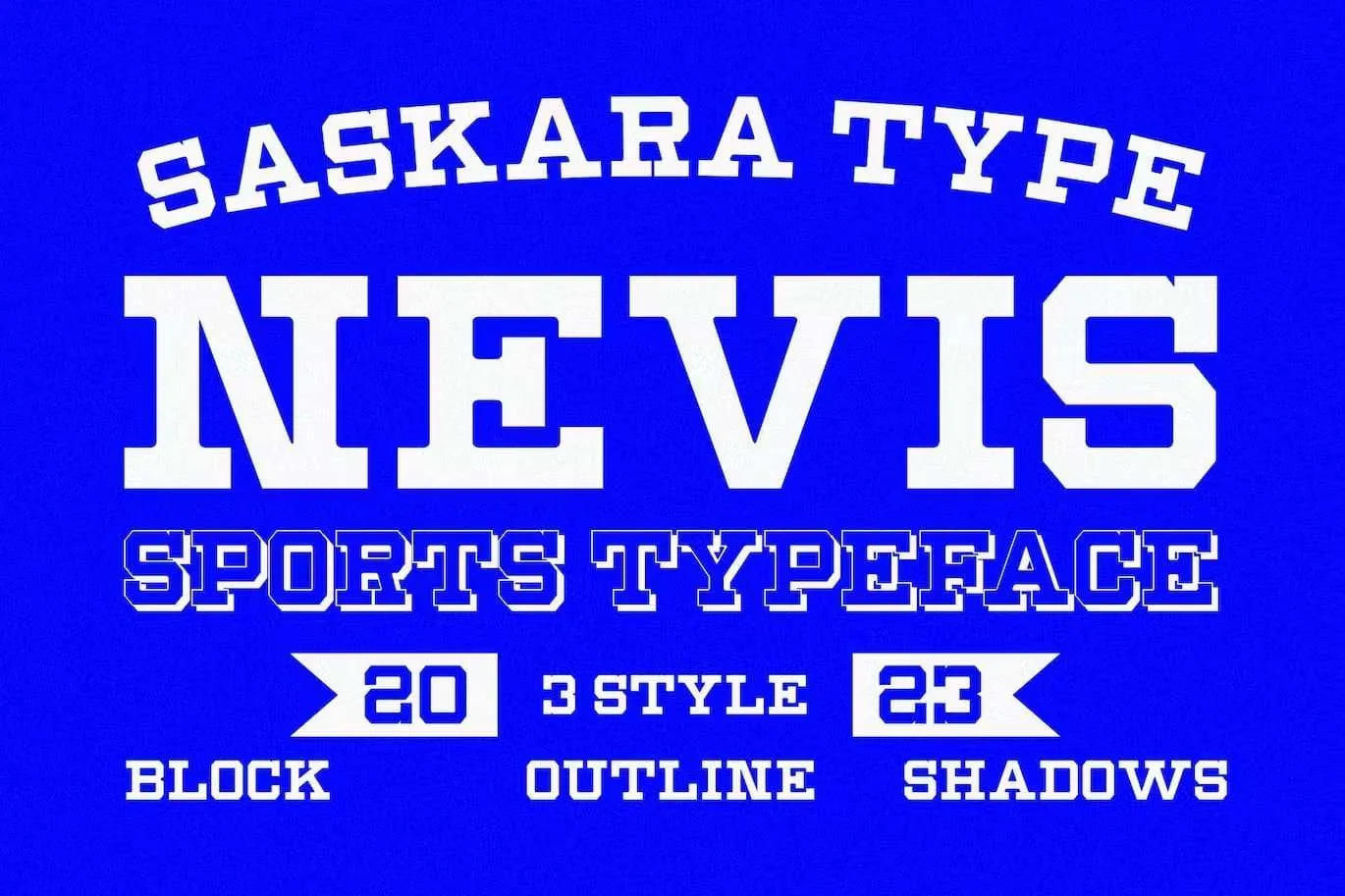
Nevis Font is a strong, angular typeface, well-suited for heading and large display settings. Its bold geometry makes it particularly impactful for attention-grabbing headlines, while its simplicity ensures clarity and readability.
This makes Nevis an excellent choice for web design, corporate branding, and any application where a statement needs to be made with typographic treatment.
You can find more free Slab serif fonts here.
Uppercase, Lowercase & Symbols Font


History of Nevis Font
Nevis Font is a strong, angular typeface often associated with corporate and media visual communication. It was designed to capture attention and convey boldness and reliability. The font’s creation was inspired by the need for clear, impactful typography that could be easily scalable across various digital and print mediums.
Despite its contemporary look, Nevis draws subtle influences from traditional geometric fonts, merging the old with the new to create a versatile typeface suitable for various design projects. Its history reflects the evolving nature of graphic design as designers seek to balance aesthetic appeal with functional readability in an increasingly digital world.
Tips for Using Nevis Font
When incorporating Nevis font into your design projects, consider the following tips to maximize its impact:
- Ensure proper spacing: Nevis is inherently bold and attention-grabbing. Use adequate spacing between letters and words to ensure the text is easily readable, especially in digital formats.
- Use for headings and logos: Given its bold nature, Nevis works best for headings, subheadings, and logos where you want to make a statement or draw immediate attention.
- Pair with a contrasting font: For body text or to create a visual hierarchy, pair Nevis with a more subdued font. A sans-serif or serif font contrasting in weight and style can complement Nevis very well.
- Experiment with cases: Nevis is versatile in both uppercase and lowercase. However, using uppercase for short phrases or titles can amplify its presence, whereas lowercase may be more suitable for longer headings.
- Consider the medium: Nevis stands out in digital media but holds its own in print. Ensure the font size is adjusted accordingly to maintain readability across different mediums.
- Colour matters: The font’s angular nature pairs well with bold colour choices. However, for a more subtle approach, using darker shades against light backgrounds or vice-versa can make the text pop without overwhelming the senses.
Usage of Nevis Font
Nevis font finds its strength and versatility in various applications, each leveraging its unique characteristics to enhance visual communication. Here, we explore some key areas where Nevis is especially effective:
1. Corporate Branding
Nevis is an excellent choice for businesses looking to establish a strong, authoritative brand identity. Its bold, angular lines convey confidence and reliability, making it ideal for company logos, business cards, and corporate websites. In such applications, Nevis helps businesses stand out in a competitive marketplace, embodying professionalism and forward-thinking.
2. Digital Content
In digital content, including websites and social media, Nevis ensures that headings and call-to-action buttons are immediately noticeable. Its clear, impactful appearance enhances user navigation and engagement, conveying important messages with clarity and precision.
3. Editorial Design
Magazines and editorial platforms benefit from Nevis Font’s ability to attract and hold the reader’s attention. Whether used for article titles, headings, or pull quotes, this typeface adds a layer of sophistication and emphasis, guiding readers through the content’s hierarchy seamlessly.
4. Advertising and Promotional Material
Nevis shines in advertising and promotional materials, from posters and flyers to banners and digital ads. Its boldness cuts through the noise, capturing the viewer’s attention and conveying key messages at a glance. When paired with dynamic imagery and compelling copy, Nevis elevates the overall impact of promotional content.
5. Packaging Design
On product packaging, Nevis can be a game-changer. Its strong presence commands attention on crowded shelves, contributing to brand recognition and consumer recall. Utilizing Nevis on packaging ensures product names and essential information stand out, appealing directly to consumers.
6. Signage and Environmental Graphics
For signage, wayfinding, and environmental graphics, the readability and attention-grabbing nature of Nevis Font make it a go-to choice. In busy urban spaces or within large facilities, its clear and direct style ensures that information is conveyed effectively, guiding and informing viewers at every turn.