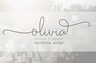
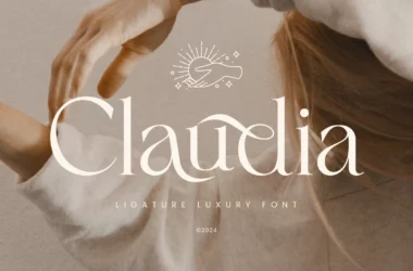
Parisian Font
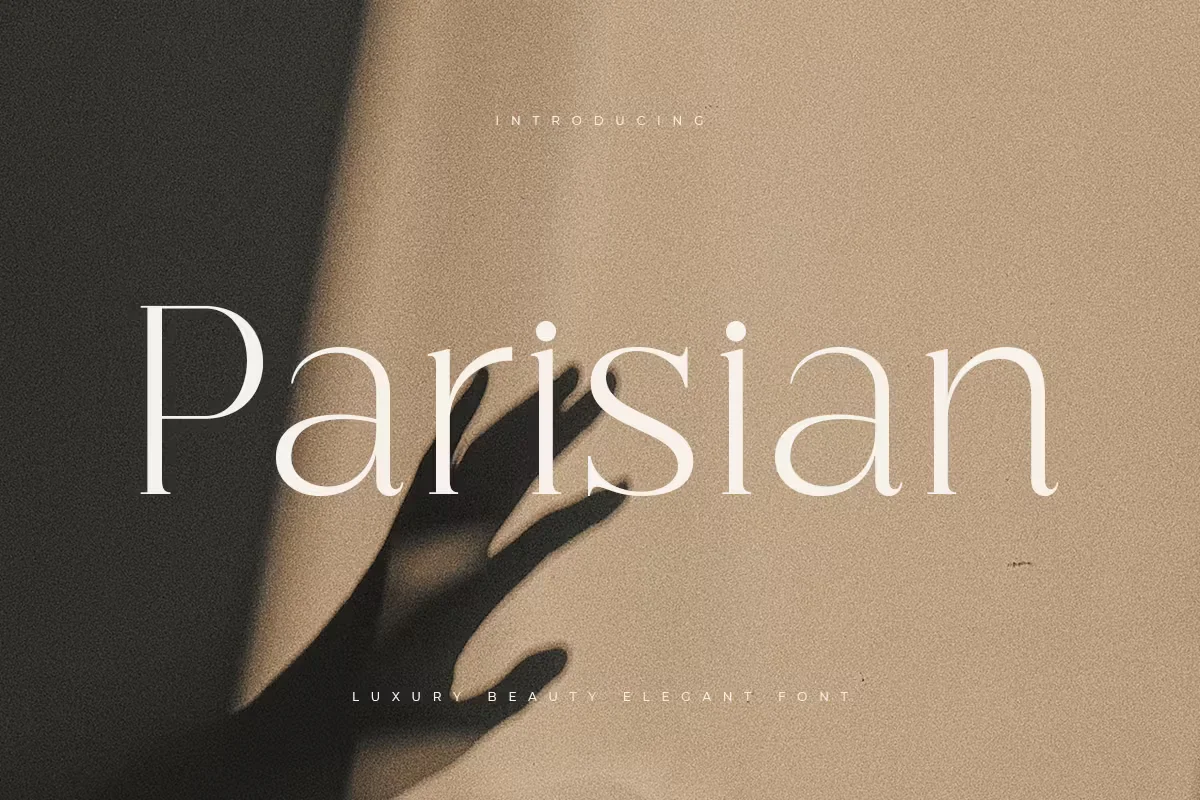
Parisian font is a decorative typeface, known for its vintage and elegant flair, reminiscent of early 20th-century Parisian art and design. This font is characterized by its stylish and slender letterforms, it exudes sophistication and charm.
It is often used in contexts that require a touch of elegance, such as wedding invitations, branding for boutique businesses, or upscale restaurant menus. Parisian’s distinct allure lies in its ability to transport the reader to a bygone era of glamour, making it a timeless choice for designers seeking to infuse their work with a classic aesthetic.
You can find more free Luxury fonts here.
Uppercase, Lowercase & Symbols Font


History of Parisian Font
Parisian font, also known as Parisine, is a modern rendition of early 20th-century lettering styles seen on Paris’ indicators like the Métro rail signage. In the 1990s, the Paris transport authority, Régie Autonome des Transports Parisiens (RATP), sought a unifying typeface to lend a contemporary yet timeless Parisian identity to its new signage.
Their solution was a collaboration between typographer Jean François Porchez and the RATP Design Department, leading to the creation of the Parisine typeface in 1996. This font family is an amalgamation of various weights and styles that serve the practical purpose of readability and reflect Paris’ architectural heritage, balancing elegance and simplicity.
Characteristics of Parisian Font
Parisian font is lauded for its simple yet sophisticated features. It exhibits a sense of classicism fundamental to designing in the Parisian style.
Elegance Through Simplicity
The Parisine typeface is marked by its clean, uncluttered look that overlays a modern aesthetic on top of traditional letterforms. This tension between old and new is quintessentially Parisian, mirroring the city’s approach to art and culture.
Geometric Precision
Rigorous, geometrical integrity runs through the Parisine font. The letterforms echo the arches and the lines of the Eiffel Tower and Notre Dame. Such precision is a nod to the city’s love for a well-structured composition.
Readability at Its Core
Given its genesis in public signage, Parisian font is incredibly readable even at a distance. Clear spacing and well-crafted letter shapes ensure legibility, a necessity in the bustling corridors of the Paris Métro.
Using Parisian Font in Design
Incorporating a Parisian font in your design can elevate it with a touch of the French capital’s cultural residue. Here are some instances where the Parisine typeface can be effectively deployed.
1. Editorial Layouts
Parisine is a fantastic choice for editorial designs, particularly for culture, art, or fashion articles. It can seamlessly weave through the narrative, emphasizing key points while maintaining a refined visual coherence.
2. Brand Identities
For brands aiming to evoke the essence of Paris – sophistication, luxury, and art – Parisian font can be a defining element of their visual identity. It can be used expertly on logos, signage, and marketing collateral, grounding the brand in the aesthetics of Paris.
3. Event Invitations
Whether it’s a soirée at a Parisian cafe, an art opening in the Marais, or a fashion show in Palais de Tokyo, event invitations call for the Parisine font to set the right tone. It transforms the banal task of relaying information into a piece of art that’s both functional and expressive.
4. Packaging Design
If your product is associated with Parisian themes, using the Parisine font on its packaging can communicate this link effectively. Branding the product as part of an elegant lifestyle often associated with the city is crucial.
This font is free for personal use; click here for commercial use.