Stranger Things Font
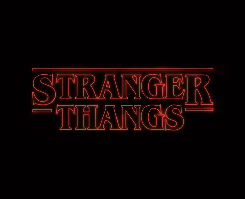
Stranger Things Font is a quintessential element of the popular TV series visual identity is characterized by its nostalgic, retro appeal that harks back to the 1980s. Officially known as ITC Benguiat, this typeface, designed by Ed Benguiat in 1978, encapsulates the era’s typographic trends with its serif design, sharp edges, and tight letter spacing.
Its prominent use in the “Stranger Things” title sequence evokes a sense of vintage horror and science fiction. It plays a pivotal role in setting the show’s atmospheric tone, reminding viewers of the bygone era of film and literature that influenced the series.
You can find more free Movies fonts here.
Uppercase, Lowercase & Symbols Font


History of Stranger Things Font
“Stranger Things Font” typographic tale begins with the creators’ vision to capture the essence of 1980s pop culture. The series debuted on Netflix and was an instant hit largely due to its meticulous attention to detail, including how it displayed text on-screen. The font quickly grew into a symbol of the show’s nostalgic charm.
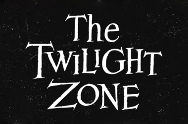
The typeface used for the show’s title card, and implicitly in marketing materials, closely resembles the style of iconic book covers from the era, particularly those found in Stephen King novels and Dungeons & Dragons manuals. In a clever homage to the period’s pop culture, the font looks the part and plays a pivotal role in setting the show’s mood.
Elements of Stranger Things Font
Stranger Things font, known for its distinctive and eerie charm, encapsulates the following elements:
- Thick, Bold Characters: The characters in the font are thick and bold, commanding attention and exuding a sense of strength and eeriness, perfect for the show’s supernatural theme.
- Retro Style: The font pays homage to the typographic trends of the 1980s, featuring a retro style that recalls the era’s horror and science fiction book covers. This is achieved through its unique character shapes and spacing.
- Slightly Irregular Edges: Unlike the perfectly smooth fonts of the digital age, the “Stranger Things” font has slightly jagged edges in some letters, giving it a hand-crafted feel that adds to its vintage charm.
- Extended Character Design: The font features elongated horizontal lines in characters like ‘T’, ‘E’, and ‘K’, enhancing its distinctive appearance and readability from afar.
- Glowing Effect: Often, the font is portrayed with a backlight or neon glow effect in promotional materials, accentuating its supernatural vibe and standing out in visuals related to the show.
- Variation in Character Heights: Some letters stand taller or shorter than others, contributing to a dynamic and slightly unsettling visual effect, mirroring the show’s thrilling narrative.
These elements create not just a typeface but a visual portal to the thrilling and nostalgic world of “Stranger Things,” perfectly blending the past’s aesthetic with the intrigue of the supernatural.
Usage of Stranger Things Font
Stranger Things Font’s unique blend of nostalgia and novelty has seen its adoption beyond the series’ realms into various aspects of design and marketing. Here’s how this distinctive typeface is being used:
1. In Pop Culture Memorabilia
Merchandise related to “Stranger Things,” including T-shirts, posters, and mugs, often features the iconic font. This helps fans instantly connect with the product, as the typography evokes memories and emotions tied to the show.
2. Digital and Print Media
The font has found its way into numerous digital and print media forms, from video game titles to book covers, emulating the eerie vibe of Stranger Things Font. Its usage in media unrelated to the show demonstrates its versatility and widespread appeal.
3. Marketing and Advertising
Brands seeking a touch of retro flair or aiming to tap into the show’s massive fanbase have utilized the “Stranger Things” font in their marketing campaigns. This typography thus serves as an effective tool in evoking nostalgia, drawing attention, and creating a unique visual identity.
4. Personal Projects
For enthusiasts and designers working on personal projects, the font has become a go-to choice for creating invitations, greeting cards, or even personal websites that aim to capture a vintage or supernatural aesthetic.
5. Themed Events
Event planners have adopted the Stranger Things Font for themed parties or events, using it in invitations, banners, and decor to set the mood and immerse guests in an 80s-themed, supernatural atmosphere from the moment they receive their invite.