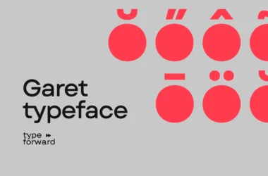
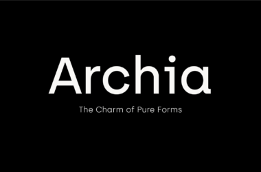
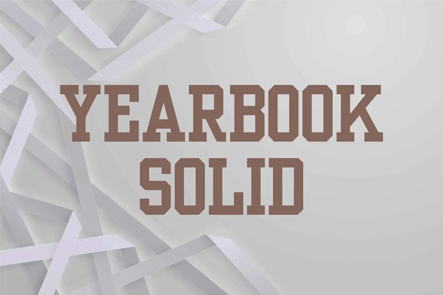
Yearbook Font
“Yearbook Font” typically refers to various typefaces popularly used in creating yearbooks. These fonts are chosen for their readability, versatility, and ability to convey a sense of formality or nostalgia.
Common characteristics include clean lines, classic styling, and, sometimes, a touch of whimsy to add personality to the page. Fonts such as “Times New Roman” for body text and “Old English” for headers or titles are examples of styles that might be considered yearbook fonts, chosen to ensure the text is legible and that the yearbook has a timeless appeal.
You can find more free Slab serif fonts here.
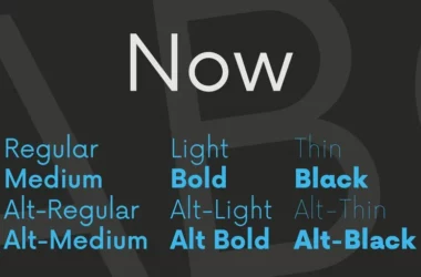
Uppercase, Lowercase & Symbols Font

History of Yearbook Font
Using a distinct font to encapsulate the essence of a given year has a rich history. Yearbook fonts date back to the early 20th century when the practice of dedicating an entire typeface for the school’s yearly chronicle emerged. Each font serves as a communication medium and an artistic expression of the era it symbolizes.
Early Traits of Yearbook Font
Yearbook fonts at their advent bore traits of traditional serif typefaces. These exhibited inherent characteristics that reflected the stoicism and traditionalism synonymous with the educational institutions of the time. They were dependable and precise and evoked a sense of permanence—ideal characteristics for an endeavour documenting historical moments.
Typography’s Evolution in Yearbooks
Against the evolving backdrop of historical and cultural change, yearbook font began to adopt features of the changing typographic landscape. The influence of Art Deco, mid-century modernism, and post-modern typography styles could be noted. Yearbooks of the 60s and 70s experimented with more abstract and playful font shapes, rejecting the strictness of their predecessors.
Digital Era Impact on Yearbooks
The digital era ushered a significant shift in typographic presentation in yearbooks and all print media. The proliferation of font options created a myriad of possibilities for yearbook editors. With the internet and digital design tools at their disposal, editors could now choose from hundreds of fonts, allowing for more excellent encapsulation of the year’s spirit and diversity of the student body.
Characteristics of Yearbook Font
Characteristics of Yearbook Font include:
- Distinctiveness: A chosen font often stands out to embed a unique character and identity into the yearbook’s design. It aims to capture the essence of the school year it represents, making each edition memorable.
- Legibility: Despite the desire for a unique appearance, the font’s legibility remains paramount. These fonts are selected to ensure that text is easily readable, facilitating a pleasant reading experience.
- Versatility: The font must be versatile enough to be used across various yearbook sections, from headlines and subheadings to body text and captions. This ensures consistency and cohesiveness throughout the publication.
- Emotional Resonance: The chosen font can evoke certain emotions or feelings, reflecting the prevailing sentiments or themes of the school year. Fonts can convey seriousness, playfulness, tradition, or innovation, depending on their design.
- Historical Alignment: Often, yearbook fonts reflect the design trends of their time, serving as a typographic snapshot of the era. This historical alignment adds another layer of depth to the yearbook’s time documentation.
- Durability: The font’s styling is chosen with an eye toward an enduring appeal. Even as design trends shift, this font needs to remain appealing and accessible to readers for decades to come.