Avenir Font
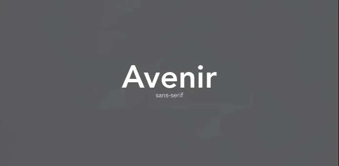
Avenir Font is a sans-serif typeface designed by Adrian Frutiger in 1988 and released by Linotype GmbH, drawing inspiration from the early geometric sans-serif typefaces such as Erbar and Futura. The name “Avenir” is French for “future,” reflecting Frutiger’s intent to blend the aesthetic qualities of these historical models with a more harmonious and functional approach suitable for contemporary typography.
Characterized by its clean, sleek lines and modernist aesthetic, Avenir has been widely adopted for print and digital media, embodying a versatile and forward-thinking choice for many design applications.
You can find more free sans-serif fonts here.
Uppercase, Lowercase & Symbols Font

History of Avenir Font
Avenir, which means “future” in French, was designed by Frutiger in 1988. It emerged as a harbinger of the next generation of geometric sans-serif typefaces, based on the geometric shapes that are representative of the Bauhaus design movement and the International Typographic Style. Unlike its predecessors, Avenir Font was crafted to be less austere and more organic, with a notable touch of warmth.
The inspiration for Avenir came from various sources, not least Frutiger’s desire to create something with a nod to the past but a clear direction towards a modern, technological future. The font’s creation was also influenced by his experience designing for the digital age – Avenir was a font that excelled both in print and on screen, which was a rarity at the time.
Applications of Avenir Font
Avenir Font’s flexibility allows it to be used in a multitude of applications. Here are a few areas where the font shines:
1. Web Design
For web designers, Avenir is a go-to choice for websites that demand a modern, clean, and highly readable typeface. Its scalability and clarity make it a perfect companion for responsive design – adapting effortlessly across different devices and screen sizes.
2. Branding and Identity
The versatility of Avenir makes it a popular choice for branding and corporate identity. Its simple elegance can convey various brand attributes such as trustworthiness, forward-thinking, and professionalism. Avenir’s even stroke widths and open letterforms are ideal for logos and brand messaging.
3. Editorial Design
In editorial contexts, Avenir Font stands out for its legibility, making it perfect for body text in magazines, newspapers, and books. Its subtle variations in line weight provide a graceful and harmonious appearance, adding a touch of sophistication to any publication.
4. Signage and Wayfinding
Avenir’s clear, unambiguous letterforms are suited for signage and wayfinding designs where readability from a distance is critical. The uniform concern for verticals and horizontals within the letters ensures they stand out sharply against any background.
Tips for Using Avenir Font
Here are some tips for maximizing the impact of Avenir Font in your design projects:
- Balance with Negative Space: Utilize ample negative space around Avenir text blocks to enhance readability and highlight its elegant structure. The font’s clean lines benefit greatly from uncluttered layouts.
- Pair Wisely: When pairing Avenir with other fonts, select complementary fonts that do not overpower its subtle elegance. Serif fonts for body text and Avenir for headings can create a harmonious balance.
- Consider the Weight: Avenir comes in multiple weights; use them to your advantage. Lighter weights work well for body text, while heavier weights make striking headings or call-to-action.
- Maintain Contrast: For designs featuring Avenir in the heading and body text, maintain contrast by varying font weights and sizes. This differentiation helps guide the reader’s eye and enhances the overall legibility of the design.
- Opt for Simplicity in Color: Avenir’s refined character pairs best with a simple colour palette. Avoid using too many bold colours, which can detract from the font’s inherent elegance and readability.
- Leverage Its Versatility: One of Avenir’s strengths is its versatility. Don’t hesitate to use it across different mediums and design formats – from digital screens to printed material, Avenir adapts beautifully.
Implementing these tips when using Avenir Font can amplify the font’s potential in your design projects, ensuring that your work stands out and communicates effectively with your audience.