Arial Font
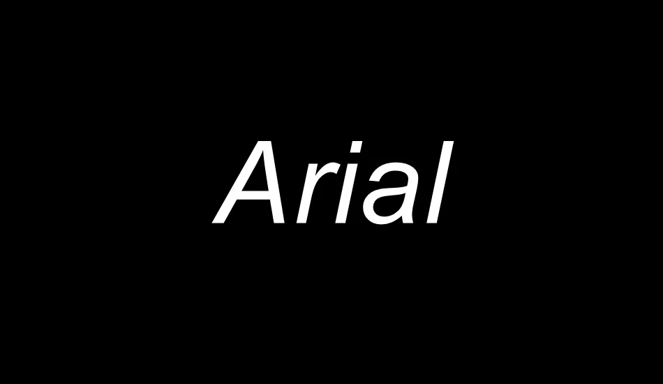
Arial Font is a sans-serif typeface that has become one of the world’s most widely used and recognized fonts. Designed in 1982 by Robin Nicholas and Patricia Saunders for Monotype Typography, Arial was created as a more accessible and versatile alternative to the popular Helvetica font.
Characterized by its clean lines and neutral appearance, Arial is optimized for legibility across print and digital platforms. Its simplicity and clarity have made it a default font choice for countless documents, web pages, and graphical designs, underscoring its enduring popularity in typography.
You can find more free sans-serif fonts here.
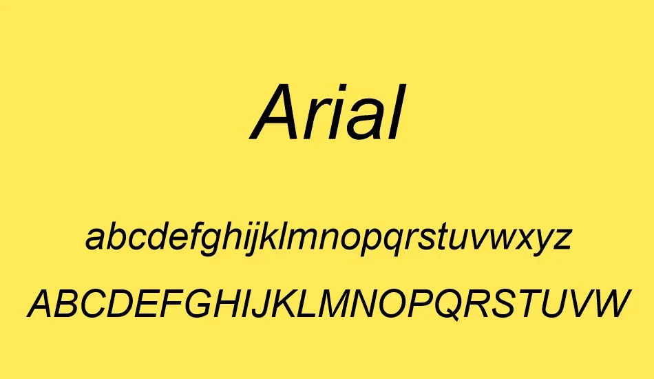
Uppercase, Lowercase & Symbols Font

History of Arial Font
Arial Font’s roots trace back to 1982, the brainchild of type designer Robin Nicholas and Patricia Saunders, both members of the famed Monotype team. The intent was clear—developing a versatile sans-serif typeface to serve the burgeoning desktop publishing market.
Initially, Arial was distributed with various Microsoft software products, and its accessibility quickly propelled it to the forefront of digital design. By the 1990s, it had carved out a staggering user base, becoming a default font for many word-processing applications and operating systems.
Characteristics of Arial Font
Characteristics of Arial Font include:
- Sans-serif: Arial is a sans-serif typeface, meaning it lacks the small projecting features called “serifs” at the end of strokes. This gives it a modern and clean appearance, suitable for print and digital media.
- Versatility: It is designed to be highly versatile and suitable for various applications, from body text in documents to signage and branding.
- Legibility: With its open forms and ample spacing, Arial is highly legible even at smaller sizes, making it a reliable choice for lengthy texts.
- Variety of Weights: The Arial family includes various weights and styles, such as Arial Regular, Arial Bold, Arial Italic, and Arial Bold Italic, allowing for a wide range of typographic expressions.
- Neutral Design: Arial’s design is intentionally neutral, making it a chameleon that can fit into almost any design without overshadowing other elements.
- Compatibility: Thanks to its widespread use and inclusion with Microsoft Windows, Arial is highly compatible across different operating systems and devices, ensuring that documents look consistent everywhere.
Usage of Arial Font
The ubiquity of Arial Font across various platforms and mediums has led to its widespread use in multiple domains. Here are some of the most common uses:
Web Design
Arial has become a staple in web design due to its legibility and compatibility across browsers and devices. It’s often used for body text to ensure that content is easily readable on screens of all sizes.
Corporate Identity
Many businesses choose Arial for corporate identity materials, including logos, letterhead, and business cards. Its neutrality and clarity convey a sense of professionalism and modernity.
Printed Media
From books and newspapers to posters and flyers, Arial is frequently utilized in printed media. Its versatility and legibility make it an excellent choice for large blocks of text and headlines.
Digital Media and Presentation
Arial’s clean and simple design makes it a favorite for digital media, such as PowerPoint presentations and online publications. It allows for easy on-screen reading and maintains consistency across digital platforms.
Accessibility
Due to its straightforward and clear design, Arial is often used in materials designed for accessibility. This includes signage and materials created for those with visual impairments, where clarity and simplicity are paramount.
Pros and Cons of Arial Font
Here are some pros and cons of Arial Font:
Pros:
- Readability is paramount, with clear distinctions between characters.
- Digital-friendly, it renders well even at low resolutions.
- Universally recognized, it is a neutral ground for communication.
Cons:
- Its ubiquity is a double-edged sword, often stifling distinctiveness.
- Typographic purists cite its widespread use as evidence of a “dumbing down” of design.

