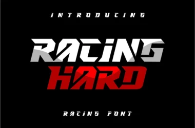
Sport Game Font
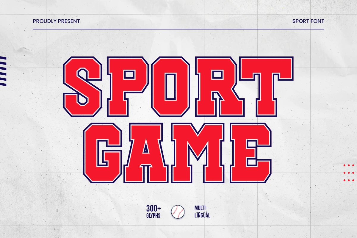
About Sport Game Font
Sport Game Font is perfect for big projects like sports branding, marketing, and more. With its unique style, this font is sure to make your project stand out from the rest.
When you’re designing a sports game, one of the most important things to think about is what font you’re going to use. The right font can make or break the game. It’s important to choose a font that is easy to read and that conveys the right feeling.
You can find more free Sports fonts here.
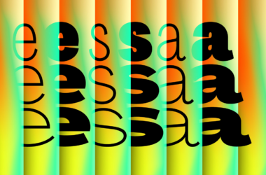
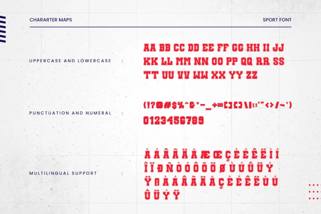
Uppercase, Lowercase & Symbols Font
Why Choose Sport Game Font?
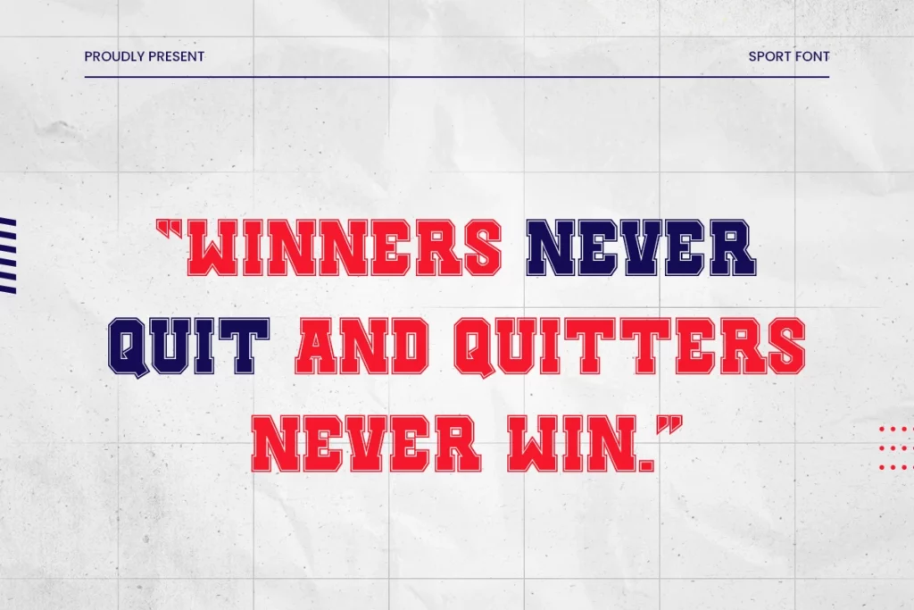
When it comes to fonts, there are endless possibilities. But if you’re working on a sports-related project, you want a font that perfectly captures the energy and excitement of the game. That’s where Sport Game Font comes in. This cool sport display font is specifically designed for sports projects. And with its unique style, this font is sure to make your project stand out from the rest.
Fonts are like any other element of design, they should be chosen deliberately and with purpose. The wrong font can make a sports game look unprofessional and cartoony. The right font will give the game a feeling of sophistication and excitement. Here are a few things to keep in mind when choosing a font for your next sports game.
Size Matters
One of the most important things to consider when choosing a font for a sports game is the size. The text needs to be large enough that it can easily be read by viewers from a distance. This is especially important for games that will be played on television. You want viewers at home to be able to see the score and other important information without having to strain their eyes.
Another thing to keep in mind is that the size of the font will also be affected by the resolution of the screen. If you’re using a lower resolution, you’ll need to use a larger font so that it’s still legible. Conversely, if you’re using a high resolution, you can get away with using a smaller font. Just make sure that it’s still easy to read.
The Right Feeling
The font you choose should match the overall feeling of the game. For example, if it’s an intense, fast-paced game, you’ll want to use a more energetic-looking font. On the other hand, if it’s a slow-paced strategy game, you’ll want to use a more subdued font. The key is to make sure that the font you choose fits the tone of the game.
This font is free for personal use, Click here for commercial use.