Akrobat Font
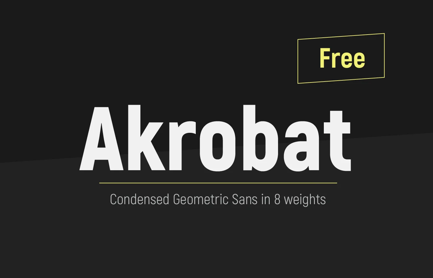
Akrobat Font is a modern sans-serif font with a geometric touch. Designed for efficiency and style, it features clean lines and a sleek appearance, making it highly readable even at small sizes. The font includes a wide range of weights, from thin to extra bold, allowing for versatile use across various print and digital media.
Its contemporary design makes Akrobat particularly suitable for headlines, branding, and advertising materials, offering a professional and polished look that stands out in any context.
You can find more free Modern fonts here.
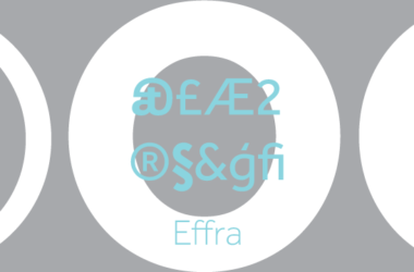
Uppercase, Lowercase & Symbols Font


History of Akrobat Font
Akrobat font is a modern sans-serif typeface known for its clean lines and geometric form. This contemporary font was designed by Plamen Motev and debuted in the design world relatively recently. Akrobat boasts a wide range of weights, making it versatile for various design projects, from print to digital media.
Its sleek design and excellent readability at both large and small sizes have quickly made it a favourite among graphic designers and typographers. The typeface stands out for its open shapes and neutral yet friendly appearance, which aligns well with branding, advertising, and web design. Its development was driven by the need for a highly legible and adaptable font that could meet the demands of modern design aesthetics and digital platforms.
Uses of Akrobat Font
The Akrobat font, with its versatility and clean aesthetics, is used across a broad spectrum of design applications. Here are some of the primary uses of Akrobat Font:
- Branding: Akrobat’s modern and neutral appearance makes it an excellent choice for brand identities, helping to establish a clean and professional look.
- Advertising: Its high legibility at various sizes and weights allows for impactful advertising materials, whether in prints, billboards, or digital ads.
- Web Design: The font’s readability and modern style enhance the website user experience, making it a popular choice for web designers.
- Editorial Design: Akrobat is often selected for magazines, newspapers, and online publications for its elegance and ease of reading.
- Corporate Communication: From annual reports to corporate presentations, Akrobat ensures a consistent and professional appearance in all forms of corporate communication.
- Packaging Design: Its wide range of weights can create dynamic and appealing packaging that stands out on shelves.
- Signage and Wayfinding Systems: The transparent and open shapes of Akrobat make it suitable for large-format applications such as signage, aiding in readability and navigation.
How to Use Akrobat Font
Using Akrobat font effectively involves understanding its characteristics and applying them to your design projects to enhance visual appeal and readability. Here are some detailed guidelines and tips on how to use Akrobat Font:
1. Selecting the Right Weight
Akrobat comes with a variety of weights, from thin to extra bold. Choose a weight that complements the nature of your project. For instance, lighter weights are ideal for body text in editorial designs, whereas bolder weights make a strong statement in headlines and branding.
2. Pairing with Other Fonts
While Akrobat is highly versatile, pairing it with the right fonts can elevate your design. Consider using a serif font for body text in print materials to create a contrast, or stick to sans-serif combinations for a more modern look in digital designs.
3. Legibility in Digital Media
When using Akrobat for web design or digital platforms, ensure that text is legible across all devices. Opt for standard or medium weights for body text and reserve heavier weights for headings and calls to action.
4. Implementing in Branding
For branding projects, utilize Akrobat’s range of weights to create a dynamic and cohesive visual language. You can use different weights to distinguish between various types of information, such as company names, taglines, and body content.
5. Color and Contrast
Pair Akrobat with contrasting colours to make your text stand out. High contrast between text and background, especially in advertising and signage, ensures maximum visibility and impact.
6. Licensing
Before using Akrobat font in any project, obtain the appropriate licensing. This is important for commercial projects to avoid legal issues and respect the designer’s intellectual property.