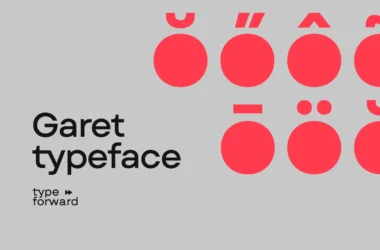
Futura Font
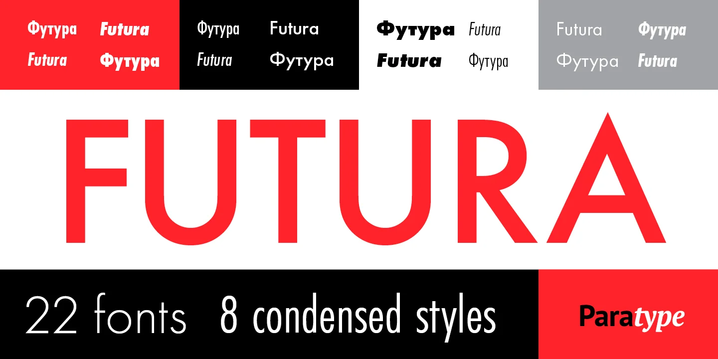
Futura Font is a geometric sans-serif typeface designed in 1927 by Paul Renner. Inspired by the Bauhaus movement in Germany, Futura emphasizes functionality and simplicity through its clean lines and shapes. Its design is based on geometric shapes like circles, squares, and triangles, making it recognizable and futuristic even today.
Over the years, Futura has been widely adopted for its modernist aesthetic and readability, making it a go-to choice for branding, advertisements, and various print and digital media. Its extensive family includes a variety of weights and styles, offering versatility in professional typography.
You can find more free Modern fonts here.
Uppercase, Lowercase & Symbols Font


History of Futura Font
Futura, a geometric sans-serif typeface, was designed by Paul Renner and released in 1927 by the Bauer Type Foundry. Its design was influenced by the Bauhaus movement in Germany, which emphasized functionality and simplicity in art and design. Futura’s appearance is defined by its geometric shapes—circles, triangles, and squares—which align with the Bauhaus aesthetic of minimalist beauty.
It was groundbreaking for its time, moving away from the traditional serif fonts that dominated print. Over the years, Futura has seen widespread use across various mediums, including advertising, logos, and book covers, solidifying its status as a timeless classic in typographic design. Its influence can still be seen today in many modern fonts and branding efforts, a testament to its enduring appeal and functionality.
Usage of Futura Font
The versatility and striking appearance of the Futura font have led to its widespread use in a multitude of applications, including:
- Advertising: Its clean, modern aesthetic makes it a favorite for advertisers looking to convey a sense of elegance and efficiency.
- Logos and Branding: Many well-known companies use Futura in their logos and branding materials to project an image of forward-thinking and professionalism. This includes companies like Supreme, Dolce & Gabbana, and Volkswagen.
- Film and Television: Futura has been used in the title sequences and promotional materials for various films and TV shows, emphasizing a futuristic or avant-garde setting. Stanley Kubrick notably used it in many of his films.
- Print and Digital Publications: Due to its readability and stylish geometric form, Futura is often chosen for headlines, body text, and display settings in both print and digital media.
- Public Signage: Its clarity and legibility make it an excellent choice for public signage, where conveying information effectively is paramount.
Futura’s continued prevalence in these areas highlights its design appeal and functional versatility across different media.
Pros and Cons of Futura Font
Like any typeface, Futura has its strengths and weaknesses. Here are some pros and cons to consider when using this font:
Pros of Futura Font
- Timelessness: Futura has remained popular since its creation in the 1920s, a testament to its enduring design appeal and versatility.
- Legibility: Its geometric shapes and clear, simple lines offer excellent legibility, making it suitable for various applications, from print to digital.
- Simplicity and Modernity: The minimalist aesthetic of Futura aligns well with modern design trends, making it a go-to choice for designers looking to convey cleanliness and sophistication.
- Brand Appeal: Futura’s association with high-profile brands and use of various iconic logos have elevated its status, making it a prestigious choice for branding and advertising.
Cons of Futura Font
- Overuse: Because of its popularity, there’s a risk of Futura feeling overused or clichéd, particularly in specific industries or design contexts.
- Readability Issues at Small Sizes: While Futura is legible, its geometric shapes can make reading more challenging at smaller sizes, especially for extended text.
- Lack of Warmth: Its geometric and minimalist appearance can sometimes be perceived as cold or impersonal, which may not suit all design projects or messages.
- Compatibility and Licensing: Depending on the project, restrictions or costs might be associated with using Futura, especially in commercial or digital projects.